Krogerus website analysis
A detailed critique of the homepage's craft, originality, usability, and ability to move visitors toward its intended goal.
Our observations
A strong and distinctive legal-services homepage with excellent visual direction and clear content breadth, held back from exceptional status by contrast problems and some information-dense sections.
Best practices
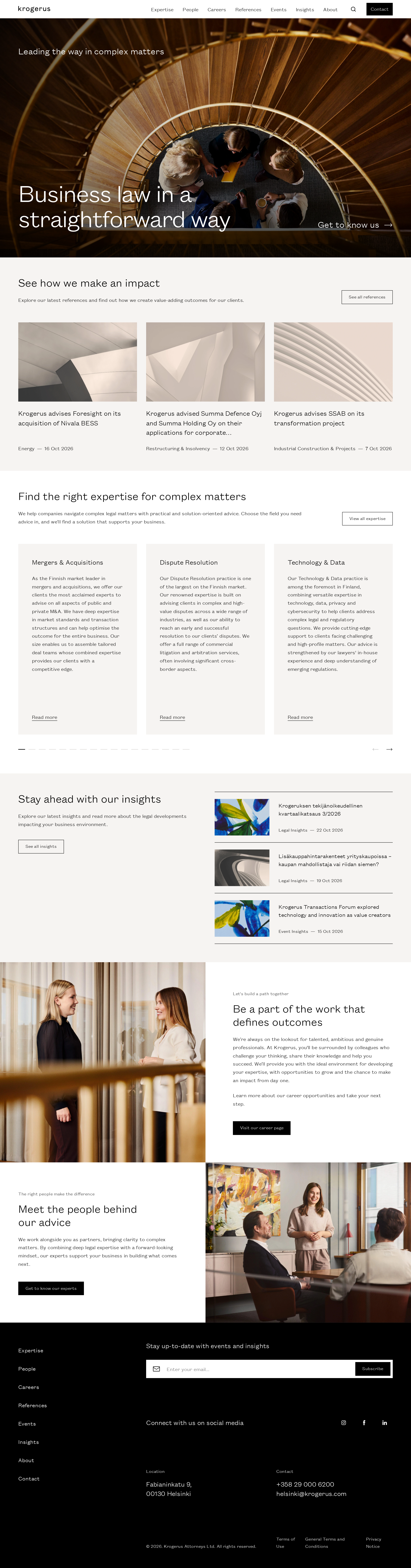
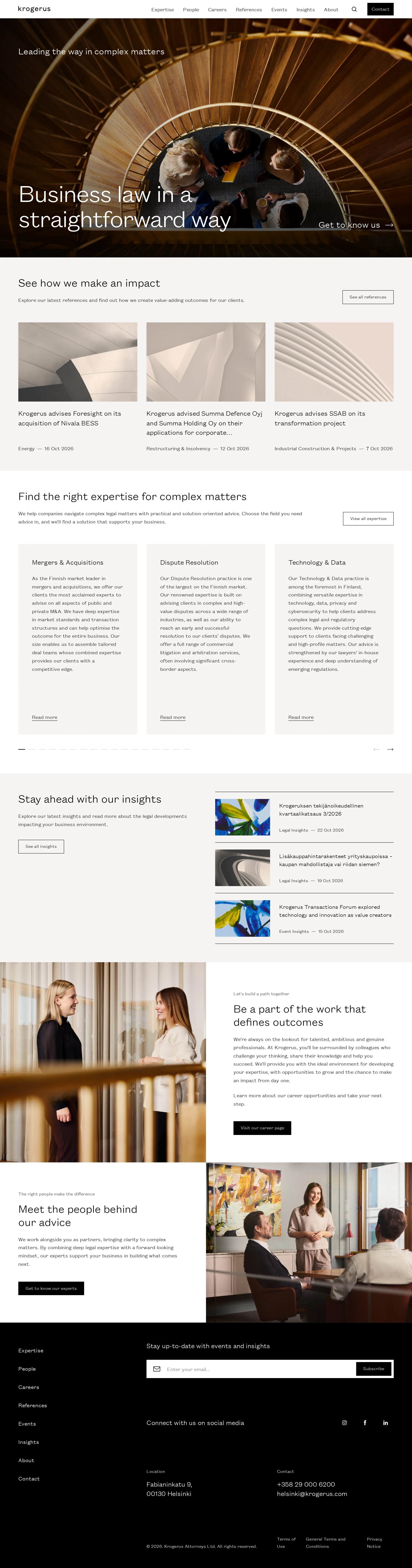
The page has a coherent information architecture, one main heading, logical heading progression, semantic navigation and footer regions, and clear pathways to expertise, work, insights, people, and contact content. Automated accessibility evidence reports a good overall score but also three serious contrast failures.
What works
- A single prominent H1 establishes the page topic.
- Heading levels progress without detected skips.
- Primary navigation, footer navigation, forms, buttons, and content links are visibly represented.
- The page provides multiple routes for different visitor intents, including expertise discovery, case-study review, recruitment, and contact.
Opportunities
- Resolve the three detected text-contrast failures, especially text placed over the photographic hero.
- Audit the smaller card metadata and descriptive copy at normal viewing sizes rather than relying on the large-screen composition.
- Verify keyboard focus visibility, image alternative text, carousel controls, and reduced-motion behavior in an interactive test.
Design
The visual design is confident, restrained, and well matched to a modern business law firm. Strong photography, disciplined spacing, square-edged controls, and a limited palette create a memorable editorial character.
What works
- The hero image gives the brand an immediate visual point of view.
- Warm off-white sections prevent the monochrome palette from feeling sterile.
- Alternating image-and-copy sections create useful pacing after the dense expertise content.
- The consistent type family and thin rules unify cards, lists, buttons, and footer content.
Opportunities
- Increase the visual distinction between long expertise cards so the section is easier to scan.
- Consider slightly stronger typographic or color differentiation for secondary metadata.
- Ensure the hero overlay remains sufficient across different image crops and viewport sizes.
Uniqueness
The page avoids the generic blue-and-white law-firm template through its photographic art direction, warm neutral surfaces, and editorial composition. Its restrained approach is distinctive without becoming theatrical.
What works
- The combination of architectural imagery and candid workplace photography creates a recognizable tone.
- The composition balances institutional credibility with human storytelling.
- The square, rule-based component language feels deliberate and consistent.
Opportunities
- A more ownable accent or recurring graphic device could further differentiate the brand from other minimalist professional-services sites.
- The expertise and insights patterns could carry a more distinctive visual cue while preserving the restrained system.
User experience
The homepage supports several plausible visitor goals and maintains a predictable section order. However, long card copy, small text in places, and a visually dominant hero may make rapid scanning less efficient for some users.
What works
- The sequence from credibility signals to expertise, insights, people, and contact is sensible for a law-firm homepage.
- Case studies and expertise areas are exposed directly rather than hidden behind a single generic call to action.
- The footer consolidates navigation, newsletter signup, social links, and contact details.
Opportunities
- Shorten or visually prioritize descriptions in the expertise grid to improve comparison.
- Make carousel state and controls more explicit for screen-reader and keyboard users.
- Test the page at narrower widths for heading wraps, image crops, and dense footer navigation.
- Provide clearer persistent contact guidance for visitors who are ready to discuss a matter.
Conversion optimization
For a professional-services site, the page does a good job of building credibility and offering multiple next steps, but the primary route from interest to consultation is less prominent than the content-discovery routes.
What works
- Recent client work and named expertise areas provide useful credibility signals.
- Calls to action lead to relevant deeper content rather than relying on vague promotional language.
- Recruitment and firm-culture content broaden the page's utility beyond client acquisition.
Opportunities
- Introduce a more prominent consultation or contact action near the hero for visitors with immediate legal needs.
- Pair case studies with clearer contextual actions, such as viewing the matter or contacting the relevant team.
- Use concise proof points or outcome summaries alongside selected work to make credibility easier to assess quickly.
What we'd improve
- 01high
Correct hero and link contrast
Rework the hero overlay, text color, or text placement so the heading, supporting copy, and hero action remain clearly legible across the full image. Re-test the three reported contrast failures at representative image crops and viewport sizes.
- 02high
Audit small and dense content
Review expertise descriptions, article metadata, and footer text at normal desktop and mobile zoom. Increase legibility or reduce copy where scanning and comprehension are impaired.
- 03medium
Strengthen the primary contact pathway
Add a clearly prioritized contact or discuss-a-matter action in the hero or immediately after the first credibility section, while retaining the existing expertise and insights routes.
- 04medium
Improve carousel communication
Give the carousel controls a clearer active-state treatment and verify accessible names, focus states, keyboard operation, and announcements for changing content.
- 05low
Add a more ownable supporting motif
Consider a subtle recurring brand graphic, color accent, or editorial marker to distinguish the expertise and insights modules without disrupting the restrained visual language.