Tremain Artaza website analysis
A detailed critique of the homepage's craft, originality, usability, and ability to move visitors toward its intended goal.
Our observations
Strong visual direction and credible conversion structure, but accessibility and semantic issues keep the homepage below exceptional gallery quality.
Best practices
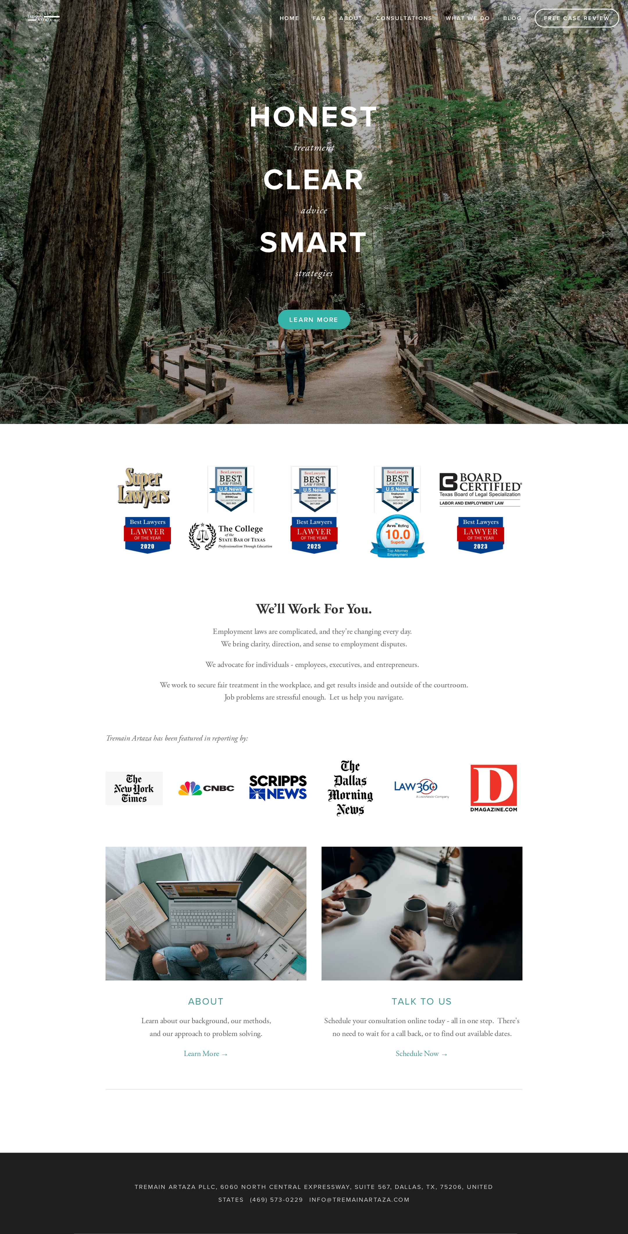
The page has a clear site structure, a semantic footer, a visible primary consultation route, and a coherent hierarchy. However, the automated evidence reports serious contrast and link-naming issues, duplicate IDs, and two h1 elements.
What works
- The navigation exposes key pages including attorneys, practice areas, consultations, and reviews.
- A consultation action is visible in the hero and repeated in the lower content area.
- The footer provides address, phone, and email information.
- The page has one reported main landmark and no reported heading skips.
Opportunities
- Resolve all 12 reported contrast failures, especially navigation and over-image text.
- Give the three unnamed links accessible names and meaningful focus treatment.
- Remove the duplicate ID instances and ensure the logo does not create an empty h1.
- Test keyboard navigation, focus order, skip navigation, and touch targets on desktop and mobile.
Design
The homepage has a confident editorial identity, strong image selection, controlled spacing, and a clear visual rhythm from hero to proof points to contact. The credential-logo band is effective as social proof but somewhat visually crowded and less informative than the rest of the composition.
What works
- The forest hero creates a memorable and calm alternative to generic law-firm imagery.
- The serif and sans-serif pairing supports both authority and usability.
- Centered copy and generous white space create a composed, premium presentation.
- The turquoise accent gives consultation links and section labels a consistent point of emphasis.
Opportunities
- Add concise practice-area framing near the hero so the firm’s employment-law focus is immediately explicit.
- Reduce dependence on logos as the primary proof of credibility by adding short explanatory labels or outcomes.
- Review image overlays and text placement for consistent legibility across different viewport crops.
Uniqueness
The nature-led art direction and measured editorial typography distinguish the page from common legal-services templates. Its differentiation comes from atmosphere and restraint rather than unusual interaction design.
What works
- The redwood setting gives the brand a distinctive metaphor of guidance and movement.
- The alternating large uppercase words and small italic descriptors create a recognizable verbal-visual motif.
- The page avoids excessive effects, gradients, cards, or generic corporate imagery.
Opportunities
- Extend the brand idea into a more distinctive system for practice areas, attorney profiles, or case guidance.
- Make the firm’s Dallas and employment-law specialization more visually and verbally central so the atmosphere does not overshadow relevance.
User experience
The page offers straightforward navigation and multiple routes to learn more or schedule a consultation. However, contrast failures, unnamed links, image-heavy proof sections, and uncertain mobile behavior create meaningful usability risks.
What works
- The primary CTA is easy to locate in the hero.
- The About and Talk to Us cards provide understandable next steps.
- The page’s limited number of major sections supports quick scanning.
- Contact details are available in the footer.
Opportunities
- Improve text contrast in the transparent header and hero states.
- Use descriptive accessible names for logo, gallery, and utility links rather than relying on visual context.
- Provide stronger section headings for credentials, media coverage, and practice focus.
- Validate responsive stacking and navigation behavior at mobile widths.
Conversion optimization
For a law-firm homepage, the page establishes credibility and offers a direct consultation pathway, but it leaves important decision-making information implicit. Conversion would likely improve if the page explained fit, scope, and next steps before asking visitors to schedule.
What works
- The hero CTA is prominent without being visually aggressive.
- The consultation message is repeated lower on the page with a scheduling-oriented label.
- Awards, board certification, professional affiliations, and media coverage provide visible trust signals.
- The lower CTA card uses supportive language that reduces perceived friction.
Opportunities
- State the firm’s core employment-law matters and client types directly in the hero or immediately below it.
- Explain what a consultation includes, how long it takes, and what information a prospective client should prepare.
- Add a persistent or repeated phone/contact option for visitors who prefer not to schedule online.
- Pair award marks with dates, categories, or concise context so visitors can assess their relevance.
What we'd improve
- 01high
Repair accessibility and semantic structure
Address the 12 contrast failures, name the three unnamed links, remove duplicate IDs, and consolidate the empty logo heading with the visible page h1. Recheck keyboard focus and screen-reader naming after changes.
- 02high
Clarify the service proposition above the fold
Add a concise statement identifying the firm as a Dallas employment-law practice and naming the principal client or matter types served before or alongside the hero CTA.
- 03medium
Make trust signals more informative
Introduce short labels or supporting copy for the award, certification, and media logos, including relevant years or categories where appropriate, and provide equivalent text alternatives.
- 04medium
Strengthen consultation expectations
Explain the scheduling process, consultation format, and likely next step near the Talk to Us CTA so visitors can make an informed decision before submitting a request.
- 05low
Verify narrow-screen composition
Test the hero crop, transparent navigation, credential grid, paired cards, typography, and CTA focus states across mobile breakpoints, with particular attention to readable contrast over the image.