Bick Law LLP website analysis
A detailed critique of the homepage's craft, originality, usability, and ability to move visitors toward its intended goal.
Our observations
A distinctive and credible law-firm homepage with strong art direction, but accessibility failures, small low-contrast text, and carousel-heavy interaction keep it below gallery-leading quality.
Best practices
The structure includes one detected H1, orderly heading levels, a skip link, visible carousel pause controls, and a footer. However, the audit reports a serious contrast problem, missing image alternatives, unnamed links, and no detected main landmark.
What works
- The homepage has a single detected H1 and no heading skips in the supplied structure.
- A skip-to-content control and carousel autoplay controls are present.
- The page exposes clear sections for people, practices, firm rationale, insights, and awards.
Opportunities
- Resolve the 338 reported contrast failures, especially navigation and text layered over hero or dark imagery.
- Add meaningful alternative text to the eight flagged images and accessible names to the four unnamed links.
- Add a semantic main landmark and verify focus visibility, keyboard operation, carousel announcements, and pause behavior.
- Test reduced-motion behavior and ensure autoplay does not create cognitive or reading disruption.
Design
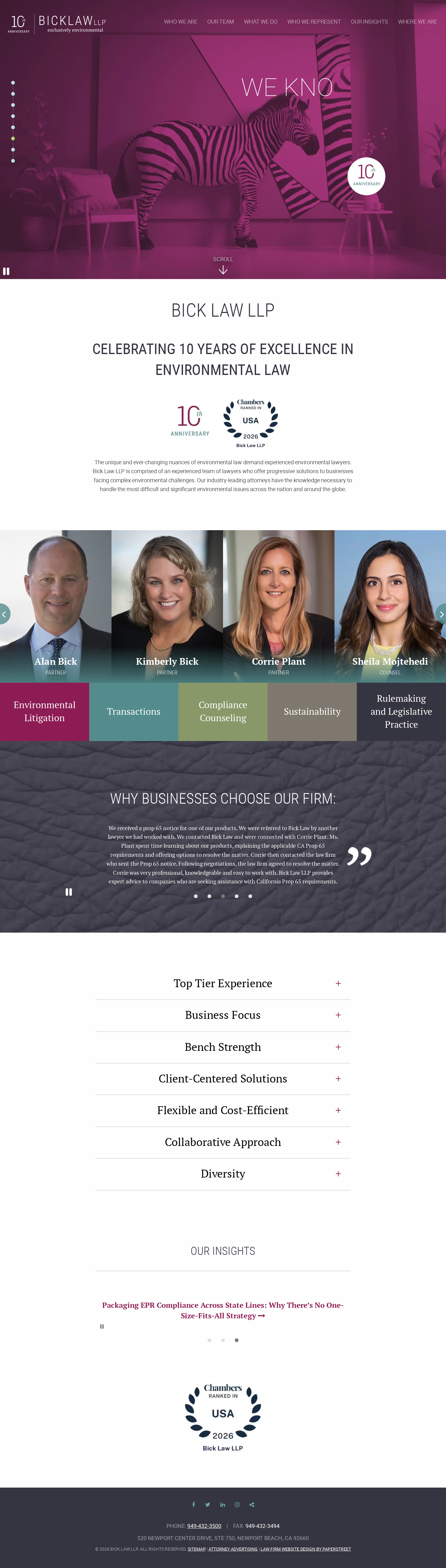
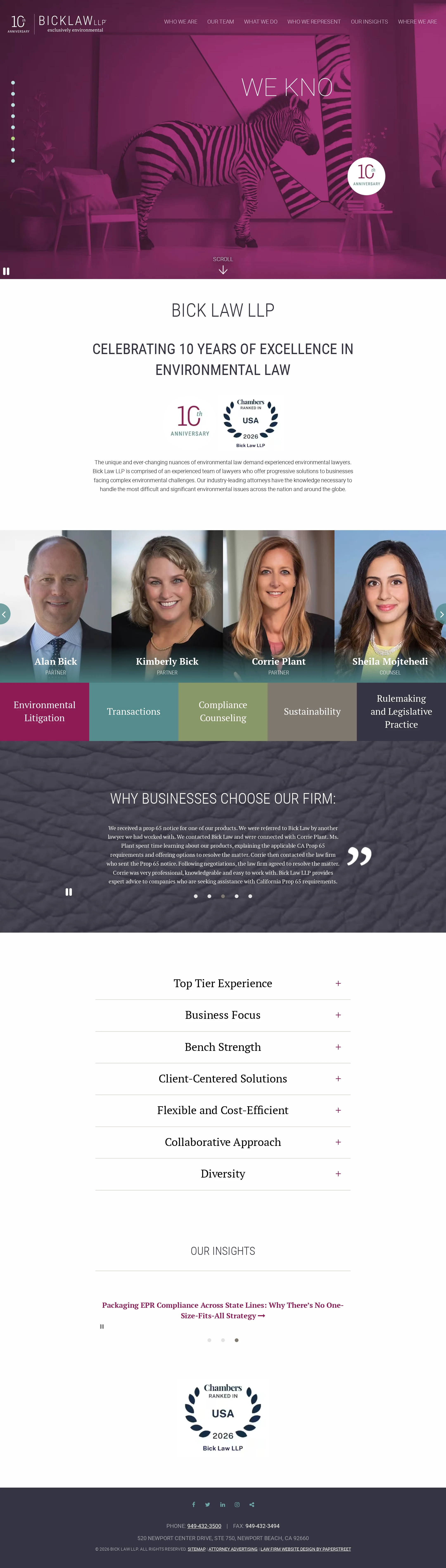
The page has a confident, recognizable visual system that differentiates the firm from generic corporate legal templates. The combination of magenta photography, portraits, colored practice tiles, and editorial type creates a cohesive but somewhat visually dense experience.
What works
- The plum-tinted hero and zebra imagery provide a memorable point of view.
- The attorney portrait band makes the firm feel human and presents individual attorneys prominently.
- The practice-area tiles and accordion rows create clear visual grouping.
- The serif and condensed type pairing supports a legal-editorial tone.
Opportunities
- Reduce competing visual emphasis between the hero, portraits, practice tiles, testimonial panel, and awards.
- Improve text scale and spacing in the insights and footer areas, where information appears particularly small in the screenshot.
- Use more consistent treatment for content modules so the page feels less dependent on sliders and decorative transitions.
Uniqueness
The homepage is notably more distinctive than a conventional law-firm marketing page. Its environmental visual metaphor, saturated color treatment, and portrait-forward presentation give it a clear identity.
What works
- The zebra-centered hero connects the firm’s environmental focus to an unusual, memorable visual motif.
- The anniversary and Chambers recognition content create a specific institutional narrative.
- The alternating image, color, texture, and white-space sections avoid a generic all-white professional-services layout.
Opportunities
- Make the environmental-law connection explicit in the first hero message rather than relying primarily on imagery and a broad anniversary statement.
- Replace or refine repeated carousel patterns with more ownable editorial storytelling or case-led proof points.
- Ensure distinctive art direction does not reduce practical clarity for prospective clients.
User experience
The page offers a logical overview of the firm, but the first screen prioritizes atmosphere and rotating content over an immediately actionable explanation of services. Multiple sliders, small controls, and low contrast increase navigation and comprehension friction.
What works
- The page progresses from firm identity to team, services, client proof, firm attributes, insights, and awards.
- Practice areas are visible without requiring the user to open the accordion section.
- Attorney names and service categories are presented as prominent navigational content.
Opportunities
- State the firm’s audience, core environmental litigation value, and primary next step more directly in the hero.
- Provide stronger labels and persistent controls for all carousels, including status and slide context.
- Increase the size and contrast of small text, dots, arrows, and footer information.
- Validate the page at mobile widths and with keyboard, screen-reader, zoom, and reduced-motion use cases.
Conversion optimization
For a legal-firm awareness page, the homepage establishes credibility through team visibility, awards, testimonials, and practice areas. Conversion intent is comparatively understated: the supplied screenshot does not show a strong above-the-fold consultation or contact action, and the most prominent hero content is largely brand-led.
What works
- Team profiles, practice categories, testimonials, awards, and insights support trust-building.
- The phone number is present in the footer and the navigation exposes firm and practice information.
- The anniversary and external recognition content provide useful credibility signals.
Opportunities
- Add a prominent, plain-language contact or consultation pathway near the hero and after the practice-area section.
- Connect each practice tile to a clear service page with an appropriate next action.
- Surface representative matters, industries served, or outcomes where legally and ethically appropriate.
- Use descriptive link labels instead of relying on images, icons, or hover states to communicate the next step.
What we'd improve
- 01high
Repair contrast and alternative-text failures
Audit every text/background pairing across the hero, navigation, testimonial panel, practice tiles, and footer; then add meaningful alternative text to the eight flagged images and verify decorative images are correctly ignored.
- 02high
Make the primary legal-service path explicit
Add a concise hero statement for business clients, one primary contact action, and repeated contact pathways after the practice-area and credibility sections.
- 03high
Harden carousel and keyboard accessibility
Give every carousel an accessible name, current-slide announcement, labeled controls, visible focus state, and reliable pause behavior; test autoplay and reduced-motion settings with keyboard and screen-reader workflows.
- 04medium
Improve information density and scanability
Increase small type in the insights, award, and footer areas, simplify secondary decorative copy, and reserve the strongest contrast for essential navigation and conversion actions.
- 05medium
Verify responsive layouts independently
Run dedicated mobile, tablet, zoom, and touch testing to confirm that the portrait band, practice tiles, accordion rows, carousel controls, and fixed header remain usable.
- 06low
Strengthen proof for prospective business clients
Supplement general testimonials and recognition with clearly organized industries, representative matters, attorney expertise, or practical environmental-law resources.