Offsuit Games website analysis
A detailed critique of the homepage's craft, originality, usability, and ability to move visitors toward its intended goal.
Our observations
A polished and distinctive gaming homepage with strong visual discipline and clear product prioritization. It is ready for inclusion, with responsive and interaction details worth validating before treating it as a benchmark.
Best practices
The page demonstrates strong structural hygiene and a focused content hierarchy. Automated evidence reports one main landmark, one h1, no heading skips, no duplicate IDs, and no sampled contrast failures. Some behavioral and responsive best practices remain unverified.
What works
- Clear semantic page structure with a single main region and a detected footer.
- One primary heading and no reported heading-order violations.
- Strong contrast in the supplied samples, supported by the black-and-white presentation.
- Consistent card treatments and predictable footer navigation.
Opportunities
- Verify keyboard focus visibility and hover alternatives for all card links and voting controls.
- Test mobile layouts, touch targets, image loading, and text wrapping at narrow widths.
- Confirm that the large visual tiles expose meaningful accessible names and useful alternative text.
Design
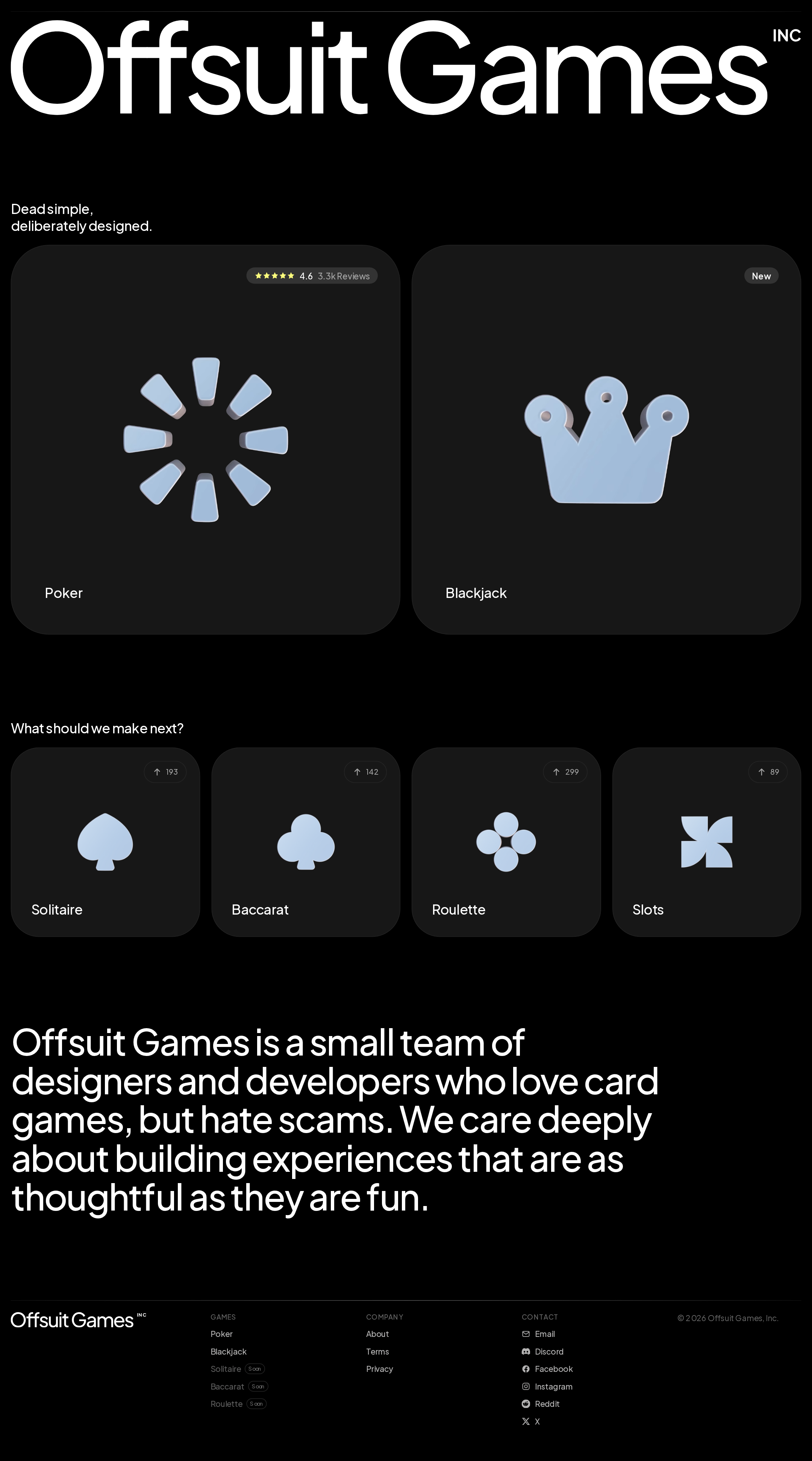
The design is exceptionally cohesive. Oversized identity typography, sparse black space, charcoal cards, and pale-blue symbols create a memorable studio aesthetic without visual noise.
What works
- Excellent opening hierarchy: the wordmark, positioning statement, and featured games are immediately legible.
- The featured and voting cards form a consistent visual family while maintaining clear size-based priority.
- The studio statement adds emotional clarity and differentiates the brand from generic game portals.
- The restrained palette makes the card illustrations and typography feel intentional.
Opportunities
- Add a small amount of supporting context to the featured games without weakening the minimal presentation.
- Make the relationship between the voting counts and future game production more explicit.
- Consider a subtle visual distinction between available games and proposed games beyond card scale and labels.
Uniqueness
The page’s combination of anti-casino positioning, oversized typographic branding, abstract game symbols, and community-led product selection feels more authored than a conventional games catalogue.
What works
- The anti-scam studio positioning gives the page a clear point of view.
- The abstract iconography avoids the familiar casino imagery common in this category.
- The oversized wordmark and extensive black space create a strong editorial signature.
- The voting section makes the homepage feel like an evolving studio hub rather than a static product list.
Opportunities
- Develop a more recognizable recurring motif across the game illustrations and editorial sections.
- Use a distinctive explanation or interaction around voting to further separate the experience from a standard poll grid.
- Ensure future games maintain the same level of visual authorship so the catalogue does not become generic.
User experience
The information path is easy to scan: visitors see the studio identity, current games, possible future games, and company context in sequence. The main limitation is that several interaction outcomes are implied rather than explained.
What works
- Featured games are prominent and easy to identify.
- Large cards create generous visual and likely pointer targets.
- The page provides a concise company explanation instead of relying only on branding.
- Footer navigation covers games, company pages, and contact channels.
Opportunities
- Add explicit action language or supporting metadata to the Poker and Blackjack cards.
- Explain what a vote does, whether voting is limited, and how results influence development.
- Provide stronger state feedback for voting and ensure cards are understandable without relying on imagery alone.
- Validate the long scrolling rhythm on smaller screens, where large tiles may substantially increase page length.
Conversion optimization
For a studio homepage whose goal is to route visitors into games and gather product interest, the page performs well through prominent featured cards and a visible voting area. Conversion intent is less explicit than the visual hierarchy.
What works
- The two current games receive the strongest placement and largest surfaces.
- The review badge on Poker supplies useful social proof without dominating the card.
- Future-game voting offers a secondary engagement path for visitors who are not ready to play.
- Contact and social links are available in the footer.
Opportunities
- Add a clear play or open action to each live game card so the next step is unambiguous.
- Use a concise heading or helper text to frame voting as a meaningful studio feedback loop.
- Surface platform availability or launch status near the featured cards.
- Consider a lightweight confirmation state after voting to reinforce participation.
What we'd improve
- 01high
Clarify the primary game-card action
Add an explicit play, open, or launch cue to the Poker and Blackjack cards, while preserving the current visual restraint. Include platform or availability information where relevant.
- 02high
Explain the voting interaction
Add one concise sentence describing how votes are counted and how they influence the studio’s next game. Provide visible confirmation and accessible state feedback after a vote.
- 03medium
Validate responsive and keyboard behavior
Test the featured cards, poll controls, footer links, and large text across mobile and tablet widths. Confirm visible focus states, adequate touch targets, no horizontal overflow, and sensible card stacking.
- 04medium
Strengthen non-visual game identification
Ensure each illustration has an informative accessible name and that game status, review information, and voting counts are available as text rather than being communicated only through badges or imagery.
- 05low
Add lightweight product context
Introduce brief supporting metadata such as game format, platform, or session style to help visitors choose a game without compromising the minimalist composition.