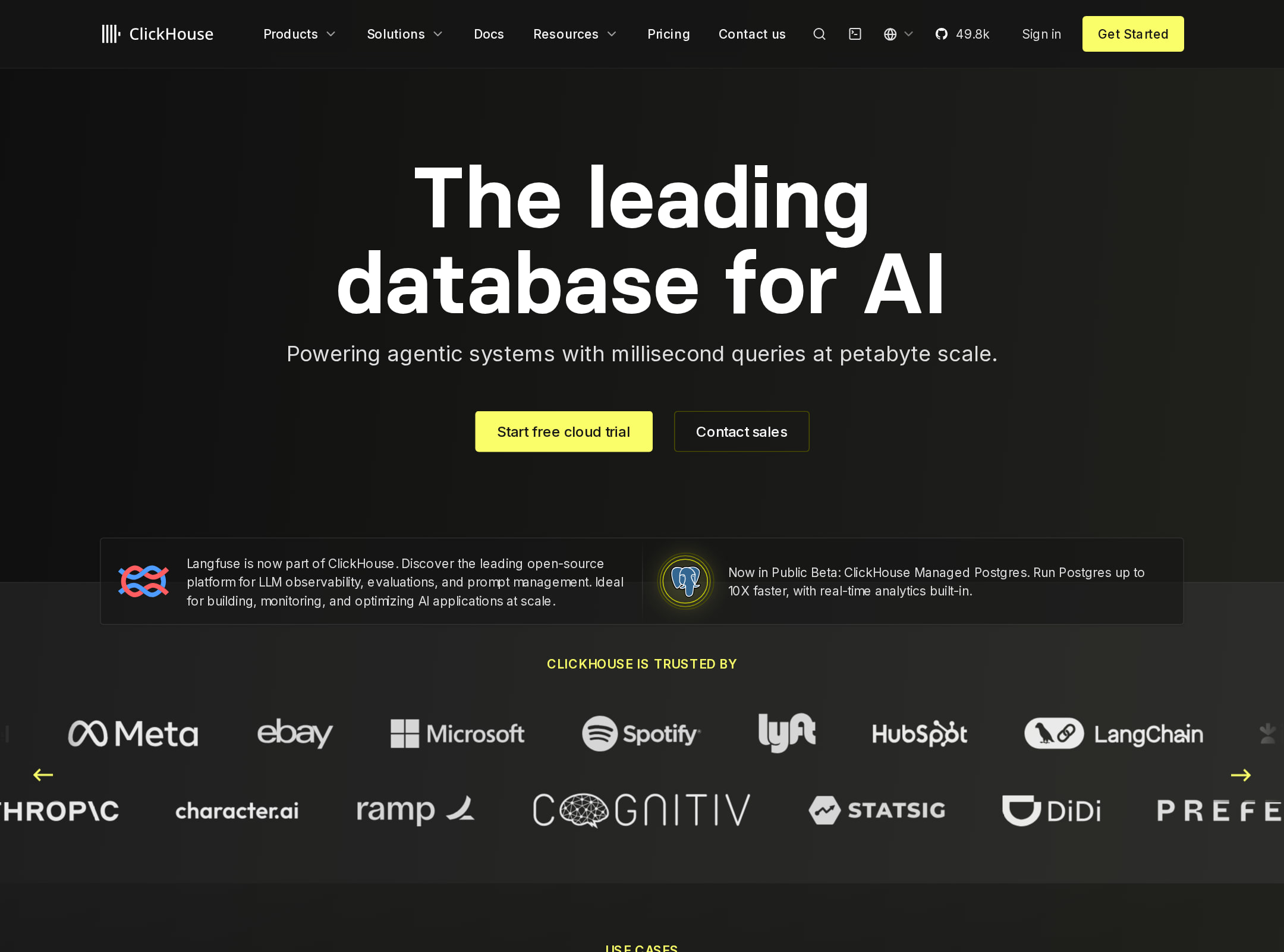


ClickHouse website analysis
A detailed critique of the homepage's craft, originality, usability, and ability to move visitors toward its intended goal.
Our observations
Visually strong and commercially credible, but accessibility defects and content density keep it below exceptional gallery quality. Recommend review before publication.
Best practices
The page demonstrates strong semantic foundations and a complete marketing information architecture, but automated accessibility findings are material.
What works
- One H1 and one main landmark were detected, with no heading skips or duplicate IDs.
- The page provides a broad set of decision-support content: use cases, integrations, performance explanation, FAQs, metrics, and conversion paths.
- Navigation, footer, buttons, code content, and structured marketing sections are visibly represented.
Opportunities
- Resolve the 61 links reported without accessible names, especially carousel and logo-related links.
- Audit the eight reported contrast failures across light feature panels and dark content treatments.
- Test keyboard focus order, carousel controls, menu states, code-copy controls, and mobile navigation with assistive technology.
- Verify reduced-motion behavior rather than relying only on observed transition and animation hooks.
Design
A distinctive, disciplined dark interface with a strong yellow accent and credible technical storytelling.
What works
- The black, white, and yellow palette is immediately recognizable and consistently applied.
- Technical diagrams, code, ecosystem logos, and performance content make the product feel tangible and category-specific.
- The page balances card grids, editorial sections, proof metrics, and conversion modules without losing its overall visual identity.
Opportunities
- Reduce the number of simultaneous visual treatments competing for attention, particularly in the long middle and lower sections.
- Increase the scale or simplify selected diagrams and supporting copy for faster scanning.
- Give the hero and primary product promise slightly more breathing room before the announcement and ecosystem content.
Uniqueness
The combination of analytical database education, developer proof, open-source positioning, and a vivid yellow-on-black system gives the page a clear identity.
What works
- The product narrative is anchored in real technical concepts rather than generic enterprise imagery.
- Performance diagrams, integration maps, code, developer counts, and open-source cues create a coherent category-specific story.
- The bright yellow content surfaces are used as brand punctuation rather than as a ubiquitous background.
Opportunities
- Some familiar SaaS conventions remain, including logo bands, feature-card grids, FAQ accordions, and metric proof blocks.
- A more original opening visual or interactive explanation of the database architecture could further distinguish the first impression.
User experience
The page supports multiple buyer questions but requires sustained scrolling and careful parsing, especially for technical visitors comparing several products and offerings.
What works
- The sequence moves from positioning to use cases, product rationale, integrations, performance, proof, objections, and signup.
- The navigation exposes a broad product ecosystem, while the page itself provides paths for both technical exploration and sales-oriented evaluation.
- The narrow screenshot remains visually structured, with distinct section changes and a persistent brand accent.
Opportunities
- Make the primary audience path more explicit so visitors can choose between cloud trial, self-managed exploration, documentation, and sales earlier.
- Shorten or group repetitive supporting content and make section-level wayfinding more prominent on a very long page.
- Improve the readability and interaction model of dense diagrams, carousels, and small card copy on narrow screens.
- Confirm that all interactive media and carousel items expose meaningful names and state changes.
Conversion optimization
Conversion support is strong for a developer infrastructure product, with clear trial and sales CTAs reinforced by technical proof, metrics, and a code-oriented final prompt.
What works
- The hero presents both a free cloud trial and a sales route, serving self-serve and enterprise visitors.
- Performance rationale, integrations, customer references, developer metrics, FAQs, and signup messaging address common adoption objections.
- The bright conversion section creates a clear visual reset and makes the product action easy to locate.
Opportunities
- Clarify the relationship between cloud trial, open-source usage, managed offerings, and self-hosted adoption so visitors do not have to infer the next step.
- Add more immediate contextual reassurance near the hero CTA, such as deployment expectations, trial scope, or documentation access, if supported by the product.
- Reduce competing product announcements and secondary paths near the top so the main conversion decision is more focused.
- Validate CTA performance with analytics or testing; the supplied evidence shows placement and labeling, not measured conversion outcomes.
What we'd improve
- 01high
Repair accessible link naming
Provide meaningful accessible names for the 61 unnamed links, including carousel items, logo links, and image-led destinations; verify the accessible tree after implementation.
- 02high
Correct contrast failures
Rework the eight reported contrast failures in carousel, feature-card, and explanatory content treatments while preserving the yellow accent system.
- 03high
Reduce the page’s cognitive load
Group related product offerings and technical explanations, strengthen section wayfinding, and shorten low-priority supporting copy so visitors can reach a decision faster.
- 04medium
Make adoption paths explicit
Differentiate the cloud trial, sales contact, open-source download, documentation, and managed-product paths near the hero and in later conversion sections.
- 05medium
Audit interactive technical modules
Test carousels, diagrams, video controls, accordions, code-copy actions, and sticky navigation for keyboard access, focus visibility, announcements, and narrow-screen usability.
- 06low
Strengthen the opening signature
Consider a more product-specific first-screen visualization or concise architectural explanation to make the hero more distinctive without adding substantial visual noise.