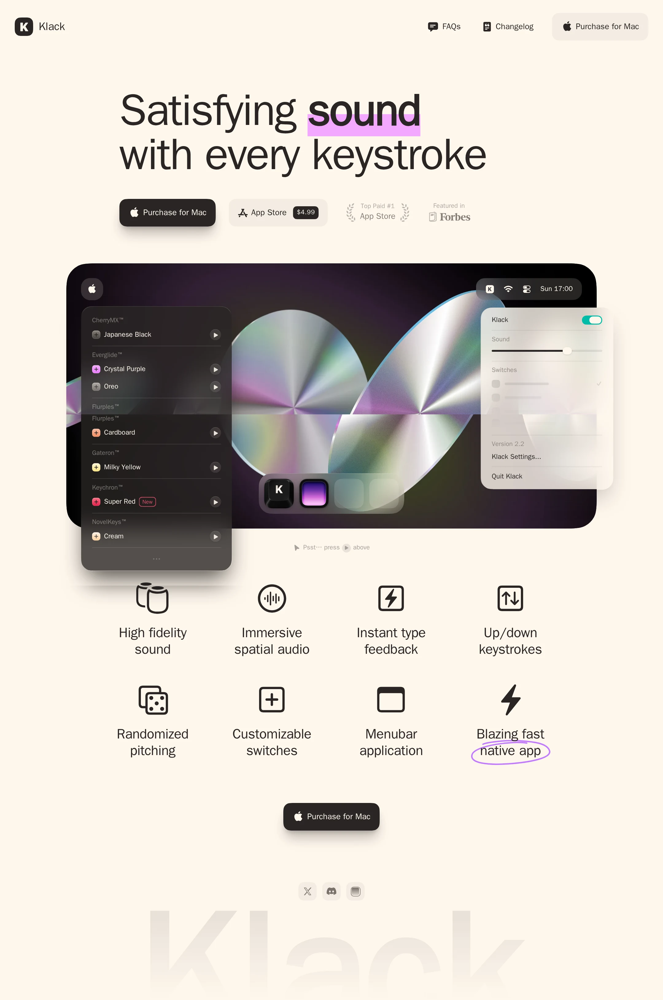
Klack website analysis
A detailed critique of the homepage's craft, originality, usability, and ability to move visitors toward its intended goal.
Our observations
An exceptional, highly cohesive product landing page with strong visual authorship and a clear purchase path. Its main weakness is accessibility and explanatory clarity in low-contrast supporting content.
Best practices
The page has a clear heading structure, one primary H1, a semantic main region, repeated calls to action, and a focused single-product narrative. Automated evidence reports a 96 accessibility score with one contrast failure, but motion and responsive behavior require further verification.
What works
- Clear single-purpose landing page with a prominent product benefit.
- One H1 and consistent H2 feature structure in the supplied DOM evidence.
- Primary and secondary purchase paths are visible without competing navigation.
- Strong semantic separation between hero, content, and footer regions.
Opportunities
- Resolve the detected serious text-contrast failure in the pale supporting content.
- Verify keyboard focus states, accessible names, image alternatives, and reduced-motion behavior.
- Test the fixed header and large hero typography at narrow viewport widths.
Design
A highly polished visual system balances editorial restraint with a vivid, technically credible product presentation. The large mockup, cream background, and disciplined feature grid create a memorable and coherent composition.
What works
- Excellent contrast between quiet page framing and energetic product artwork.
- Oversized typography gives the page an immediate point of view.
- Product interface panels and feature icons communicate the category quickly.
- Spacing, corner treatment, shadows, and CTA styling feel consistently art-directed.
Opportunities
- Add a concise explanatory subhead so the product value is not dependent on interpreting the mockup.
- Ensure pale press and store-supporting labels remain legible in every state.
- Consider a slightly stronger visual distinction between decorative annotations and functional content.
Uniqueness
The page feels more authored than a conventional SaaS template, especially through its audio-focused product imagery, editorial headline treatment, and playful drawn emphasis. Some conventions, including the feature grid and app-store CTA pattern, remain familiar.
What works
- Distinctive iridescent product visualization gives the page a recognizable focal point.
- Hand-drawn highlight and underline-like annotation add personality to an otherwise restrained system.
- The combination of editorial typography and desktop utility UI is well differentiated.
Opportunities
- Develop a more ownable visual or verbal device for explaining the sound experience beyond the product render.
- Use supporting proof or a brief product ritual to deepen the brand story beyond feature enumeration.
User experience
The page appears easy to scan from headline to product demonstration to capabilities and purchase. The main limitation is that several supporting details are visually subtle, and the supplied evidence cannot confirm interaction, mobile, or keyboard behavior.
What works
- Logical progression from promise to demonstration to feature summary.
- Feature labels are short, consistent, and arranged in a highly scannable grid.
- The product mockup provides useful context for a utility that is otherwise difficult to explain visually.
- Repeated purchase access reduces the need to return to the top of the page.
Opportunities
- Add a short plain-language explanation of how keyboard sounds work and who benefits from them.
- Make secondary credibility content more readable and more clearly distinguishable from decoration.
- Validate touch targets, focus visibility, and responsive stacking on mobile devices.
Conversion optimization
For a paid Mac utility, the page establishes a clear commercial path with a prominent purchase CTA, App Store access, price visibility, credibility badges, and a repeated bottom action. Conversion messaging could be stronger for visitors who need reassurance before buying.
What works
- The primary purchase action is prominent, repeated, and visually differentiated.
- App Store access and visible pricing reduce uncertainty about the acquisition path.
- Press and ranking badges provide useful social proof near the primary action.
- The hero communicates an experiential benefit rather than only listing technical features.
Opportunities
- State compatibility, pricing context, and any trial or refund information near the first CTA if applicable.
- Add a brief reason to choose Klack over ordinary system sounds or competing utilities.
- Use a short product demonstration or sound preview with an explicit accessible label and clear play state.
What we'd improve
- 01high
Fix the detected contrast failure
Identify the pale supporting label flagged by the automated audit and increase its foreground/background contrast while preserving the cream editorial palette. Recheck all press, ranking, annotation, and disabled-looking states.
- 02high
Add concise product context beneath the hero
Introduce one short sentence explaining that Klack is a Mac utility for customizable keyboard sounds, including the core benefit and intended audience. Keep it secondary to the headline so the current visual hierarchy remains intact.
- 03high
Verify accessible interaction and motion states
Test keyboard focus visibility, accessible names for icon-only controls, sound-preview controls, image alternatives, and reduced-motion behavior. The supplied evidence reports extensive transitions but no confirmed reduced-motion path.
- 04medium
Strengthen purchase reassurance
Place compatibility, current price, and any trial or refund information close to the first purchase action. This can reduce uncertainty without adding a new section or disrupting the minimalist composition.
- 05medium
Validate narrow-screen composition
Check headline wrapping, product mockup cropping, feature-grid stacking, fixed-header clearance, and CTA spacing at mobile widths. Preserve the reading order and ensure controls remain comfortably tappable.
- 06low
Make the sound experience more tangible
Consider an accessible, optional preview or a short visual explanation of sound customization. Provide a clear play/pause state and a non-audio alternative so the feature is not communicated only through decorative imagery.