Momentus website analysis
A detailed critique of the homepage's craft, originality, usability, and ability to move visitors toward its intended goal.
Our observations
Visually distinctive and well aligned with an aerospace brand, but not yet ready for publication without accessibility and conversion-focused review.
Best practices
The page has one main heading and one main landmark, but automated evidence identifies serious accessibility defects and a heading hierarchy problem.
What works
- A single primary heading is present.
- The page includes a main landmark and a recognizable navigation structure.
- The hero message is prominent and likely understandable in visual context.
Opportunities
- Add accessible names to the three flagged links, including logo links.
- Provide alternative text for the flagged footer image.
- Resolve the six reported text-contrast failures, particularly in footer and legal content.
- Repair the heading-level skip in the footer link groups.
Design
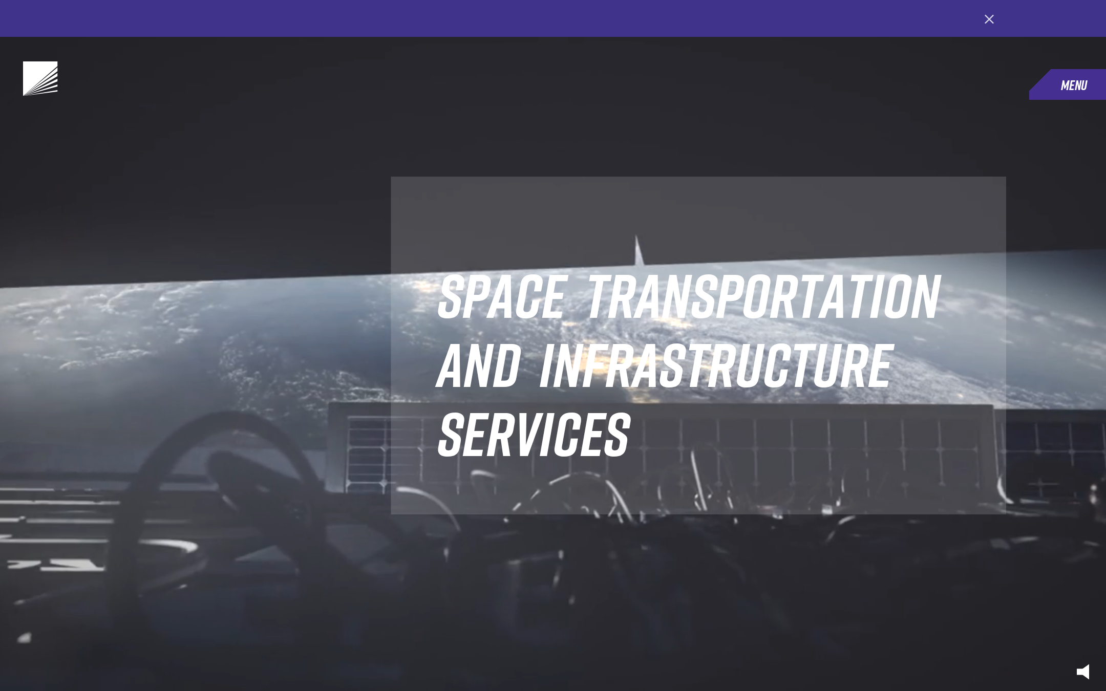
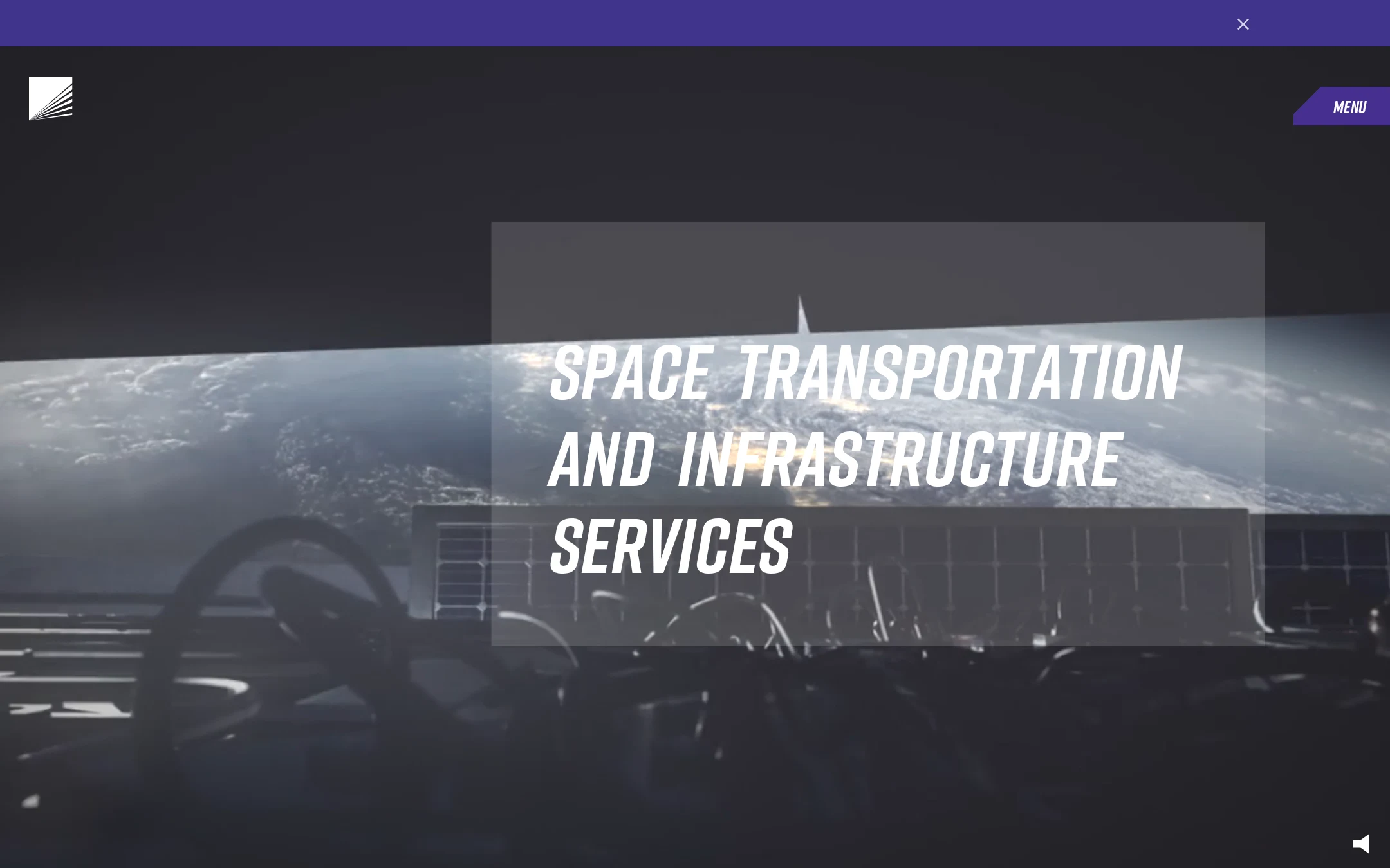
The visual direction is cohesive, cinematic, and appropriate for a space-technology company, with strong contrast between the dark environment, orbital imagery, and bright display type.
What works
- The hero communicates the aerospace category immediately through imagery and typography.
- The condensed display type creates a confident technical tone.
- The purple navigation treatment and angular menu control create a recognizable visual signature.
- The large-scale composition gives the homepage a premium, campaign-like presence.
Opportunities
- Reduce the hero text's dependence on the changing photographic background and translucent overlay.
- Verify that the large display treatment remains legible at smaller widths.
- Introduce a clearer visible action or supporting context near the hero message.
Uniqueness
The combination of orbital photography, oversized condensed typography, and an angular purple navigation treatment is more distinctive than a conventional corporate aerospace homepage.
What works
- The visual language has a clear point of view rather than defaulting to a generic enterprise layout.
- The menu shape and saturated purple accent give the interface a memorable brand cue.
- The hero composition uses atmosphere and scale effectively.
Opportunities
- Extend the distinctive visual language into supporting sections so the experience does not depend almost entirely on the hero.
- Use more explicit service, mission, or proof-point framing to distinguish the brand proposition beyond mood and category.
User experience
The primary message is easy to locate, but the evidence does not establish how users move from the cinematic introduction into services, missions, or contact pathways.
What works
- Navigation labels cover core destinations such as services, updates, missions, careers, investors, and contact.
- The menu trigger is visually prominent in the supplied viewport.
- The hero has a clear focal point and a concise positioning message.
Opportunities
- Make the next action after the hero more explicit.
- Ensure the menu, logo links, close control, and motion controls have accessible names and keyboard-visible states.
- Provide a reduced-motion experience and verify that animated or changing imagery does not obscure the message.
- Test fixed layers and the right-offset hero at tablet and mobile widths.
Conversion optimization
For a B2B aerospace marketing homepage, the design establishes credibility and category quickly, but the visible viewport offers limited evidence of a direct path to inquiry or product understanding.
What works
- The presentation feels high-value and industry-specific, which can support initial trust.
- Contact is represented in the information architecture and a contact form is present elsewhere in the page structure.
- The headline communicates a broad business position rather than an ambiguous brand-only statement.
Opportunities
- Add a clear primary pathway for prospective partners, customers, or investors near the hero.
- Pair the positioning statement with a concise proof point, service summary, or mission outcome.
- Reduce friction in the contact experience with clearly labeled fields and a more descriptive submit action.
- Connect hero messaging to measurable evidence such as missions, capabilities, or customer outcomes where appropriate.
What we'd improve
- 01high
Fix the reported accessibility blockers
Add accessible names to all flagged logo and navigation links, provide alternative text for the footer image, correct the heading hierarchy, and remediate the six reported contrast failures.
- 02high
Define a clear hero next step
Add a prominent, descriptive action for the page's main audience, such as exploring capabilities, reviewing missions, or contacting the team, without competing with the headline.
- 03high
Audit motion and reduced-motion behavior
Verify the ripple, media, transition, and fixed-layer effects with prefers-reduced-motion enabled, and ensure the hero message remains stable and readable when motion is disabled.
- 04medium
Test the hero responsively
Validate the large right-offset content block, display type, overlay, fixed navigation, and menu trigger across tablet and mobile widths, including landscape orientation.
- 05medium
Strengthen above-fold proof
Add a compact supporting proof point or capability cue so visitors can understand why the company is credible before navigating deeper into the site.
- 06low
Unify footer hierarchy and contrast
Refine footer headings, link grouping, legal text, and muted states so the lower page remains legible and semantically coherent without losing the dark visual character.