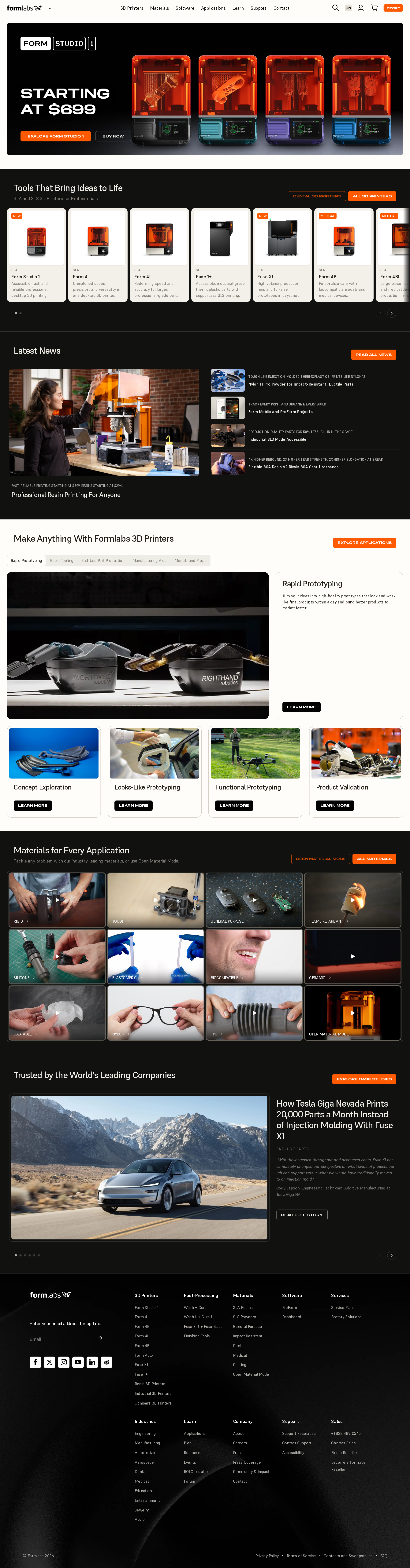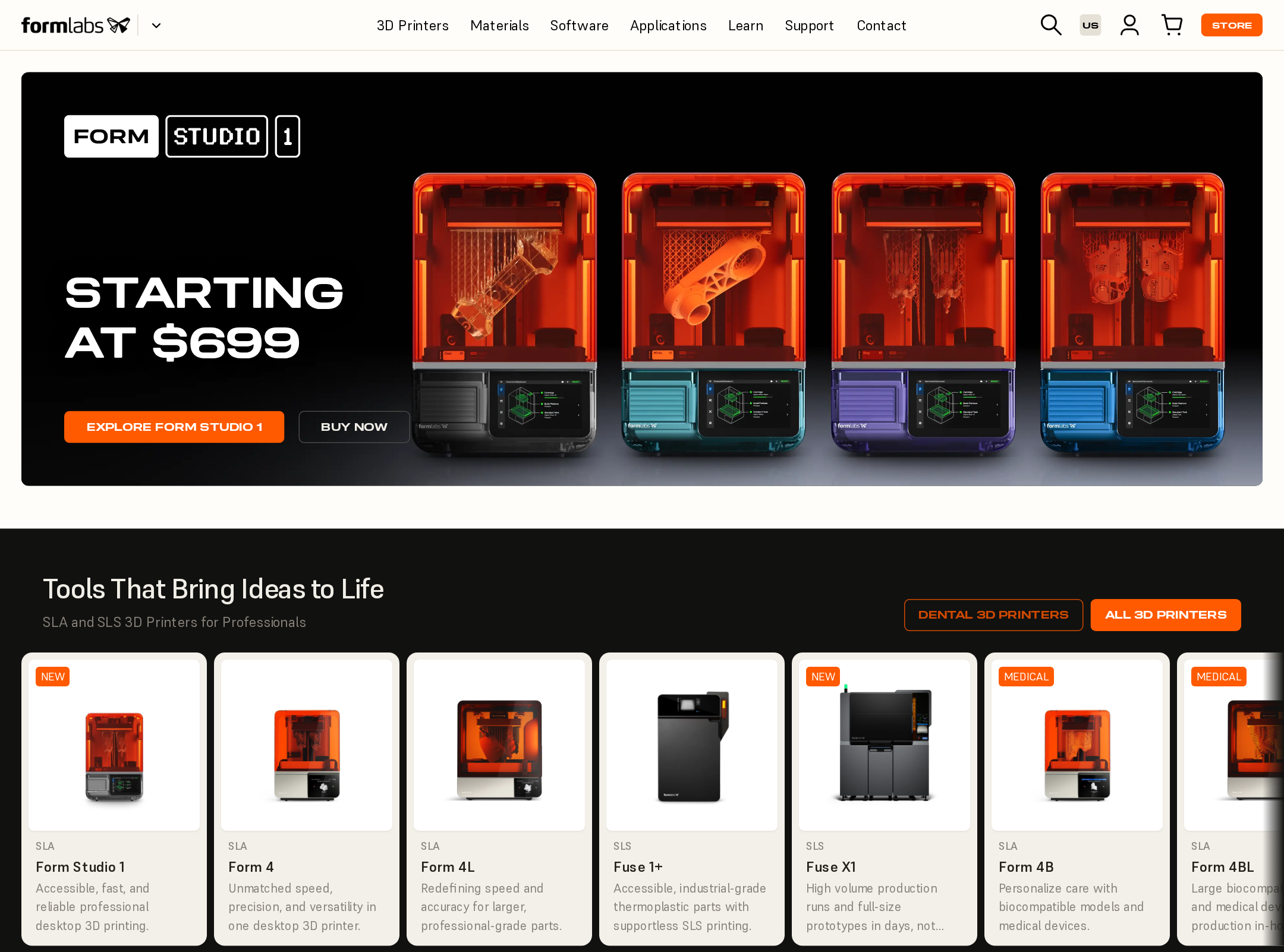


Formlabs website analysis
A detailed critique of the homepage's craft, originality, usability, and ability to move visitors toward its intended goal.
Our observations
A visually strong and commercially credible manufacturing homepage that merits gallery consideration after accessibility and content-density improvements.
Best practices
The page has clear semantic regions, a single main landmark, recognizable navigation, and a substantial content hierarchy, but the audit identifies major accessibility defects.
What works
- A clear global navigation exposes core product, software, application, support, and commerce paths.
- The page has one main landmark and a recognizable footer structure.
- Product, news, application, and customer-story content is organized into visually distinct sections.
Opportunities
- Resolve all 51 reported contrast failures, prioritizing small metadata, navigation controls, and orange-on-light combinations.
- Provide accessible names for the six icon or image-only links and labels for the two unlabeled controls.
- Reduce the reported heading-level skips and replace the ten h1 elements with one page title plus appropriately nested section headings.
Design
The visual system is cohesive, premium, and well matched to technical manufacturing, with particularly effective use of photography and dark/light section rhythm.
What works
- The black, warm-white, and orange palette creates a distinctive industrial atmosphere.
- Product photography and application imagery make abstract 3D-printing capabilities tangible.
- The hero, product carousel, application modules, and customer story form a strong visual narrative.
Opportunities
- Reduce the number of simultaneous cards and calls to action in dense sections to improve visual prioritization.
- Increase the legibility and scale of small labels over imagery and in product metadata.
- Use more consistent heading treatment across sections so the information hierarchy is easier to scan.
Uniqueness
The combination of near-black editorial surfaces, warm technical neutrals, orange commerce cues, and high-quality manufacturing imagery gives the page a recognizable identity.
What works
- The visual language feels purpose-built for professional fabrication rather than generic technology marketing.
- Application-led merchandising connects printer products to concrete industrial outcomes.
- The editorial customer-story module adds credibility beyond a conventional product catalog.
Opportunities
- Develop a more ownable visual motif for process, material, or layer technology instead of relying primarily on product photography and standard card grids.
- Differentiate the repeated gallery and carousel patterns with clearer storytelling devices or data visualization.
User experience
The page supports several plausible visitor goals, but dense navigation, horizontal content areas, small text, and reported accessibility defects create avoidable friction.
What works
- Visitors can enter through products, applications, materials, news, support, or customer proof.
- The hero provides an immediate commercial entry point, while lower sections support research and validation.
- Alternating dark and light backgrounds help users distinguish major content groups.
Opportunities
- Add stronger visual grouping and progressive disclosure to reduce the cognitive load of the long homepage.
- Make carousel controls, overflow regions, and card destinations explicit and accessible.
- Audit focus order, keyboard access, touch targets, and screen-reader announcements; these behaviors are not established by the supplied screenshot.
Conversion optimization
For a product-led manufacturing site, the homepage provides strong commercial and credibility signals, although the number of competing actions may dilute the primary path.
What works
- The promotional hero leads with a concrete offer and direct product actions.
- Product cards expose the catalog early, supporting comparison-oriented visitors.
- Application categories, materials content, and customer proof address different stages of a technical buying journey.
Opportunities
- Define a more explicit primary conversion path, such as product comparison, consultation, or quote request, and subordinate secondary actions.
- Add concise qualification cues near product cards, such as intended user, process, or decision criteria.
- Repeat a high-intent action after the proof section so users do not need to return to the header or hero.
What we'd improve
- 01high
Repair the accessibility foundation
Fix the reported contrast failures, add accessible names to icon-only links, label the site-switcher and other unlabeled controls, and correct heading structure before further visual refinement.
- 02high
Simplify the homepage hierarchy
Choose one dominant journey for the hero and reduce competing buttons, card groups, and repeated gallery patterns so product discovery has a clearer sequence.
- 03medium
Improve small-text legibility
Increase the size, weight, and contrast of card metadata, image overlays, and utility navigation, especially on dark imagery and orange-accented controls.
- 04medium
Clarify interactive content regions
Give horizontal product and media areas visible labels, meaningful carousel controls, and clear indication of additional content for keyboard and touch users.
- 05low
Strengthen proprietary storytelling
Introduce a distinctive visual explanation of printing processes, materials, or production outcomes to make the brand experience more memorable than a polished catalog alone.