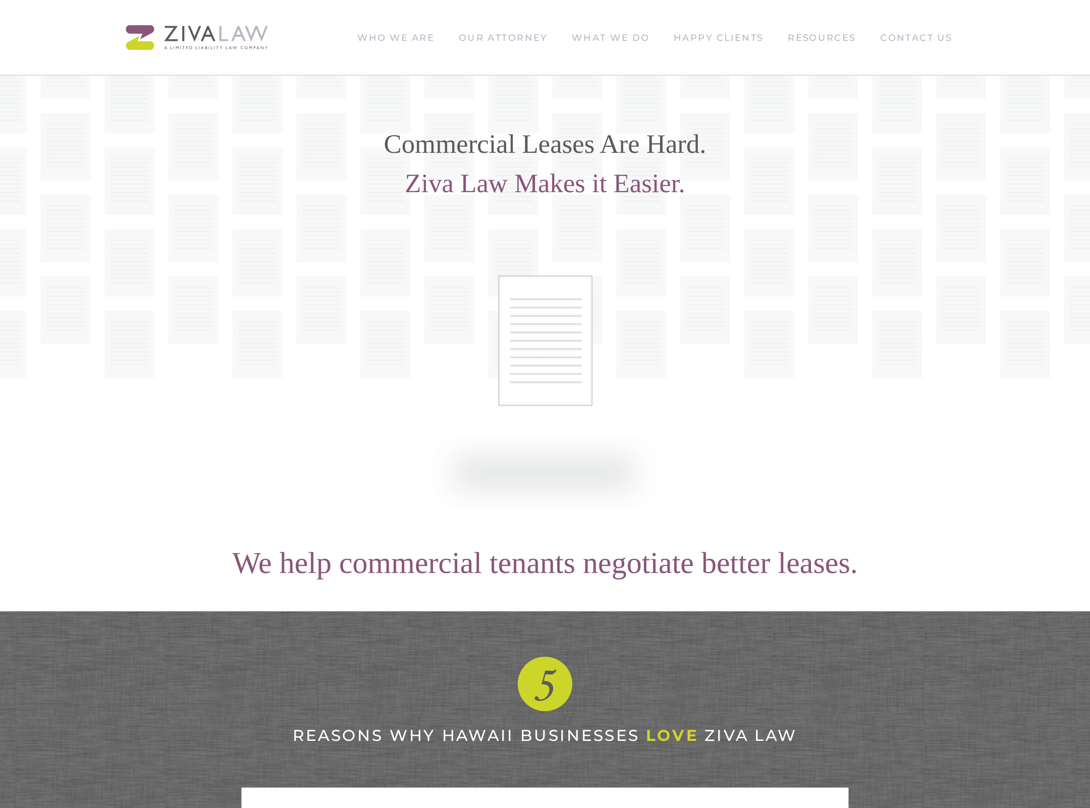


Ziva Law website analysis
A detailed critique of the homepage's craft, originality, usability, and ability to move visitors toward its intended goal.
Our observations
A distinctive and coherent legal-services homepage with strong editorial styling, but material accessibility and conversion-hierarchy weaknesses keep it below gallery-ready quality without review.
Best practices
The page has one detected h1, a semantic main region, semantic navigation and footer, and a recognizable content hierarchy. However, the accessibility evidence is concerning and includes multiple issues with serious impact.
What works
- Clear primary subject matter focused on commercial tenant lease negotiation.
- Detected main landmark, navigation, footer, and a single h1.
- Consistent repeated patterns make the long benefits section easy to scan visually.
Opportunities
- Resolve 18 detected text-contrast failures, particularly navigation and muted link treatments.
- Add meaningful alternative text to the nine reported images and accessible names to the three unnamed social links.
- Correct the two heading-level skips and ensure visual styling is not achieved through semantically misleading heading nesting.
- Verify keyboard focus states, touch target sizing, zoom behavior, and mobile navigation manually.
Design
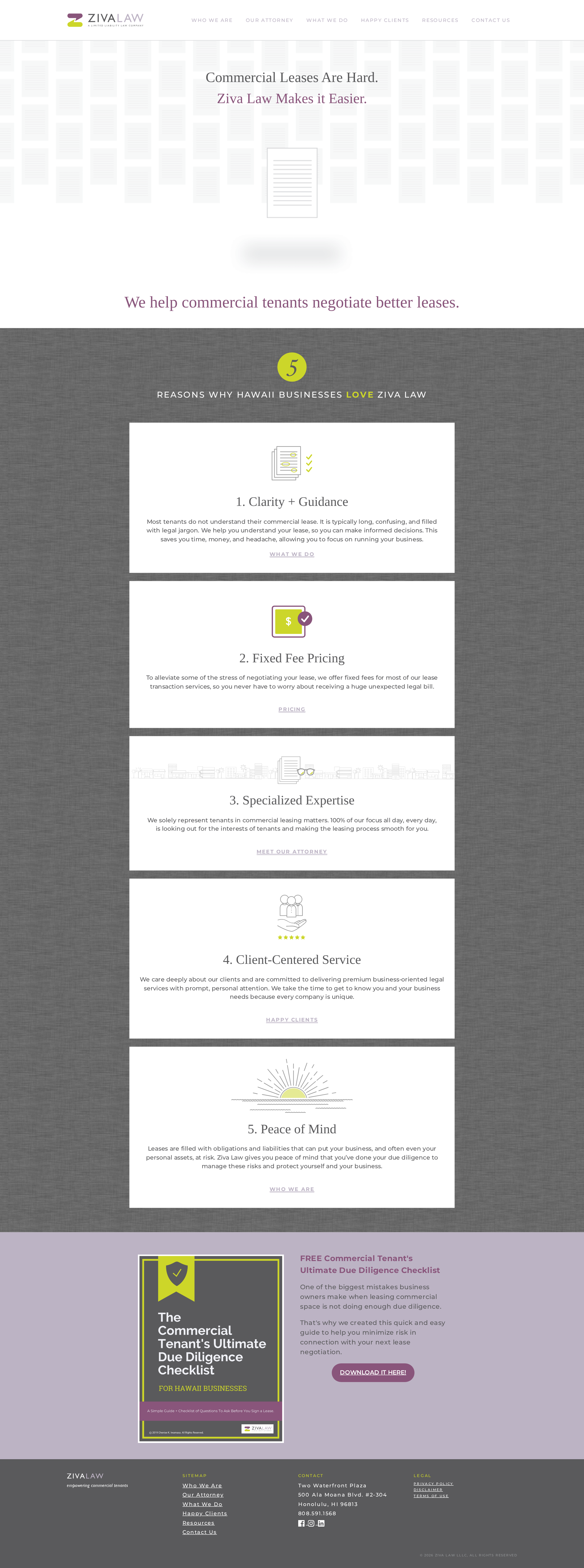
The visual direction is cohesive and more characterful than a generic law-firm template. Its strongest qualities are the editorial serif/sans pairing, restrained palette, document imagery, and contrast between the airy hero and textured benefits section.
What works
- Distinctive paper-and-document visual language supports the service proposition.
- Plum and lime accents create a memorable identity without overwhelming the content.
- Repeated benefit cards establish a clear visual rhythm and consistent alignment.
- The resource section provides a visually strong endpoint to the main content.
Opportunities
- Increase the visual and informational weight of the hero's primary action.
- Reduce the sense of vertical repetition in the five-card benefits sequence through stronger grouping or progressive emphasis.
- Improve the legibility of very small footer, navigation, and utility text.
- Refine the faint hero artwork so it contributes more clearly to the first-screen message.
Uniqueness
The page has a recognizable point of view, particularly through its paper textures, legal-document illustrations, and lime/plum palette. It feels more bespoke than a standard professional-services landing page, though the card-based structure remains familiar.
What works
- The combination of editorial typography and document illustration is well matched to commercial leasing.
- The textured charcoal benefits section gives the page a memorable visual anchor.
- The visual system carries consistently from hero imagery through the downloadable checklist.
Opportunities
- Develop a more ownable hero composition rather than relying mainly on centered headline treatment.
- Use the firm’s regional and tenant-specialist positioning more visibly in the visual storytelling.
- Introduce a stronger signature graphic or diagram that explains the lease-review process without adding clutter.
User experience
The information path is understandable from the hero to the benefits and resource offer, but the small type, subdued links, lengthy card stack, and reported accessibility defects create friction. The supplied evidence does not establish mobile or keyboard usability.
What works
- The page communicates its audience and service focus quickly.
- The five benefits provide a logical explanation of the firm’s value proposition.
- Navigation labels cover core informational areas including services, attorney information, clients, resources, and contact.
Opportunities
- Make the first actionable path explicit with a visible consultation, pricing, or contact action near the hero.
- Increase body and utility text legibility and distinguish links from surrounding text more clearly.
- Add stronger section landmarks or summaries so users can navigate the long benefits region efficiently.
- Test the full page at mobile widths and with keyboard navigation before publication.
Conversion optimization
The page supports consideration well through benefits, fixed-fee positioning, and a downloadable checklist, but the dominant conversion action appears late and the hero does not provide a strong immediate next step. For a legal-services homepage, the path to contacting the firm should be more prominent.
What works
- Fixed-fee pricing is surfaced as a concrete differentiator.
- The downloadable checklist is a relevant lead-generation offer for the intended audience.
- Links beneath the benefit cards provide contextual routes to services, pricing, attorney information, clients, and firm information.
Opportunities
- Add a prominent above-the-fold action such as booking a lease review or speaking with the firm.
- Repeat a contact or consultation CTA after the benefits section and near the resource offer.
- Clarify the checklist CTA with a short expectation-setting label describing the download or follow-up.
- Add trust signals such as attorney credentials, client proof, service area, or a concise process explanation near the primary CTA.
What we'd improve
- 01high
Repair accessibility fundamentals
Address the reported contrast failures, missing image alternative text, unnamed social links, and heading-level skips. Recheck the page with keyboard navigation, zoom, focus visibility, and screen-reader landmarks rather than relying only on the automated scan.
- 02high
Strengthen the hero conversion path
Place a clearly prioritized consultation, lease-review, or contact action in the first screen and pair it with a concise explanation of what happens next.
- 03high
Improve small-text legibility
Increase the size and contrast of navigation, footer, link, and supporting copy, especially where muted lavender text is used on light backgrounds.
- 04medium
Reduce benefits-section fatigue
Group the five benefits into a more scannable structure, vary emphasis between primary and secondary points, or add a compact summary before the repeated cards.
- 05medium
Validate responsive behavior
Review narrow viewport layouts for navigation wrapping, card heights, illustration scaling, checklist layout, and tap target spacing; verify that no critical content depends on desktop width.
- 06low
Add stronger trust evidence
Use concise, verifiable attorney credentials, client outcomes, testimonials, or a visible service process to support the decision to contact the firm without making unsupported claims.