

VELUX UK website analysis
A detailed critique of the homepage's craft, originality, usability, and ability to move visitors toward its intended goal.
Our observations
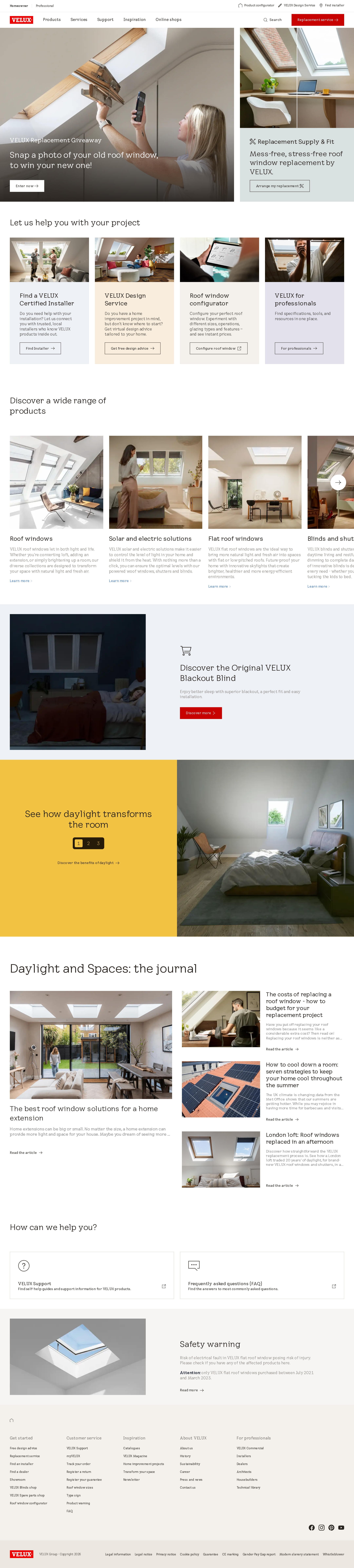
A polished and commercially credible product-marketing homepage with strong photography and clear service pathways, but serious accessibility findings and a crowded content journey warrant review before publication.
Best practices
The page has a clear semantic main region, one detected h1, a semantic footer, descriptive image alternatives in the supplied evidence, and several recognizable conversion paths. Accessibility issues prevent a stronger result.
What works
- A single h1 and a clearly identifiable main content area are present.
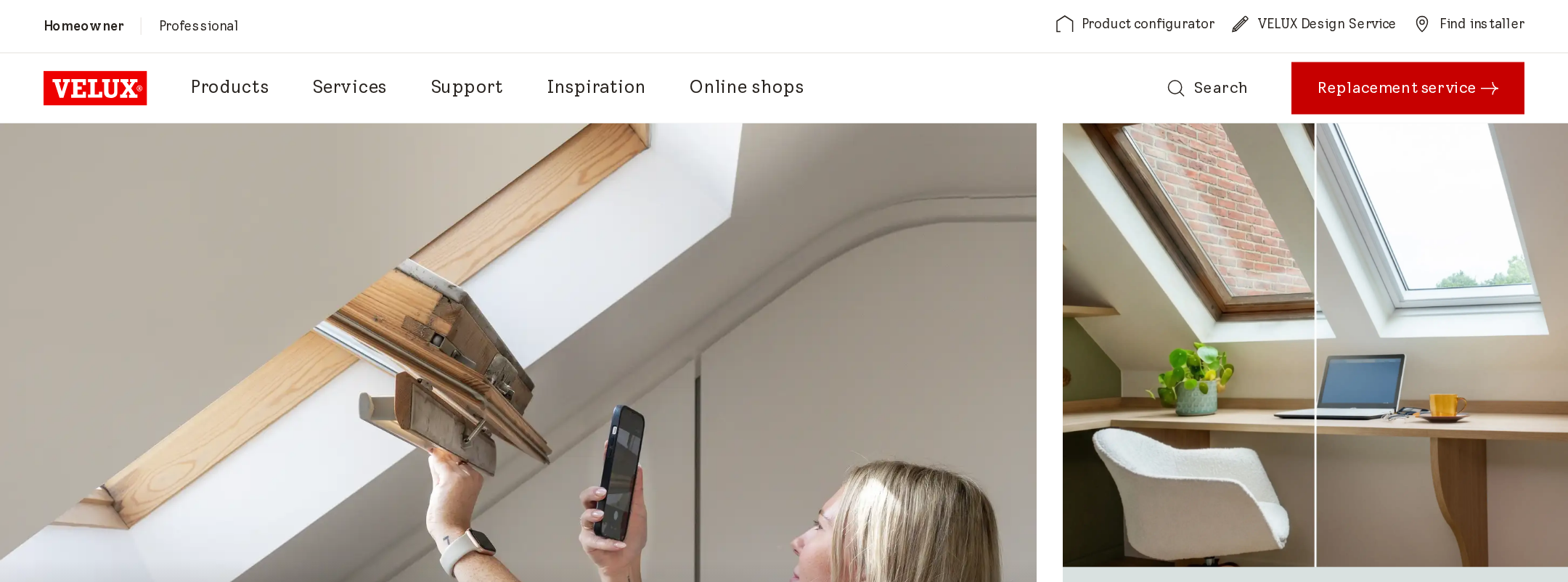
- The homepage exposes practical journeys such as installer search, design advice, configuration, replacement, and professional support.
- The footer is organized as semantic navigation rather than an undifferentiated link block.
Opportunities
- Nine links are reported without accessible names, including links within card and utility areas.
- Nine contrast failures are reported across headings, body copy, and card text.
- One heading-level skip from h1 to h3 is detected; heading structure should be reviewed for logical nesting.
- Focus, keyboard, carousel semantics, and reduced-motion behavior are not established by the supplied evidence and require manual testing.
Design
A coherent, premium-feeling visual system uses real-world photography, generous whitespace, modular panels, and a restrained brand palette. The page is visually confident without excessive decoration.
What works
- Product and lifestyle photography directly supports the home-improvement proposition.
- Pale blue, yellow, grey, green, and purple panels provide useful sectional differentiation.
- Flat cards, light typography, and selective red actions create a consistent brand-led presentation.
- The editorial journal and daylight promotion broaden the page beyond a simple catalogue.
Opportunities
- The number of promotional and content modules creates a long, information-heavy scroll.
- The campaign-led hero does not communicate the broader VELUX proposition as directly as it could.
- Some small text and low-contrast treatments reduce visual clarity, particularly in dense cards and supporting copy.
Uniqueness
The experience has a recognizable brand character through its daylight-focused imagery, warm neutral palette, and practical project pathways, although its underlying marketing patterns remain familiar.
What works
- The visual emphasis on lived-in attic spaces and changing daylight gives the product category an identifiable emotional angle.
- The combination of configurator, installer, design service, and professional tools reflects a broad end-to-end customer journey.
- The restrained palette and flat panel treatment feel specific to the brand rather than generic SaaS or ecommerce styling.
Opportunities
- The card-and-carousel structure is common among large manufacturing and home-improvement sites.
- A more distinctive storytelling device could connect daylight, room transformation, and product selection across the entire page.
User experience
The visible information architecture supports several likely audiences, but the large number of pathways and detected accessibility defects may increase friction for users who rely on assistive technology or need stronger content prioritization.
What works
- Homeowners can reach product discovery, installation support, design advice, replacement services, and inspiration from the homepage.
- The page separates homeowner-oriented help from professional resources.
- Image-led cards make many destinations recognizable before reading every description.
Opportunities
- Provide meaningful accessible names for all card imagery and utility links.
- Improve contrast for the reported failing text samples and validate states across overlays and panels.
- Reduce or better prioritize competing calls to action in the first major viewport.
- Confirm that carousel controls, slide announcements, and touch/keyboard interaction are understandable and operable.
Conversion optimization
For a product-led home-improvement homepage, the page offers a strong spread of next steps rather than relying on a single sales CTA. Conversion clarity is weakened by the campaign-specific opening and the number of equally weighted routes.
What works
- Installer search, replacement, design advice, configuration, and professional resources map well to distinct user intents.
- Several cards pair concise explanations with explicit action links.
- The hero campaign has a clear promotional action and visually demonstrates the replacement use case.
Opportunities
- Add a more durable primary proposition near the top that explains what VELUX helps visitors achieve before introducing the campaign.
- Establish a clearer primary action hierarchy between replacement, product discovery, installer search, and design advice.
- Use stronger, more descriptive labels for image-linked cards so the action remains clear without relying on surrounding context.
- Test whether the long sequence of modules delays high-intent users from reaching product or installer pathways.
What we'd improve
- 01high
Repair accessible names and contrast failures
Give every image-linked card and utility link a meaningful accessible name, then correct the nine reported contrast failures across headings, body copy, and card text. Recheck hover, focus, overlay, and responsive states manually.
- 02high
Restore a logical heading hierarchy
Review the detected h1-to-h3 transition and introduce or reassign intermediate headings where needed so assistive-technology users can navigate the page structure predictably.
- 03medium
Clarify the top-level proposition and CTA hierarchy
Pair the campaign promotion with a concise evergreen explanation of VELUX’s core offer, then visually prioritize the most common homeowner actions such as product discovery, replacement, and finding an installer.
- 04medium
Audit carousel interaction and motion
Test swiper controls with keyboard and touch input, expose slide position and labels, prevent hidden slides from creating navigation noise, and verify an appropriate reduced-motion experience.
- 05low
Tighten the lower-page content sequence
Consider grouping journal, help, and safety content around explicit user needs or collapsing lower-priority material so the long homepage feels easier to scan without losing useful resources.