

C.H.I Overhead Doors website analysis
A detailed critique of the homepage's craft, originality, usability, and ability to move visitors toward its intended goal.
Our observations
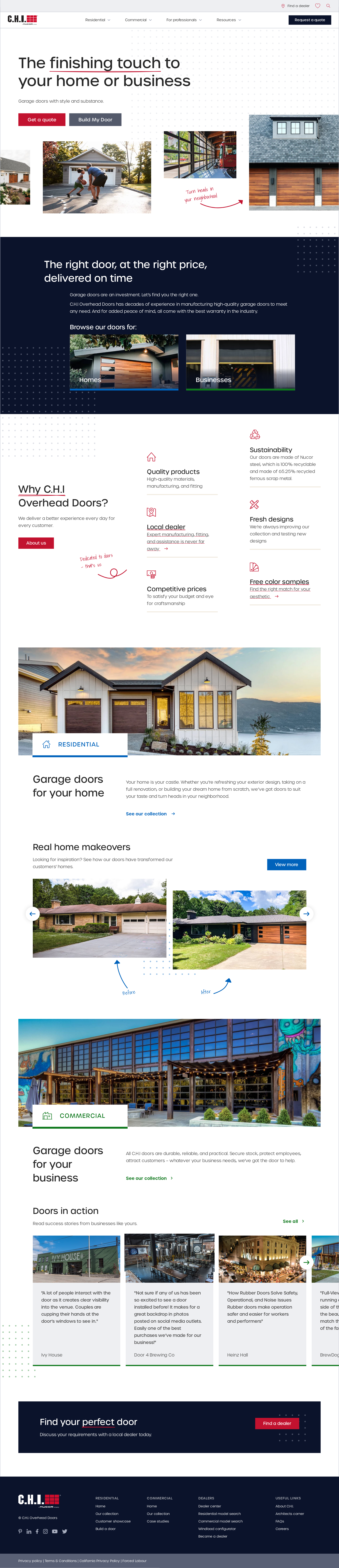
Strong visual foundation and clear audience segmentation, held back from top-tier gallery status by serious accessibility defects and unverified interaction behavior.
Best practices
The page has a clear heading hierarchy, one detected H1, recognizable content regions, and a logical progression from discovery to conversion. The automated accessibility result of 44 is a material concern, particularly for missing alternative text, unnamed links, unlabeled controls, and contrast failures.
What works
- The homepage has one detected H1 and no reported heading skips.
- Residential, commercial, benefit, project, and CTA content are separated into understandable sections.
- The footer is detected semantically and the page provides multiple routes for different audiences.
Opportunities
- Add meaningful alternative text to the five reported image elements, especially project and comparison imagery.
- Provide accessible names for the reported logo, social, favorite, and utility links.
- Label search controls and close/search buttons programmatically and verify their focus states.
- Resolve the two reported contrast failures, including text over image cards, and retest at multiple viewport sizes.
Design
A confident and cohesive visual system makes a utilitarian product category feel aspirational without losing practical clarity. The strongest moments combine large architectural images, restrained typography, navy contrast sections, and colored audience markers.
What works
- The hero establishes the category and audience immediately.
- Residential and commercial sections use strong imagery and clear labels to support recognition.
- Hand-drawn accent details add personality to an otherwise disciplined manufacturer layout.
- The navy band and alternating light sections create useful rhythm across a long page.
Opportunities
- Reduce the amount of small supporting copy in project and benefit cards to improve scanning.
- Strengthen the visual distinction between primary quote/dealer actions and lower-priority browsing links.
- Review image-overlay text treatments so labels remain legible across varied photography.
Uniqueness
The combination of architectural photography, industrial subject matter, color-coded audience pathways, and informal annotation marks gives the page more character than a typical manufacturer template. Its overall structure still follows familiar home-improvement marketing patterns.
What works
- The annotation marks provide a recognizable editorial signature.
- Before-and-after and project examples make the product story more tangible than a feature-only layout.
- Audience-specific colors help differentiate homeowner and professional content.
Opportunities
- Develop a more distinctive product-discovery moment beyond standard sector cards and sliders.
- Use original diagrams or door-configuration visuals to explain technical differences without relying primarily on photography.
- Ensure future extensions retain the informal annotation language selectively rather than turning it into decoration on every section.
User experience
The information architecture is easy to understand at a high level, but the long page, dense navigation, sliders, and reported accessibility issues introduce avoidable friction. The screenshot supports a strong visual scan path, but it cannot establish keyboard, screen-reader, or touch usability.
What works
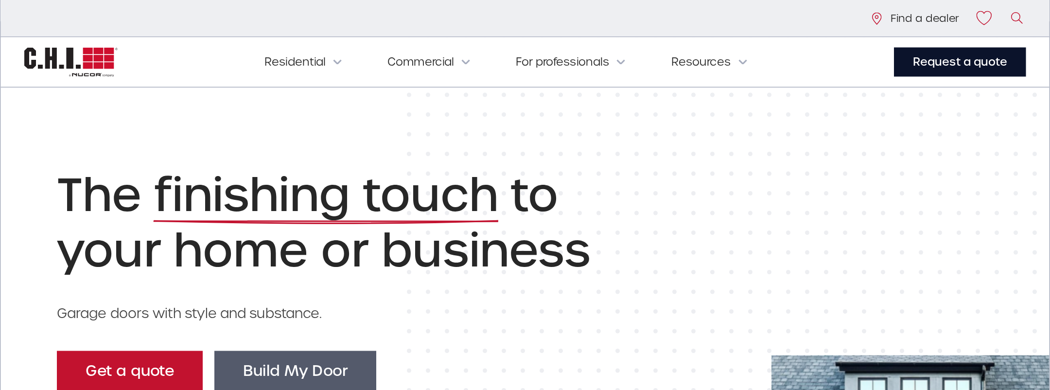
- The hero offers clear entry points for browsing or moving toward a quote.
- “Homes” and “Businesses” provide an immediate audience decision.
- Product, makeover, and case-study content supports users at different stages of consideration.
- The final “Find your perfect door” CTA gives the page a clear endpoint.
Opportunities
- Make slider position, next/previous controls, and card count understandable to non-visual users.
- Add visible and programmatic focus treatment to navigation, search, sliders, and CTA controls.
- Provide a non-carousel alternative for project content so important examples are not hidden behind horizontal interaction.
- Consider a persistent or repeated wayfinding cue on the long page, especially for users comparing residential and commercial offerings.
Conversion optimization
Conversion intent is well represented for a manufacturer: users can browse by audience, inspect real projects, and reach a dealer-oriented action. The page prioritizes trust and product context before asking for the next step, although the final action could be made more prominent and measurable.
What works
- The hero’s paired actions support both exploration and immediate purchase intent.
- Real-home makeovers and commercial installations provide useful social proof and visualization.
- The benefit section addresses quality, local dealer support, pricing, sustainability, and design choice.
- The closing CTA is visually distinct against the dark background.
Opportunities
- Clarify the difference between browsing a collection, finding a dealer, and requesting a quote at each major decision point.
- Repeat the most relevant conversion action after the residential and commercial sections rather than relying mainly on the page-end CTA.
- Add concise reassurance near the conversion action, such as what happens next, expected response timing, or dealer coverage, if supported by the business.
- Track audience-specific CTA engagement separately so homeowner and professional pathways can be evaluated independently.
What we'd improve
- 01high
Resolve the reported accessibility failures
Add accurate alternative text, accessible names, and labels to the five images, ten links, and two controls identified by the audit. Correct the two contrast failures and retest with keyboard and screen-reader checks; the automated score of 44 indicates this should precede publication.
- 02high
Make carousel content fully operable and discoverable
Expose clear previous/next labels, current-position information, keyboard operation, focus handling, and a static or expandable alternative for the comparison and project sliders. Verify behavior on touch screens and narrow viewports.
- 03medium
Strengthen the conversion hierarchy
Define one primary action for each audience—such as finding a dealer or requesting a quote—and repeat it after the relevant residential and commercial sections with consistent, descriptive labels.
- 04medium
Improve scanability of supporting content
Shorten or restructure dense card descriptions, increase the visual separation between headings and metadata, and review text placed over photography at different image crops.
- 05low
Add a more distinctive product education layer
Introduce original configuration diagrams, material comparisons, or concise selection guidance to complement the photography and make the manufacturer’s expertise more immediately useful.