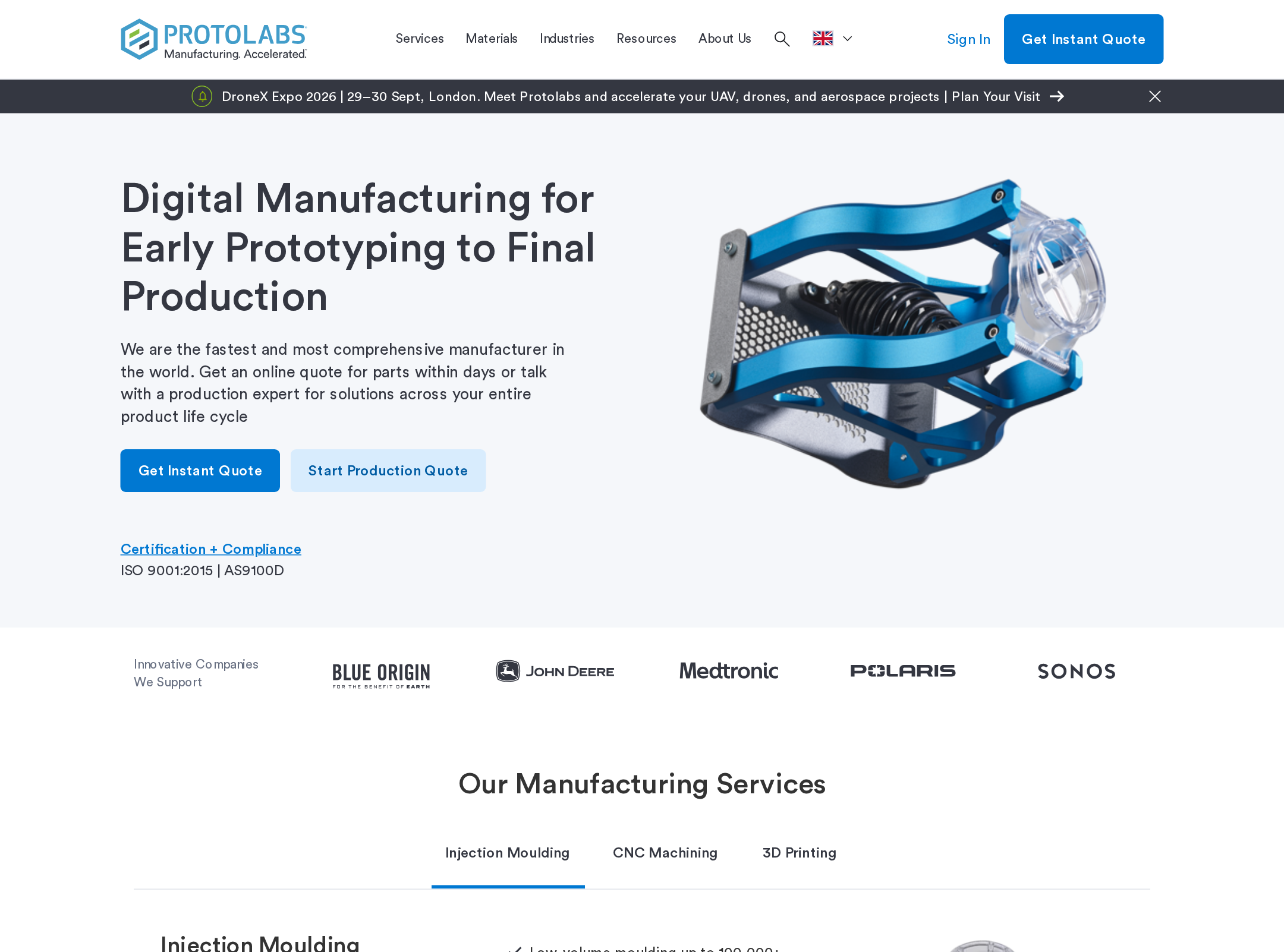


Protolabs website analysis
A detailed critique of the homepage's craft, originality, usability, and ability to move visitors toward its intended goal.
Our observations
A strong, credible B2B marketing homepage with effective information architecture and visual consistency, held back from exceptional status by content density and documented accessibility defects.
Best practices
The page follows solid marketing-site conventions, with one H1, orderly heading levels, clear sectioning, visible calls to action, and a coherent footer. Automated checks report an overall accessibility score of 80, but several serious issues remain.
What works
- A single detected H1 gives the page a clear primary proposition.
- Heading structure shows no detected skips.
- The hero presents the offering and a quote path above the fold.
- Sections address multiple visitor needs, including services, process, industries, resources, and support.
Opportunities
- Provide accessible names for the two reported unnamed links, including the header logo link.
- Add a visible or programmatically associated label to the newsletter email field.
- Resolve the two reported text-contrast failures and recheck text over gradient or colored backgrounds.
- Validate keyboard focus, carousel controls, embedded video controls, and mobile navigation manually.
Design
A cohesive, professional visual system communicates technical competence and keeps the long page recognizable through repeated spacing, card, button, and image treatments.
What works
- The blue, charcoal, white, and pale-gray palette is well aligned with an engineering and manufacturing context.
- The hero combines a clear proposition, product image, and primary quote action effectively.
- Alternating section backgrounds establish a reliable vertical rhythm.
- Photography and product imagery add credibility and break up otherwise text-heavy content.
Opportunities
- Reduce the number of equally prominent sections or create stronger visual grouping around the primary conversion journey.
- Increase the apparent scale and contrast of small card copy at typical viewing sizes.
- Differentiate resource, industry, and news modules more clearly to reduce pattern repetition.
- Review the gradient-accented heading treatment for legibility and consistency with the otherwise restrained system.
Uniqueness
The page is well executed but uses familiar enterprise manufacturing conventions rather than a highly distinctive editorial or interactive concept.
What works
- The combination of technical product imagery, manufacturing process guidance, and service-specific content feels relevant and credible.
- The page connects prototyping, production, materials, industries, and engineering support in one coherent narrative.
Opportunities
- Develop a more ownable visual device based on manufacturing data, CAD geometry, material surfaces, or production stages.
- Replace some generic card-grid presentation with a more differentiated way to explain the end-to-end manufacturing lifecycle.
- Use distinctive proof points or quantified outcomes more prominently if substantiated by the business.
User experience
The page supports broad exploration well, but its length, repeated carousels, and dense navigation create a substantial scanning burden. The screenshot supports desktop evaluation only.
What works
- Visitors can enter through a direct quote action, service categories, industries, resources, or the process explanation.
- The four-step working model gives first-time visitors a simple explanation of how engagement progresses.
- Split feature sections provide useful context without relying entirely on dense grids.
Opportunities
- Add stronger in-page signposting or a concise sticky section navigation for the long homepage.
- Make carousel state, controls, and the number of available items especially clear to keyboard and screen-reader users.
- Prioritize the most important audience paths before secondary news and resource content.
- Test the page at mobile widths and with enlarged text; these behaviors are not verifiable from the supplied screenshot.
Conversion optimization
Conversion intent is clear and appropriate for a high-consideration B2B service: the quote action is prominent, while supporting content builds confidence before the visitor commits.
What works
- The primary quote CTA is visible in the hero and supported by header-level prominence.
- Service tabs and process steps help visitors understand what happens after submitting a project.
- Customer logos, project imagery, industry examples, and engineering support content contribute to trust.
- Secondary actions allow visitors who are not ready to quote to continue researching.
Opportunities
- Clarify the expected commitment, inputs, and response time associated with the quote path near the primary CTA.
- Repeat a context-specific quote action after service and process sections rather than relying primarily on the hero and header.
- Reduce competing secondary CTAs around informational modules so the main commercial path remains unmistakable.
- State privacy and consent expectations more clearly alongside the newsletter form and fix its missing label.
What we'd improve
- 01high
Remediate the documented accessibility failures
Add accessible names to the two unnamed links, associate a label with the newsletter email control, and correct the two reported contrast failures. Then verify focus visibility, keyboard access, and screen-reader announcements for navigation, tabs, carousels, and video controls.
- 02high
Strengthen the quote journey
Explain what visitors need to submit, what happens next, and any expected response timing near the quote CTA. Add relevant quote prompts after the service and process sections for visitors who need more context before converting.
- 03medium
Reduce long-page scanning effort
Group secondary news and resource content more clearly, introduce stronger section navigation, and evaluate whether all card collections belong on the homepage or should move to deeper pages.
- 04medium
Improve small-screen and text legibility
Test the full page at mobile widths and with enlarged text, paying particular attention to navigation, service tabs, card grids, carousel controls, button wrapping, and the small supporting copy visible throughout the screenshot.
- 05low
Create a more distinctive manufacturing visual language
Explore original visual motifs derived from production stages, material behavior, or CAD geometry to make the page more ownable while preserving its restrained technical credibility.