Marley website analysis
A detailed critique of the homepage's craft, originality, usability, and ability to move visitors toward its intended goal.
Our observations
A visually distinctive and commercially credible roofing homepage whose product storytelling is weakened by significant accessibility and interface-quality defects.
Best practices
The page has a clear heading structure, a single primary heading and a recognizable semantic footer, but automated checks identify several serious accessibility issues.
What works
- The page presents one clear H1 and avoids detected heading-level skips.
- Primary content areas are organized into understandable product and news groups.
- The fixed chat entry point is visually prominent and easy to locate.
Opportunities
- Provide accessible names for the eight detected nameless links and the search-related control.
- Add an explicit label or equivalent accessible name to the hero search input.
- Resolve duplicate SVG and interface identifiers to improve assistive-technology reliability.
- Review the 13 detected contrast failures, particularly text placed over imagery and pale backgrounds.
Design
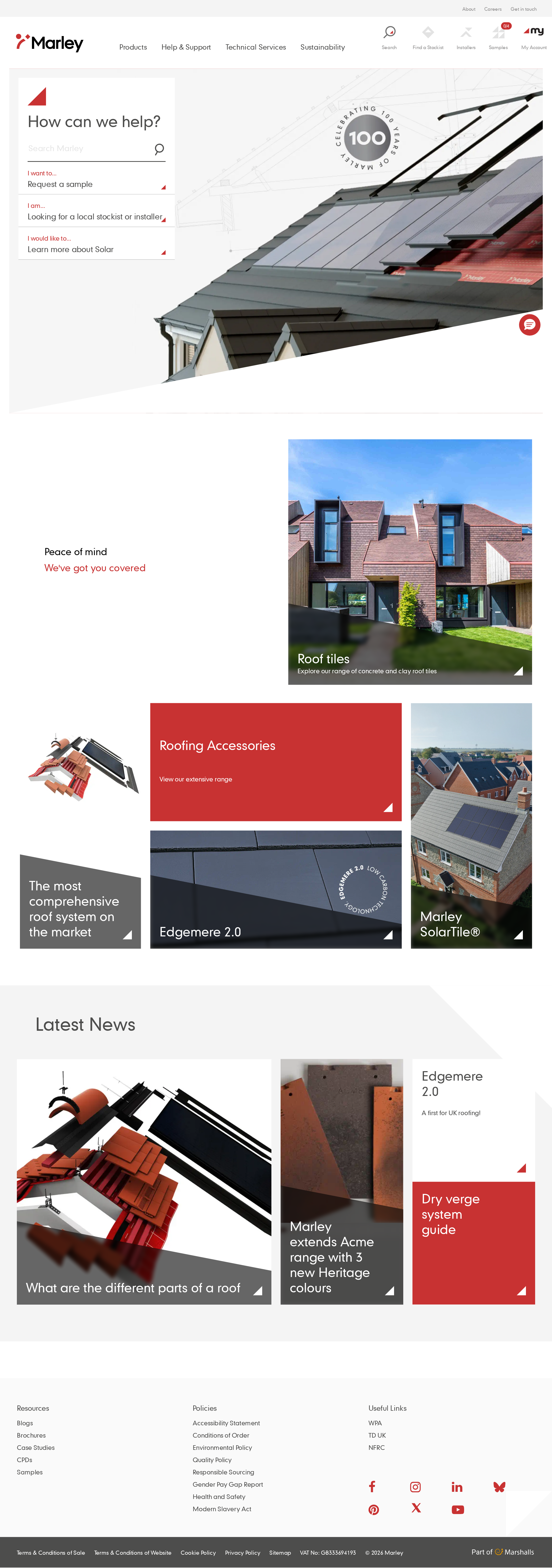
The visual system is cohesive, brand-specific and well matched to a roofing and construction business.
What works
- The roof-plane geometry and triangular endings create a memorable visual language.
- The asymmetric card composition gives product categories different levels of emphasis without becoming chaotic.
- Red, charcoal and neutral surfaces create a restrained industrial palette with clear brand ownership.
- Photography communicates real materials, installed products and architectural context.
Opportunities
- Increase consistency in text-overlay treatment so headings remain legible across changing image content.
- Reduce the visual competition between the hero image, support panel and chat affordance.
- Consider slightly stronger typographic weight or scale for small utility links and footer content.
Uniqueness
The page feels more authored than a generic catalogue template because its geometry and support-first entry point are consistently applied.
What works
- Angled card corners and roof-inspired diagonals connect the interface to the product category.
- The hero leads with practical visitor intents rather than a generic brand claim.
- The combination of installed-roof imagery, product detail and technical/editorial content gives the page a credible category voice.
Opportunities
- Develop a more distinctive visual treatment for technical resources, which currently share much of the same card language as promotional content.
- Use a clearer visual distinction between homeowner inspiration and professional specification journeys.
User experience
The homepage offers several sensible routes into a broad product portfolio, though information density and accessibility defects create friction.
What works
- The hero support panel gives visitors direct routes for search, sampling, local stockists and solar information.
- Product categories are discoverable through large, image-led cards with concise labels.
- The news area supports continued exploration after the primary product grid.
Opportunities
- Make the intended audience paths more explicit for professionals versus homeowners.
- Increase the prominence and affordance of small navigation and footer links.
- Ensure all icon-only and image-led links expose meaningful accessible names.
- Validate focus order, keyboard access, mobile navigation and touch targets in functional testing.
Conversion optimization
For a multi-audience manufacturer site, the page does a good job of directing visitors toward products, support and resources without overusing promotional calls to action.
What works
- The opening task panel addresses practical support needs immediately.
- The product grid exposes high-value categories including complete systems, accessories and solar roofing.
- Technical and editorial content provide credible secondary routes for research-oriented visitors.
- The persistent chat affordance offers an additional support channel.
Opportunities
- Add clearer next-step language to product cards so visitors understand whether a click leads to specification, purchase support, samples or installation guidance.
- Surface stronger reassurance around availability, technical documentation and installer or stockist support near relevant product groups.
- Measure whether the multiple hero choices compete with one another, then prioritize the most common visitor task.
What we'd improve
- 01high
Repair accessible names and form labeling
Give every icon-only/social/search link a concise accessible name and associate a visible or programmatic label with the hero search field. Verify names in keyboard and screen-reader flows.
- 02high
Remediate contrast in card overlays and utility UI
Review all text over photography, pale grey surfaces and small footer or utility links. Add stronger overlays, darker text, larger type or alternate treatments where needed, then retest representative states.
- 03high
Remove duplicate interface identifiers
Generate unique IDs for repeated SVG and interactive elements, and confirm that labels, descriptions and controls reference the intended element only.
- 04medium
Clarify audience pathways
Group or label entry points for homeowners, contractors, specifiers and installers so visitors can quickly choose the route most relevant to their task.
- 05medium
Strengthen card action clarity
Use concise supporting cues such as “Explore products,” “View technical details” or “Find a stockist” where the destination is not obvious from the card title alone.
- 06low
Audit responsive and reduced-motion states
Test the asymmetric grid, sticky header, chat control, image crops, keyboard focus and navigation collapse at mobile widths and with reduced-motion preferences enabled.