The School for Temporary Liveness website analysis
A detailed critique of the homepage's craft, originality, usability, and ability to move visitors toward its intended goal.
Our observations
A visually disciplined and memorable editorial archive, held back by serious text-contrast issues and limited wayfinding. Suitable for gallery consideration after accessibility and content-signposting improvements.
Best practices
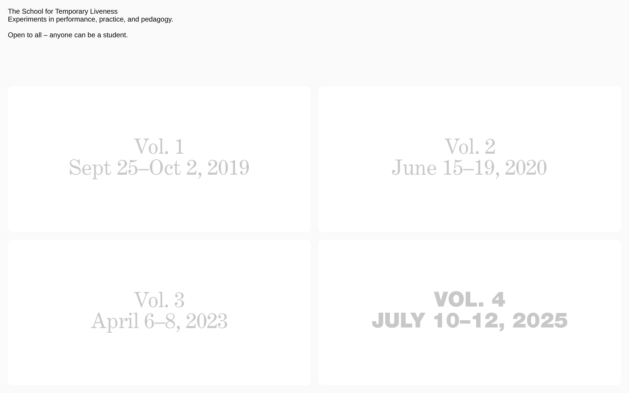
The page has a single clear heading, one main region, no duplicate IDs, and a straightforward content structure. Nevertheless, the detected contrast failures affect every volume card and are a significant usability concern.
What works
- Clear primary heading and concise introductory framing.
- Consistent repeated link structure for the four editions.
- Simple information architecture with no unnecessary interface layers.
Opportunities
- Increase the contrast of all volume labels against their card backgrounds.
- Expose clearer link affordances or supporting labels so card interactivity is unmistakable.
- Verify keyboard focus visibility, accessible names, and mobile behavior; these aspects cannot be confirmed from the screenshot and supplied metrics.
Design
The composition is confident, restrained, and cohesive. Its large-scale typographic cards and expansive whitespace give the archive a strong cultural-institutional character, although the intentionally faint text compromises the visual system's effectiveness.
What works
- Distinctive use of oversized typography in place of imagery.
- Strong repetition and alignment across the four-card archive.
- The heavier treatment of the latest volume creates a useful focal point.
Opportunities
- Use contrast, spacing, or a small amount of metadata to distinguish upcoming, current, and archival editions more clearly.
- Consider a more deliberate relationship between the serif volumes and the heavier final treatment so the variation feels intentional rather than inconsistent.
- Add subtle but accessible interaction states without disrupting the quiet visual language.
Uniqueness
The page avoids common marketing-page patterns and develops a recognizable archive-like identity from typography and spatial restraint. Its originality comes from disciplined presentation rather than elaborate visual effects.
What works
- A strong editorial stance with almost no decorative interface elements.
- The volume-based navigation gives the homepage a specific institutional purpose.
- The contrast between the first three volumes and the final bold volume adds character.
Opportunities
- Extend the archive concept with edition-specific descriptors, dates, or themes to make the identity more ownable.
- Introduce one carefully controlled contextual visual or typographic motif if additional distinction is needed, while preserving the current restraint.
User experience
The main browsing task is easy to infer, but the pale labels create a serious readability barrier and the sparse cards provide little information before selection. The screenshot does not establish whether hover, focus, or touch feedback exists.
What works
- The four available destinations are immediately visible.
- Large cards provide generous apparent click areas.
- The short introduction communicates the broad educational and participatory premise.
Opportunities
- Improve label legibility immediately; this is the highest-impact UX issue.
- Add concise descriptions or status labels to help visitors choose among editions.
- Provide explicit focus and hover states and test the grid on narrow screens and touch devices.
- Clarify whether older volumes remain available, whether the latest volume is upcoming, and what visitors can expect after clicking.
Conversion optimization
For an archive or cultural-education homepage, conversion is primarily successful exploration and participation rather than a conventional purchase. The page points visitors toward the editions but does not sufficiently explain the value or next step of exploring them.
What works
- The introductory copy establishes an inclusive proposition.
- The volume grid offers four clear entry points into the program.
- The latest edition receives visual emphasis, which can support timely discovery.
Opportunities
- Add a direct participation or learn-more pathway for visitors who do not yet know which volume to open.
- Pair each edition with a short theme, format, or outcome so selection requires less guesswork.
- Make the current or upcoming edition's status explicit and provide a clear next action such as schedule, registration, or program details when applicable.
- Use descriptive page titles and metadata rather than the generic supplied document title.
What we'd improve
- 01high
Resolve card text contrast
Replace the faint gray volume labels with a sufficiently dark foreground color and verify the result across every card, including the visually emphasized fourth volume.
- 02high
Add orientation and edition context
Give each volume a short descriptor and an explicit status such as upcoming, current, or archive so visitors can understand the collection before opening a card.
- 03medium
Strengthen interaction feedback
Provide visible hover and keyboard-focus states for the four links, while keeping the treatment minimal and consistent with the editorial aesthetic.
- 04medium
Improve document and responsive presentation
Replace the generic document title with a descriptive page title and test the two-column grid at mobile widths for readable type, orderly stacking, and comfortable touch targets.
- 05low
Clarify the primary participation path
If the school accepts applications, registrations, or public attendance, add a clearly identified pathway from the introduction so first-time visitors are not dependent on exploring an edition card.