

Teak website analysis
A detailed critique of the homepage's craft, originality, usability, and ability to move visitors toward its intended goal.
Our observations
A visually distinctive AI landing page with a strong editorial identity and clear product storytelling, held back by serious accessibility defects and a number of low-contrast text treatments. It is suitable for gallery consideration after remediation, but not yet a best-practice reference.
Best practices
The page has a coherent semantic outline and a single primary heading, but automated evidence identifies substantial accessibility risk.
What works
- A single H1 and one main landmark are present.
- The page has recognizable navigation, hero, form, FAQ, and footer regions.
- Primary actions are repeated consistently through the narrative.
- No duplicate IDs were detected.
Opportunities
- The supplied audit reports 41 contrast failures across 45 sampled elements, including headings, navigation, and card text.
- Six form controls are missing accessible labels, making the contact experience difficult to interpret with assistive technology.
- Two links are missing accessible names, including the logo link and another content link.
- A footer H4 follows a sequence that skips heading levels, weakening document hierarchy.
Design
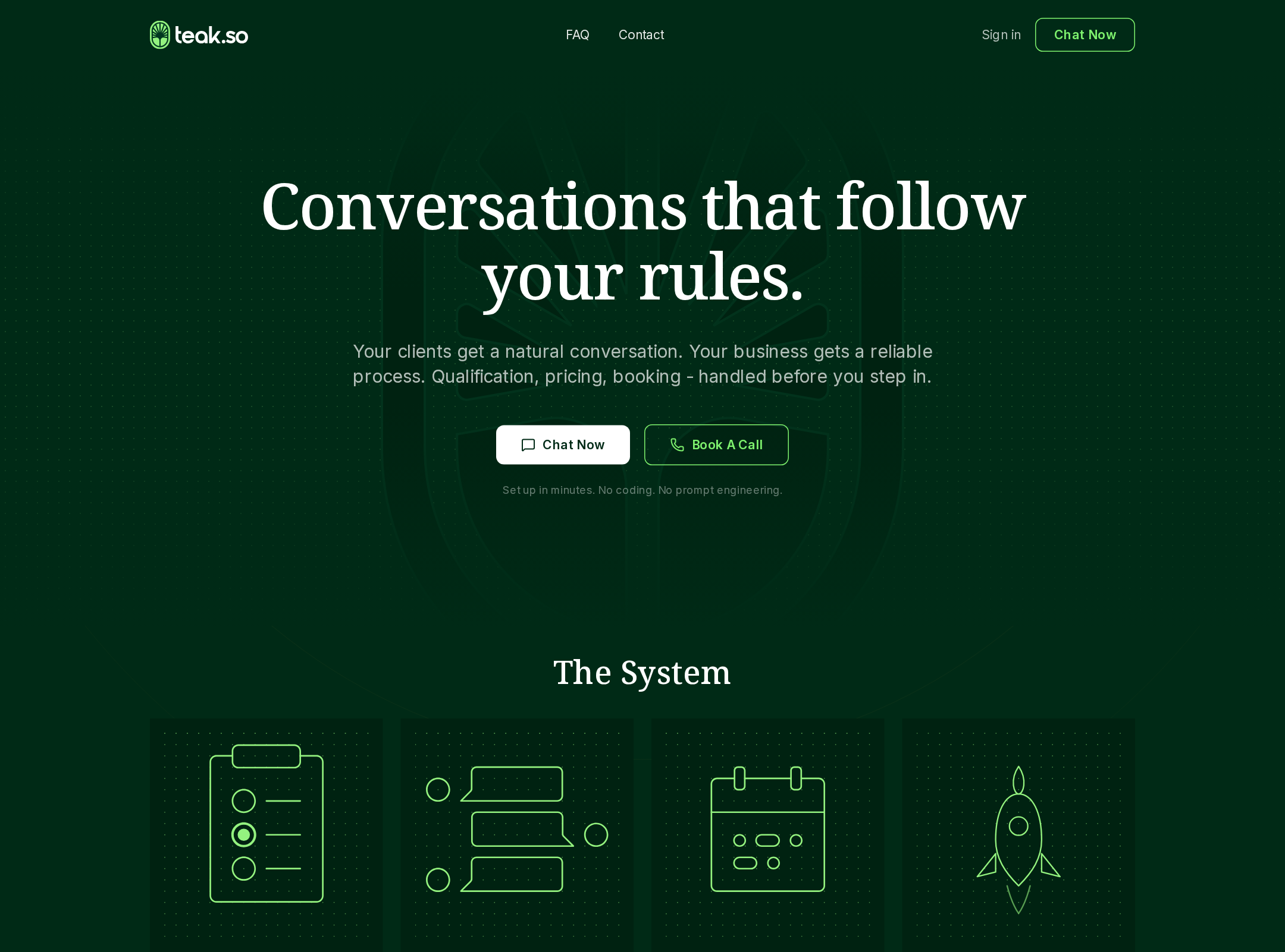
The visual system is memorable and well-art-directed, with a credible editorial tone for a human-facing AI product.
What works
- Deep green surfaces and bright green accents create a recognizable visual signature.
- Serif display typography gives the product a more considered and less generic AI-market presentation.
- Alternating editorial photography and explanatory copy create strong pacing across the long page.
- The comparison table and system cards translate abstract product claims into tangible structures.
Opportunities
- Very small supporting copy reduces legibility and makes some sections feel visually dense.
- The repeated dark-on-dark treatments can flatten hierarchy when accent color is not present.
- Some decorative grid and image treatments compete with already-small content rather than reinforcing it.
Uniqueness
The combination of forest-green editorial art direction, serif typography, human photography, and rule-oriented AI positioning is more distinctive than a typical SaaS landing page.
What works
- The page avoids the common blue-purple gradient language associated with generic AI products.
- The editorial photography gives the automation story a grounded, human context.
- The rule-based product framing is expressed visually through comparisons, system cards, and structured workflow sections.
Opportunities
- The overall section pattern still follows a familiar long-form SaaS landing-page formula.
- The visual identity would be more ownable if the technical grid, card illustrations, and photography were tied to a more explicit brand motif.
User experience
The page offers a logical information journey and multiple routes to action, but readability and form accessibility materially reduce usability.
What works
- The sequence moves from promise to capabilities, differentiation, reliability, questions, and contact in a sensible order.
- FAQ questions address practical concerns about system behavior, integrations, setup, and reliability.
- Repeated chat and call actions give visitors more than one next step.
- The screenshot shows clear section separation and predictable reading direction.
Opportunities
- Improve foreground/background contrast throughout headings, navigation, card copy, and FAQ content before publication.
- Add persistent, programmatically associated labels and useful autocomplete attributes to every form field.
- Ensure unnamed icon or logo links have descriptive accessible names.
- Verify mobile typography, image crops, CTA wrapping, and accordion keyboard behavior rather than inferring them from the desktop capture.
Conversion optimization
The page makes a credible case for a considered B2B AI product and presents multiple conversion paths, though trust and clarity could be strengthened.
What works
- The hero communicates a differentiated promise rather than presenting only a generic AI claim.
- The system overview, comparison module, and reliability section help answer buyer objections before the contact form.
- Both immediate product exploration and higher-intent calls are represented as primary actions.
- The FAQ is positioned late in the journey where it can reduce hesitation before contact.
Opportunities
- Make the first-screen value proposition easier to scan by increasing supporting-copy legibility and clarifying the distinction between the two primary actions.
- Add visible proof such as customer examples, measurable outcomes, supported-channel details, or implementation expectations if available.
- Clarify form field purposes with visible labels and reduce uncertainty around what happens after submission.
- Use a stronger, more specific contact CTA that communicates the expected next step and time commitment.
What we'd improve
- 01high
Resolve contrast failures across the dark theme
Rework the foreground colors used for headings, navigation, card copy, FAQ text, and supporting labels, then retest representative states on every background. Preserve the green accent for emphasis rather than relying on it for long passages.
- 02high
Label every form control and non-text link
Add visible labels and programmatic associations for all six reported form controls, with appropriate input types and autocomplete hints. Give the logo and any icon-only or image-based links descriptive accessible names.
- 03high
Verify keyboard and responsive interaction behavior
Test the sticky navigation, FAQ controls, CTA links, form errors, focus indicators, and compact layouts using keyboard navigation and narrow viewports. Confirm that responsive image crops and two-column sections do not obscure content.
- 04medium
Strengthen first-screen hierarchy
Increase the legibility of the supporting hero copy and make the difference between the exploratory product action and the sales-call action immediately apparent.
- 05medium
Add evidence for a high-consideration purchase
Introduce concise customer proof, outcome metrics, channel coverage, or a transparent setup overview where substantiated. These additions would complement the existing comparison and reliability sections.
- 06low
Repair heading hierarchy
Replace the reported footer heading-level skip with a semantically appropriate heading structure, and review the page outline after any content changes.