

Hajster website analysis
A detailed critique of the homepage's craft, originality, usability, and ability to move visitors toward its intended goal.
Our observations
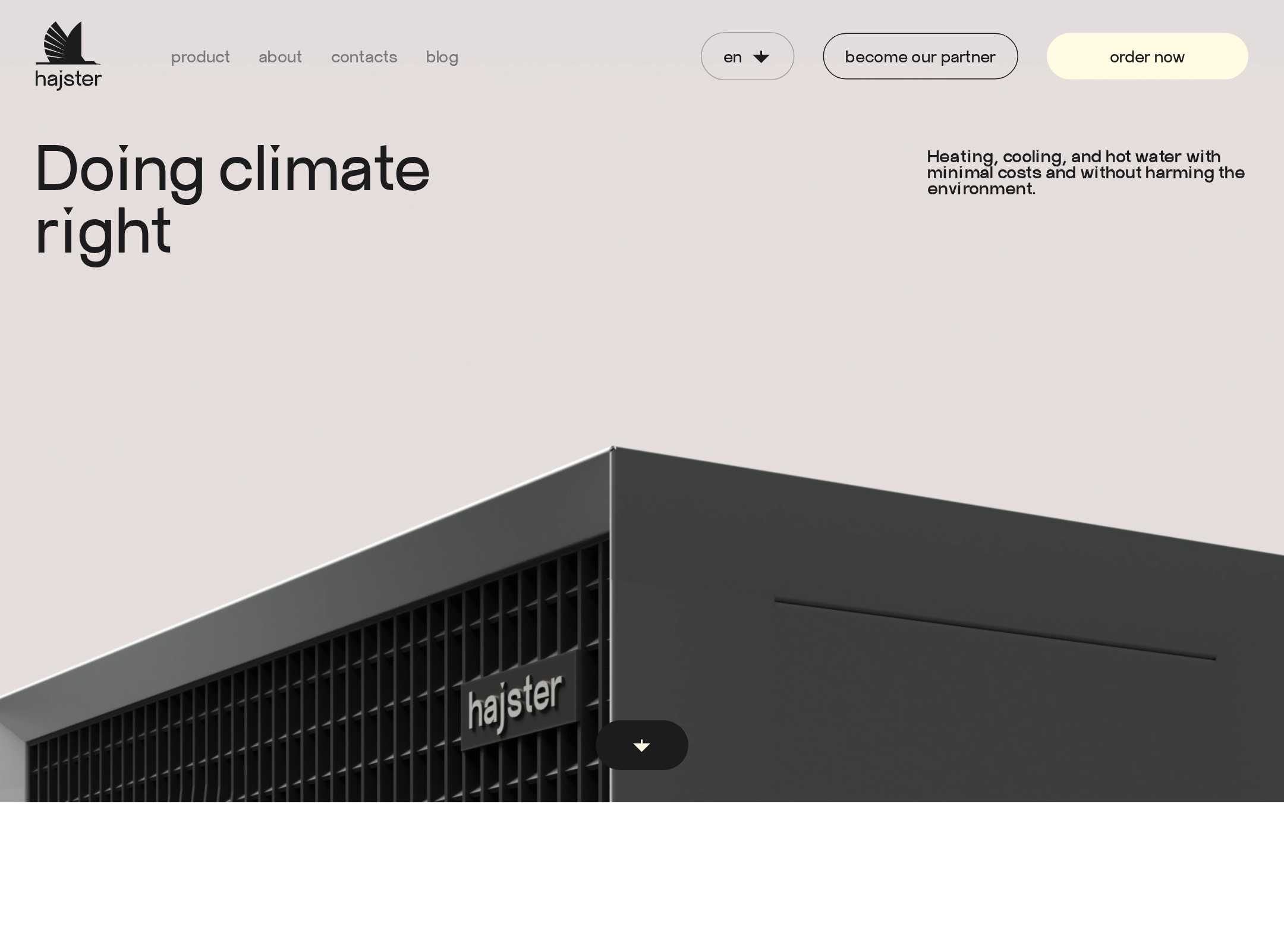
A visually distinctive and information-rich heat-pump homepage with strong art direction, held back from top-tier status by serious accessibility findings and unverified interaction behavior.
Best practices
The page has a single detected H1, a semantic main and footer, a coherent section structure, and clear product and contact pathways. However, the automated audit reports serious issues affecting links, form labels, and text contrast.
What works
- One H1 and one main landmark were detected.
- The page provides product details, specifications, a calculator, company information, and contact routes.
- A semantic footer and structured product/specification content support orientation.
Opportunities
- Resolve all six unnamed links, including social, partner, logo, and navigation controls.
- Add explicit labels to the five reported form controls, including calculator, newsletter, and icon-button controls.
- Address the 22 reported contrast failures, especially navigation and product-card text.
- Correct the detected heading-level skip and verify heading hierarchy across the long page.
Design
The visual system is confident and recognizably industrial, balancing dark technical imagery with cream surfaces and human-centered photography.
What works
- The contrast between technical product imagery and domestic/nature photography gives the brand a broad emotional range.
- The long-form sequence has clear chapter changes across catalog, benefits, calculator, specifications, and history content.
- Rounded controls, dark surfaces, and restrained accent colors create a consistent visual language.
Opportunities
- Reduce visual density in the most information-heavy benefit and specification chapters.
- Improve text legibility where imagery, texture, and small labels compete for attention.
- Make the primary next step more consistently prominent across product, calculator, and contact sections.
Uniqueness
The page distinguishes itself from generic HVAC marketing through its editorial pacing, industrial textures, technical orange illustrations, and unusually prominent product/specification narrative.
What works
- The engineering-led art direction feels specific to heat-pump technology rather than interchangeable sustainability branding.
- The combination of product catalog, technical tables, history, family imagery, and environmental visuals creates a memorable brand world.
- The dark product sections provide a stronger point of view than a standard white-and-blue HVAC template.
Opportunities
- Tie the orange technical motifs more consistently to an identifiable brand story or system.
- Use more distinctive proof points, certifications, project outcomes, or installation examples to reinforce differentiation beyond visual styling.
User experience
The information architecture appears comprehensive and the product categories are easy to identify in the screenshot, but the page is very long and includes accessibility issues that can materially affect navigation and form completion.
What works
- Product cards expose model categories and additional detail without requiring the visitor to leave the homepage.
- A calculator offers a practical route from general interest toward a more tailored estimate.
- Specifications and company history address both technical evaluation and trust-building needs.
Opportunities
- Provide stronger in-page orientation for the long scroll, particularly around benefits, specifications, and history.
- Ensure modal product content has clear accessible names, focus management, and keyboard-dismiss behavior; these behaviors were not verified.
- Increase the size and contrast of small supporting text and controls in dense sections.
- Test the calculator and specification table on small screens and with keyboard and screen-reader navigation.
Conversion optimization
For a considered heat-pump purchase, the page offers relevant conversion tools and multiple contact pathways, but the decision journey could be more direct and accessible.
What works
- The installation calculator is a meaningful lead-generation mechanism rather than a generic contact form.
- Product cards, technical specifications, and company history support research before contacting the company.
- Header and footer contact pathways provide repeated opportunities to continue the conversation.
Opportunities
- State the expected outcome, time commitment, and privacy treatment beside the calculator before asking for location, area, and email.
- Add a persistent or repeated primary action that connects product discovery to installation consultation.
- Surface trust signals closer to the main conversion points, such as installer coverage, warranty, certifications, or completed projects if available.
- Use descriptive labels for all icon-only actions and ensure contrast-compliant CTA states.
What we'd improve
- 01high
Repair the accessibility foundation
Label every reported form control, give every icon-only or image-only link an accessible name, fix the skipped heading level, and remediate the 22 reported contrast failures. Re-run automated checks and perform keyboard and screen-reader review afterward.
- 02high
Make the calculator a clearer decision step
Explain what the calculator returns, how long it takes, and what happens after submission. Use visible labels, inline validation, a clear privacy note, and an accessible success or error state.
- 03high
Verify motion and modal interaction
Test product modals, parallax, scroll transitions, focus trapping, escape behavior, and reduced-motion handling across keyboard, touch, and assistive-technology flows.
- 04medium
Improve long-page orientation
Add clearer chapter navigation or progress cues and reinforce the relationship between product selection, benefits, specifications, and consultation.
- 05medium
Strengthen proof at conversion points
Place relevant trust evidence near product cards and the calculator so visitors can assess technical credibility without searching through the full history and specification sections.