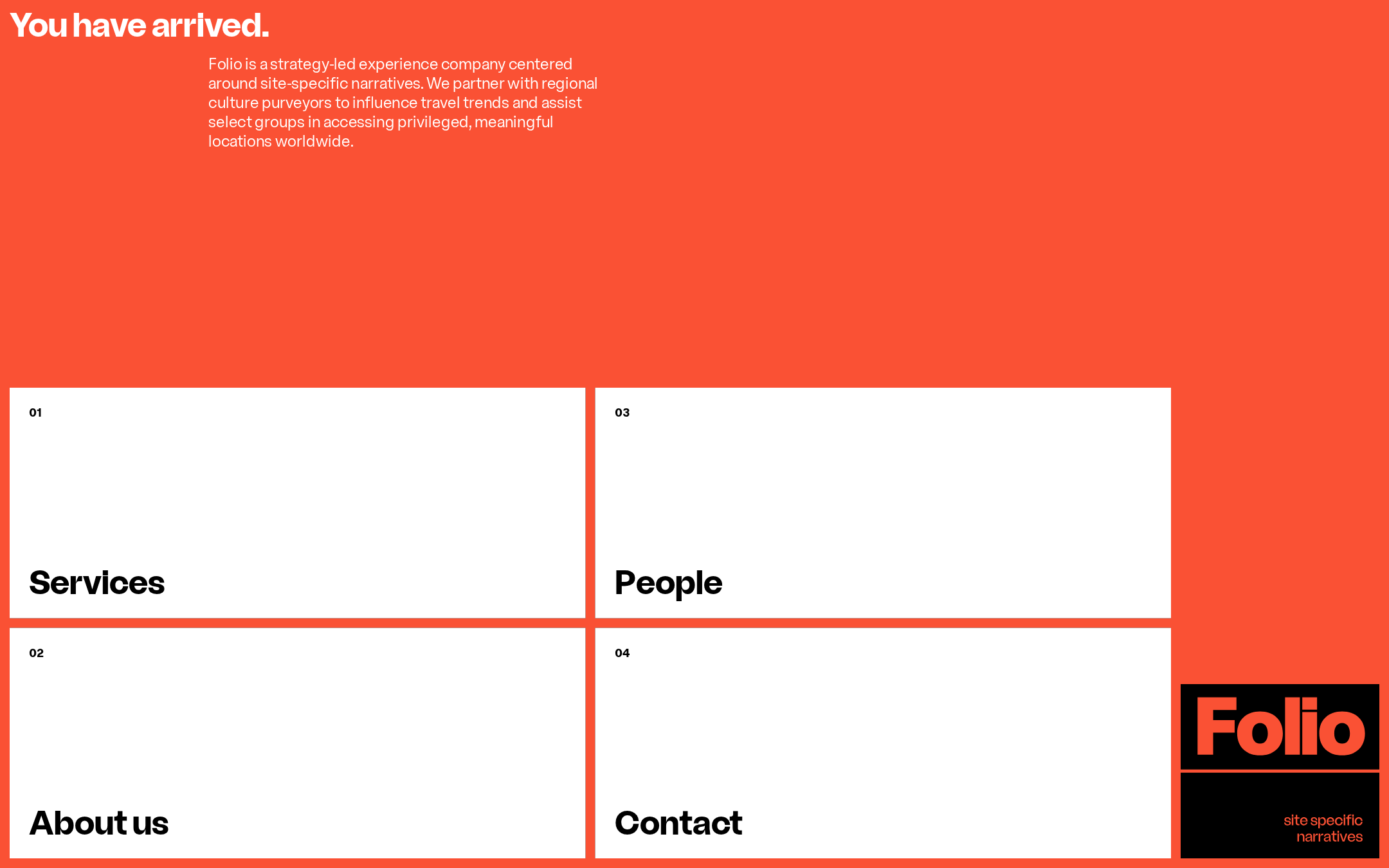
Folio website analysis
A detailed critique of the homepage's craft, originality, usability, and ability to move visitors toward its intended goal.
Our observations
A visually distinctive and commercially credible agency entry point with strong art direction, but it requires significant accessibility and content-clarity improvements before it is ready for an exemplary gallery placement.
Best practices
The page is structurally simple and visually controlled, but deterministic accessibility results reveal several serious issues.
What works
- Clear primary statement appears at the top of the page.
- Navigation is organized into four recognizable destinations.
- No duplicate IDs were detected.
- The sparse structure reduces competing interface elements.
Opportunities
- Provide accessible names for all four navigation links.
- Resolve the nine sampled text-contrast failures.
- Add a document language declaration and a meaningful main landmark.
- Correct heading-level skips and avoid using multiple navigation-card titles as additional H1 elements.
Design
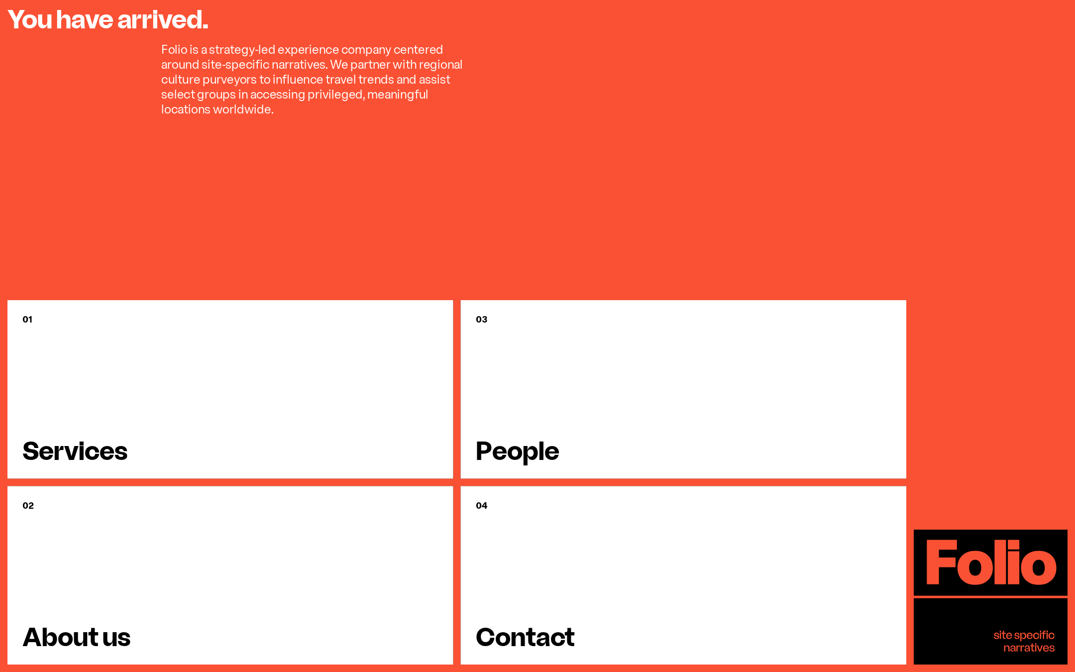
A confident, memorable visual composition with a strong color strategy and unusually disciplined use of empty space.
What works
- The red field creates immediate brand recognition.
- The white card grid establishes a clear, repeatable visual rhythm.
- Typography, numbering, and generous negative space create an editorial character.
- The logo block gives the composition a distinctive visual endpoint.
Opportunities
- Use the empty areas to reveal more evidence of the agency’s work or point of view.
- Ensure hover, focus, and active states preserve the same visual confidence without reducing legibility.
- Clarify the relationship between the introductory copy and the four navigation destinations.
Uniqueness
The combination of a full-bleed red environment, oversized navigation cards, and a compact corner logo feels considered and recognizable.
What works
- The page avoids generic agency patterns such as a conventional hero-and-case-study stack.
- The numbered card system gives the navigation a strong authored character.
- The logo treatment and asymmetrical lower-right anchor add memorability.
Opportunities
- Add a more ownable content device beyond color and layout, such as a concise proof point, project signal, or editorial detail.
- Make the agency’s specific expertise more immediately distinguishable from other strategy and experience studios.
User experience
The destination structure is easy to understand visually, but the sparse interface and accessibility defects create uncertainty for some users.
What works
- The four primary destinations are visible without requiring users to search for a menu.
- Large cards provide an obvious interaction model.
- The introductory paragraph establishes a broad purpose before navigation begins.
Opportunities
- Expose enough preview information within each card to help users choose a path confidently.
- Improve keyboard focus visibility and accessible link labeling.
- Test the grid on mobile and zoomed layouts; the observed absolute positioning and desktop-specific structures warrant particular scrutiny.
- Preserve meaningful reading order for screen readers and assistive technology.
Conversion optimization
The page communicates a distinctive point of view, but its conversion path is indirect and offers limited proof or immediate engagement cues.
What works
- Services and Contact are prominent, easy-to-find destinations.
- The opening statement establishes a clear, premium positioning.
- The branded composition may build interest among culturally aligned visitors.
Opportunities
- Add a clear invitation to contact or explore work near the first meaningful interaction.
- Include selected work, partner proof, or measurable outcomes before asking visitors to navigate deeper.
- Use short supporting descriptors on the navigation panels so visitors understand what each section contains.
- Make the Contact route more explicit for prospective clients while retaining the editorial tone.
What we'd improve
- 01high
Repair the accessibility foundation
Add accessible names to every navigation link, correct the heading hierarchy, declare the document language, provide a main landmark, and remediate the documented contrast failures. Recheck keyboard navigation and focus states after implementation.
- 02high
Strengthen the homepage’s proof of value
Add a compact preview of selected work, outcomes, partners, or capabilities so the page communicates credibility before visitors open a destination panel.
- 03medium
Make navigation choices more informative
Pair each large destination title with a short descriptive cue or interaction preview, particularly for Services and Contact, without compromising the sparse visual direction.
- 04medium
Validate responsive composition
Review narrow screens, browser zoom, keyboard traversal, and long text scenarios. Confirm that positioned cards and the lower-right logo remain readable, ordered, and comfortably tappable.
- 05low
Clarify the primary conversion path
Introduce a restrained but explicit contact invitation or project inquiry prompt within the hero or navigation system, so the page supports prospective clients as well as brand discovery.