

Family website analysis
A detailed critique of the homepage's craft, originality, usability, and ability to move visitors toward its intended goal.
Our observations
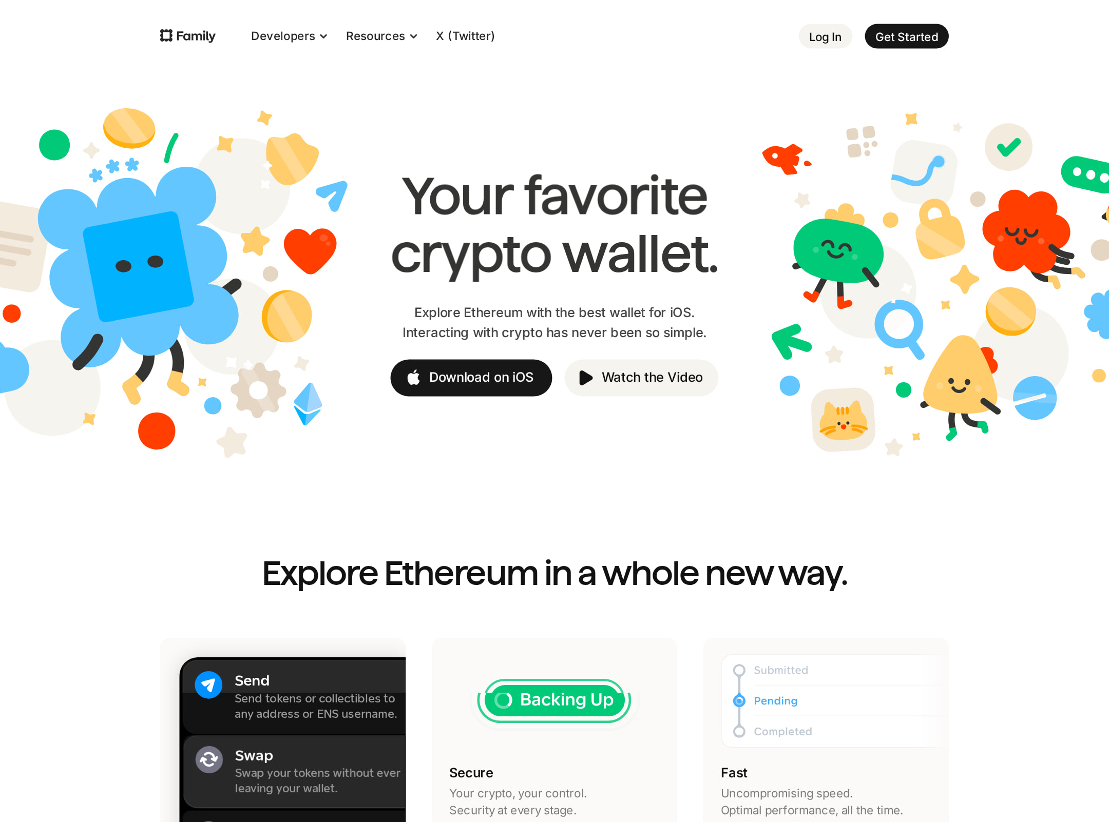
A visually polished and memorable crypto-wallet marketing site with strong illustration, product storytelling, and a credible long-form structure. It is suitable for a design gallery, but its automated accessibility findings are material and should be addressed before treating it as a best-practice reference.
Best practices
The page includes recognizable navigation, a single main landmark, a footer, clear product sections, FAQs, and multiple routes into product information. However, the supplied audit reports serious accessible-name, alternative-text, contrast, and document-structure problems.
What works
- The page has semantic navigation, one main landmark, and a semantic footer.
- The homepage visibly provides a broad explanation of the product rather than relying only on a hero claim.
- FAQ content, testimonials, product screenshots, and onboarding sections support different information needs.
Opportunities
- Add meaningful alt text to the 33 reported images, distinguishing decorative illustrations from informative product screenshots.
- Give all 64 reported unnamed links accessible names, especially logo, social, icon-only, and image-based links.
- Correct the 18 reported contrast failures, including muted text and text rendered inside SVG illustrations.
- Set the document language, remove duplicate IDs, and use a logical heading hierarchy instead of 13 H1 elements and eight heading-level skips.
Design
The visual system is cohesive, expressive, and well matched to an approachable self-custody product. The composition is carefully art-directed, though the very long page and small body copy reduce immediacy.
What works
- Bright blue and orange illustrations give the brand a recognizable personality within a category often dominated by dark, finance-oriented interfaces.
- Phone mockups are used consistently to connect feature claims to visible product evidence.
- The alternating feature sections, card-like UI examples, and generous whitespace create a deliberate editorial rhythm.
- Inter and the restrained neutral palette keep the colorful artwork from becoming visually chaotic.
Opportunities
- Increase the scale or weight of key supporting copy in dense sections so it remains legible at a glance.
- Reduce repetition across feature, security, onboarding, and product-detail sections or add stronger section-level signposting.
- Make the primary action and product availability more visually dominant on smaller screens, where the long page can dilute attention.
Uniqueness
The combination of playful custom artwork, wallet-monitoring concepts, NFT presentation, and product-led storytelling gives the homepage a strong identity beyond a generic crypto landing page.
What works
- The friendly blue mascot and colorful abstract illustrations create a distinctive brand signature.
- The page foregrounds wallet watching, collectibles, privacy, and onboarding alongside standard send, receive, and swap features.
- The visual language feels more human and consumer-oriented than conventional exchange or infrastructure marketing.
Opportunities
- Clarify the single most differentiated reason to choose Family near the top; the hero currently communicates category and polish more strongly than a specific advantage.
- Use a compact comparison, proof point, or concrete security explanation to make the differentiation more defensible, not only aesthetic.
User experience
The page appears easy to scan at a high level, with a clear sequence from introduction to capabilities and supporting evidence. Its length, small text, and accessibility defects create friction for some visitors.
What works
- The hero immediately identifies the product as a crypto wallet and is followed by visual product exploration.
- Feature headings such as sending, swapping, NFTs, wallet watching, security, and onboarding provide useful content landmarks.
- Screenshots show the product in context rather than presenting abstract claims alone.
- The FAQ and testimonials near the lower portion of the page provide reassurance for visitors who need more detail.
Opportunities
- Add a persistent or repeated primary download/get-started action so visitors do not need to return to the header after scrolling through the long page.
- Expose key prerequisites early, such as supported platforms, networks, and what self-custody requires from the user, if those details are available.
- Ensure accordion buttons have explicit accessible labels and state information; the audit identifies three unlabeled form-control-like buttons.
- Provide a reduced-motion experience for the animated and video-rich presentation, while preserving equivalent information in static content.
Conversion optimization
For a consumer wallet homepage, the page builds interest effectively through product visuals, feature coverage, security messaging, onboarding, social proof, and FAQs. Conversion intent is weakened by a diffuse long-form journey and limited visible evidence in the supplied screenshot about the primary acquisition action.
What works
- The product is demonstrated repeatedly through mobile UI rather than relying on promotional copy alone.
- Security, self-custody, privacy, and onboarding sections address common objections in the wallet category.
- Testimonials, FAQs, and a final product-oriented section create several reassurance layers before the footer.
- The hero includes a clear product proposition and visible action area.
Opportunities
- Make one action the unmistakable primary conversion goal, such as downloading the wallet or starting setup, and repeat it at major decision points.
- Place platform support, network coverage, security model, and recovery expectations close to the first CTA to reduce uncertainty before installation.
- Pair testimonials with attributable identities or stronger contextual proof where possible; the screenshot shows testimonial content but not enough evidence to assess its credibility.
- Use a shorter top-level summary or sticky section navigation to help visitors reach the feature or trust proof most relevant to them.
What we'd improve
- 01high
Repair accessible names and image alternatives
Audit every image and link in the rendered page. Add concise alt text to informative UI screenshots, mark decorative artwork as decorative, and provide visible or screen-reader text for logo, social, icon-only, and image links.
- 02high
Fix contrast and document structure
Resolve the 18 reported contrast failures, especially muted gray copy and SVG text. Set html lang, consolidate the 13 H1 elements into one page-level H1 with ordered section headings, and remove duplicate IDs.
- 03high
Strengthen the primary conversion path
Choose one dominant action for the homepage, give it stronger visual priority in the hero, and repeat it after the feature and trust sections. Include key availability and security prerequisites beside the action.
- 04medium
Improve long-page navigation
Add a compact sticky table of contents or section navigation for capabilities, security, onboarding, and FAQs, with clear active states and keyboard support.
- 05medium
Make motion and video content optional
Respect prefers-reduced-motion in the animated transitions and nine videos, pause nonessential playback, and provide static poster frames or equivalent text for product information.
- 06low
Increase small-copy legibility
Review the smallest body-text styles and low-emphasis labels across the feature grid, testimonials, and footer; increase size, line height, or contrast where they are difficult to scan.