Workday website analysis
A detailed critique of the homepage's craft, originality, usability, and ability to move visitors toward its intended goal.
Our observations
A visually strong, differentiated enterprise SaaS homepage with excellent art direction and clear commercial intent, but it should undergo accessibility and media-rendering review before being featured as a best-practice reference.
Best practices
The structure is commercially conventional and well organized, but automated observations identify several serious implementation issues.
What works
- There is one detected H1 followed by a logical H2 and persona-specific H3 headings.
- The page has a clearly identifiable hero, main content area, and semantic footer.
- Primary actions such as exploring AI agents and contacting sales are visible at important decision points.
- The footer provides broad navigation across products, industries, learning resources, and company information.
Opportunities
- Resolve the five missing image alternative-text instances, especially for content-bearing persona and promotional imagery.
- Address all 17 detected text-contrast failures rather than relying on visual styling alone.
- Give the footer logo link an accessible name and remove duplicate IDs that can impair assistive-technology navigation.
- Review the repeated footer heading labels such as “Products Products” and “Industries Industries,” which appear redundant in the supplied heading data.
Design
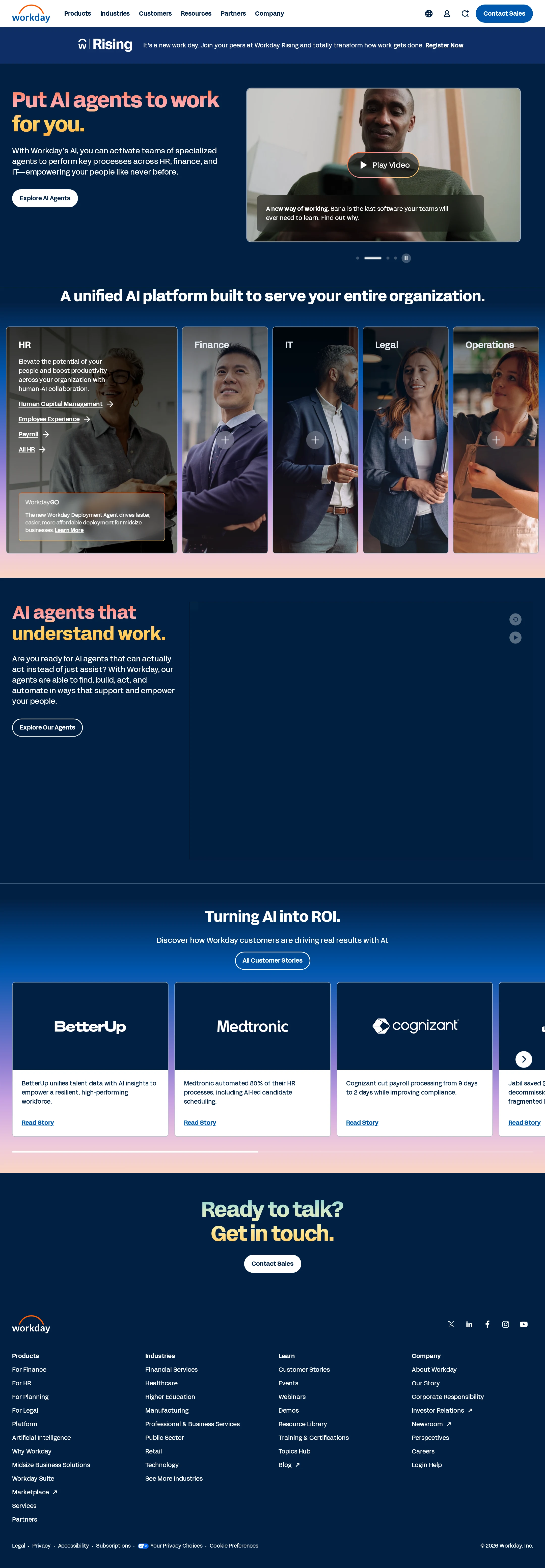
The visual system is cohesive, contemporary, and unusually expressive for enterprise software, although the apparent empty media block materially weakens the middle of the page.
What works
- The navy base gives the page a distinctive enterprise foundation while coral, yellow, blue, and lavender accents create strong section-level contrast.
- The hero establishes hierarchy efficiently with large gradient-like headline coloring, concise supporting copy, a video panel, and a compact CTA.
- Persona cards use varied portrait imagery, overlays, and expansion cues to make a broad product portfolio feel navigable.
- The customer-proof section and large closing CTA create a clear visual progression from proposition to evidence to action.
Opportunities
- Investigate the large dark media region below “AI agents that understand work” because it appears blank in the supplied screenshot and dominates the viewport.
- Reduce the density of small text in the persona cards and footer where legibility is constrained by image overlays or compact sizing.
- Make carousel state and progression more visually explicit; the small dots and pause control are easy to overlook.
Uniqueness
The combination of enterprise product positioning, persona-based portrait panels, and a bright editorial color treatment gives the page a recognizable point of view.
What works
- The five-column persona treatment is more distinctive than a standard row of product feature cards.
- The color pairing of deep navy with coral and yellow headline accents creates a strong branded signature.
- The page frames AI as an organization-wide operating layer rather than presenting only a generic chatbot or feature grid.
Opportunities
- The customer-story cards, sales CTA, and footer follow familiar B2B SaaS patterns and could be given more bespoke interaction or storytelling.
- A visible product interface, workflow diagram, or more concrete AI-agent demonstration would make the proposition feel more ownable than photography and headlines alone.
User experience
The page offers clear top-level routes and a sensible narrative, but dense content, carousel behavior, contrast failures, and the apparent unloaded media section create friction.
What works
- The top navigation exposes major routes including Products, Industries, Customers, Resources, Partners, and Company.
- The persona grouping lets visitors orient by organizational function rather than requiring them to understand the entire platform first.
- Multiple CTA placements accommodate both exploratory visitors and visitors ready to contact sales.
- Customer stories provide a lower-friction path for visitors seeking evidence before engaging with sales.
Opportunities
- Ensure the central media module has a reliable poster, fallback, or descriptive content when video or interactive assets fail to load.
- Provide clear keyboard, focus, pause, and screen-reader behavior for the video and carousels; the supplied observations confirm motion and two videos but do not establish usability of their controls.
- Improve contrast for text over imagery and colored backgrounds, then verify the corrected states across responsive breakpoints.
- Reduce reliance on small overlay text and make expanded persona content available without requiring interpretation of plus icons.
Conversion optimization
The page is well aligned to a sales-led enterprise objective, using a direct hero CTA, proof points, and a repeated contact-sales conclusion. Conversion performance itself cannot be inferred from the screenshot.
What works
- “Explore AI Agents” gives the hero a low-commitment next step while “Contact Sales” serves high-intent visitors.
- The organization-wide framing and HR, Finance, IT, Legal, and Operations segmentation help visitors self-identify quickly.
- Customer outcome cards add credibility and provide evidence-oriented paths such as reading customer stories.
- The closing “Ready to talk? Get in touch.” section supplies a clear final action after product and proof content.
Opportunities
- Clarify the destination and expected commitment for “Explore AI Agents” and “Contact Sales” so visitors can distinguish education from lead capture.
- Add concise trust signals near the primary hero CTA, such as customer scale, deployment context, or security reassurance, if supported by the product offering.
- Make customer proof more actionable by exposing a consistent outcome, industry, or solution label on every story card.
- Avoid allowing the blank media region to appear before proof content; a missing demonstration at that point may reduce confidence in the AI proposition.
What we'd improve
- 01high
Repair accessibility failures
Add meaningful alt text to the five detected images, provide an accessible name for the footer logo link, correct the 17 contrast failures, and replace duplicate IDs with unique identifiers. Re-run automated checks and perform keyboard and screen-reader review afterward.
- 02high
Fix or replace the empty media module
Determine why the large media area under the AI-agents section renders without visible content. Add a poster image, loading state, fallback copy, or static product demonstration so the section remains informative when video or interactive content is unavailable.
- 03medium
Strengthen carousel controls
Increase the visual prominence and labeling of slide indicators, pause controls, and next/previous actions. Ensure controls have descriptive accessible names and that autoplay respects reduced-motion preferences.
- 04medium
Improve text legibility over imagery
Increase overlay opacity or adjust text and link colors in persona cards and video captions, prioritizing the contrast failures identified by the supplied audit.
- 05low
Make proof content more scannable
Standardize customer-story card metadata around industry, product area, and measurable outcome so visitors can quickly select the most relevant evidence.