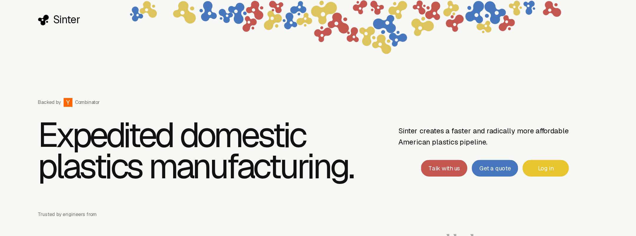


Sinter website analysis
A detailed critique of the homepage's craft, originality, usability, and ability to move visitors toward its intended goal.
Our observations
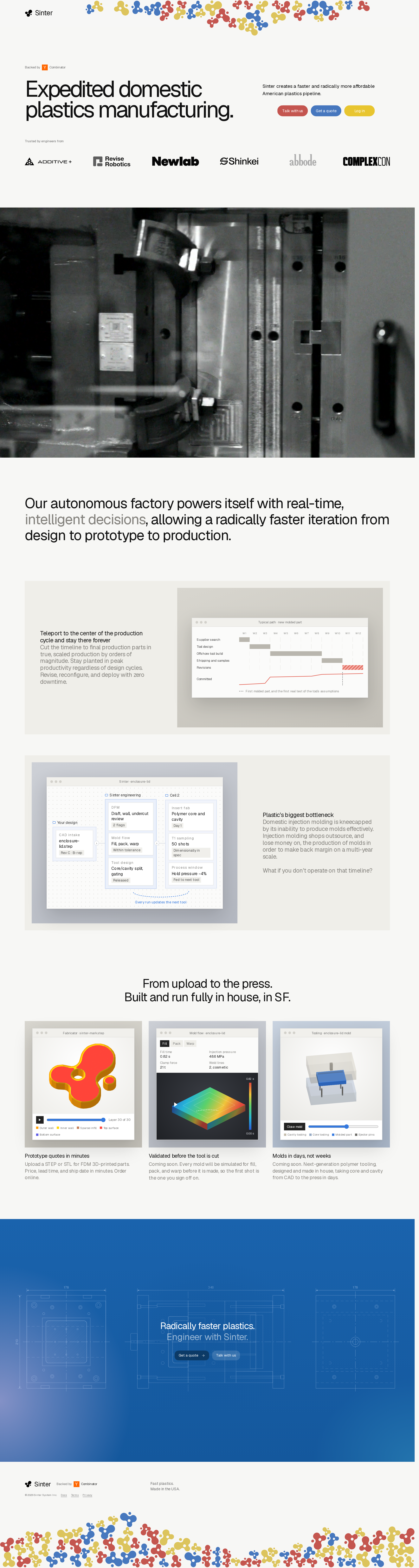
A distinctive and commercially credible manufacturing homepage with strong visual storytelling, held back from top-tier gallery status by substantial contrast and labeling issues.
Best practices
The page has a logical marketing structure, one primary heading, clear content sections, and repeated calls to action. Automated accessibility evidence reveals material implementation gaps.
What works
- A single H1 establishes the core manufacturing proposition.
- The page uses recognizable sections for proof, process, capabilities, CTA, and footer.
- Customer logos, factory media, and product visualizations provide multiple forms of credibility.
Opportunities
- Resolve all 51 reported contrast failures, prioritizing buttons, hero micro-labels, technical UI labels, and muted copy.
- Give all six customer-logo links accessible names, preferably using the associated organization name.
- Correct the reported heading-level skip so the document outline reflects the visual hierarchy.
- Manually test keyboard focus visibility, video controls, reduced motion, and mobile text scaling.
Design
The visual system is cohesive, memorable, and unusually well matched to an industrial software proposition.
What works
- The restrained neutral palette gives colorful particles and CTA accents clear emphasis.
- The factory photograph adds authenticity and breaks up the interface-heavy content.
- Alternating showcase panels and compact capability cards create a strong rhythm down the page.
- The blue closing CTA provides a decisive visual endpoint.
Opportunities
- Increase the legibility and scale of supporting copy beneath the showcase visuals.
- Reduce the number of competing hero button colors or establish a clearer primary action hierarchy.
- Ensure technical diagrams and interface screenshots remain understandable when viewed at smaller sizes.
Uniqueness
Sinter has a clear identity rather than relying on generic SaaS conventions, particularly through its combination of industrial footage, manufacturing diagrams, and particle-based brand decoration.
What works
- The particulate header and footer treatment is a distinctive visual signature.
- The page treats production workflows and factory operations as visual content, not just background claims.
- The combination of editorial typography and browser-like process demonstrations feels specific to the category.
Opportunities
- Make the relationship between the decorative particle system and the manufacturing process more explicit in the brand story.
- Add a small number of concrete, verifiable production outcomes to complement the visual distinctiveness.
User experience
The narrative is easy to follow at a high level, but small typography, low-contrast secondary content, and competing actions create avoidable friction.
What works
- The sequence moves naturally from promise to proof, workflow, capabilities, and contact.
- The factory video and interface examples help users understand an otherwise technical service.
- The closing CTA repeats the commercial next step after the visitor has seen the process.
Opportunities
- Use larger, higher-contrast text for captions, micro-labels, and interface annotations.
- Clarify whether visitors should request a quote, talk with the team, or log in first; the hero currently presents three similarly prominent actions.
- Provide descriptive accessible labels for every linked customer logo.
- Add captions or a transcript for the factory video if it conveys essential information.
Conversion optimization
The page makes a credible case for contacting Sinter and requesting a quote, but the conversion path could be more focused for a first-time manufacturing buyer.
What works
- The quote action appears in the hero and again in the closing CTA.
- The page explains the value proposition through process evidence instead of relying only on promotional language.
- Customer logos and a domestic manufacturing position support trust for a B2B audience.
Opportunities
- Make the quote CTA the unmistakable primary action and demote account access or exploratory contact to secondary actions.
- State the required quote inputs, expected response time, materials, and part-size constraints near the first quote CTA.
- Add a concise proof point such as typical lead time, order range, or representative customer outcome, provided it can be substantiated.
- Link each capability card to a concrete next step or relevant technical detail.
What we'd improve
- 01high
Repair contrast and accessible naming
Address the 51 contrast failures and assign meaningful accessible names to all six customer-logo links. Recheck buttons, muted labels, technical annotations, and text over media in both light and dark contexts.
- 02high
Establish one dominant conversion path
Make “Get a quote” the visually dominant hero action, move “Talk with us” to a secondary treatment, and clarify the separate purpose of account access.
- 03high
Improve document structure
Fix the reported heading-level skip and verify that showcase headings, card headings, and CTA headings form a logical outline for screen-reader navigation.
- 04medium
Strengthen quote qualification
Place concise information beside the first quote CTA explaining supported file formats, materials, geography, expected turnaround, and what happens after upload.
- 05medium
Increase small-copy legibility
Raise the size, contrast, and line spacing of captions and technical UI labels, especially within the three capability cards and alternating showcase panels.
- 06low
Add media alternatives
Provide captions, a transcript, or an adjacent text summary for the factory video, and verify that the visual process demonstrations communicate equivalent information without motion.