REKKI website analysis
A detailed critique of the homepage's craft, originality, usability, and ability to move visitors toward its intended goal.
Our observations
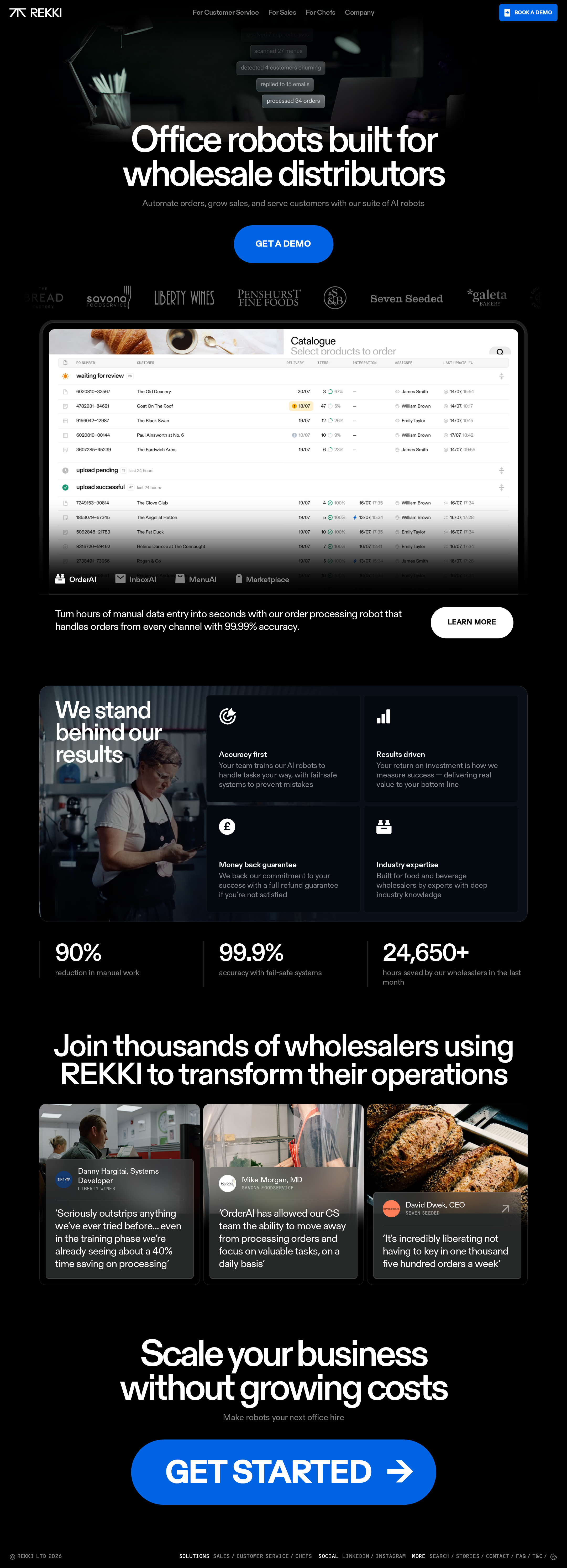
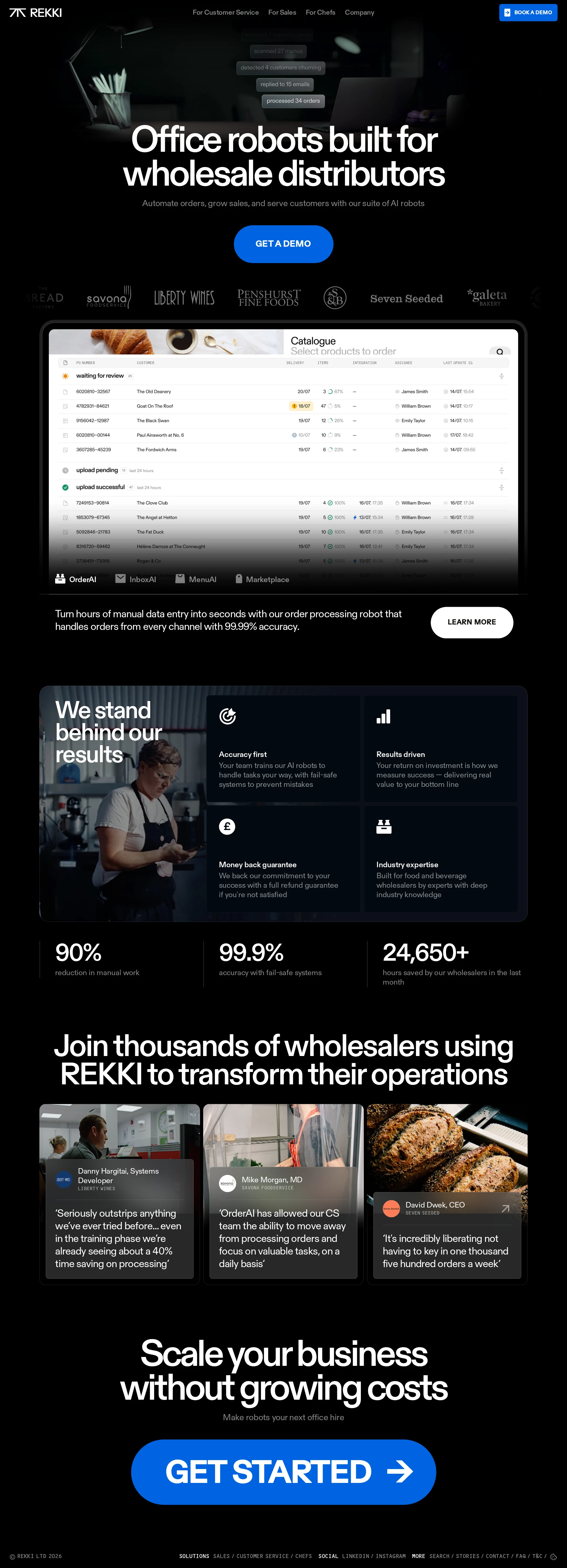
A strong and distinctive B2B AI landing page with excellent visual cohesion and credible proof architecture. It is close to gallery-ready, but semantic heading structure, link naming, landmark structure, and validation of responsive behavior should be addressed.
Best practices
The page communicates a clear product category and uses familiar trust-building patterns effectively. The audit found no sampled contrast failures, but several semantic accessibility issues reduce implementation quality.
What works
- The hero states the audience and product category immediately.
- The page combines product evidence, customer logos, quantified outcomes, and testimonials rather than relying on a single claim.
- Sampled contrast testing reported no failures across 65 samples.
- Primary actions are visually prominent and repeated at meaningful points in the journey.
Opportunities
- Resolve the unnamed link identified in the accessibility audit.
- Replace skipped heading levels with a logical document hierarchy.
- Reduce the page to one meaningful H1 and ensure alternate rendered variants do not create duplicate headings.
- Add a semantic main landmark and verify keyboard focus states across navigation, cards, and CTAs.
Design
A cohesive dark art direction and carefully controlled typography give the page a confident, premium product-marketing presence.
What works
- The black, white, and blue palette is highly consistent and strongly branded.
- Large rounded headlines create clear hierarchy and pair well with compact product UI details.
- The product preview, benefits panel, metrics, and testimonial cards form a visually varied but coherent sequence.
- The final CTA creates a decisive visual endpoint.
Opportunities
- Improve legibility where small copy sits over photographic or gradient-heavy areas.
- Consider introducing slightly more tonal separation between the black page background and dark content panels.
- The opening hero could provide a clearer visual anchor for the product before the first scroll transition.
Uniqueness
The combination of wholesale-distribution specificity, office-robot framing, and operational software imagery gives the page a more focused identity than a generic AI automation site.
What works
- The proposition is unusually specific about wholesale distributors rather than presenting broad automation claims.
- The use of real operational contexts and order-processing UI makes the technology feel concrete.
- The rounded type, dark editorial treatment, and blue action language create a recognizable visual personality.
Opportunities
- Make the relationship between the different AI products even more visually or narratively distinctive.
- Add a more explicit explanation of what makes REKKI’s approach different from conventional workflow automation or generic AI tools.
User experience
The page offers a logical progression from promise to product evidence, trust, outcomes, and action. Some structural and density issues may create friction for assistive-technology users and users scanning the opening viewport.
What works
- Navigation separates customer-service, sales, chef, and company audiences.
- The product UI is shown before the benefits and proof sections, helping visitors understand the offering in context.
- The page uses short sections and repeated visual anchors to support scanning.
- Testimonials include identifiable roles and organizations, strengthening context.
Opportunities
- Improve the semantic structure so assistive technologies can navigate sections predictably.
- Ensure all icon-only or visually represented links have accessible names.
- Test the hero and dense image-backed cards at smaller widths and with zoom enabled.
- Clarify whether the product tabs or labels are interactive, informational, or both.
Conversion optimization
Conversion intent is clear and well supported by proof, though the page could reduce uncertainty for visitors who are not ready to request a demo immediately.
What works
- The hero presents a prominent demo action and a secondary product-exploration path.
- Customer logos, testimonials, accuracy claims, and operational metrics address common B2B trust barriers.
- The closing CTA reinforces the intended commercial action after the visitor has seen benefits and evidence.
- The messaging connects automation to time savings, sales growth, and customer service.
Opportunities
- Add a concise explanation of what happens after booking a demo, including expected time commitment or next steps.
- Offer a lower-commitment path such as a product walkthrough, case study, or workflow overview for early-stage visitors.
- Substantiate prominent numerical claims with nearby context, methodology, or linked supporting evidence.
- Differentiate CTA labels by intent so visitors can clearly distinguish product exploration from sales contact.
What we'd improve
- 01high
Repair the semantic heading and landmark structure
Create one authoritative H1, establish sequential section headings, remove skipped levels, and add a semantic main landmark. Confirm that hidden or responsive variants do not duplicate headings in the accessibility tree.
- 02high
Name every interactive element
Provide an accessible name for the unnamed link reported by the audit and review icon-only controls, logo links, and any product navigation that may lack meaningful text.
- 03high
Validate the responsive experience
Test the hero, product preview, benefit grid, statistics, testimonials, navigation, and CTA at mobile widths and high zoom. Check for overflow, readable overlays, preserved hierarchy, and sufficiently large touch targets.
- 04medium
Improve evidence around performance claims
Add concise supporting context for accuracy, time-saving, and usage metrics, with links to case studies or methodology where appropriate.
- 05medium
Clarify conversion paths
Use distinct labels and supporting microcopy for demo booking, product exploration, and sales contact so visitors can choose an appropriate next step.
- 06low
Increase product differentiation in the narrative
Give each AI capability a sharper role and outcome, helping visitors understand why the suite is more valuable than a collection of generic automation features.