Heartbeat Drum Machine website analysis
A detailed critique of the homepage's craft, originality, usability, and ability to move visitors toward its intended goal.
Our observations
A visually exceptional and conceptually focused interactive awareness piece with strong authorship, but with meaningful accessibility and semantic shortcomings that prevent it from qualifying as an unqualified best-practice example.
Best practices
The page has a clear purpose, restrained composition, visible attribution, and a direct interactive entry point. Its structure is less successful as an accessible document or instructional interface.
What works
- Purpose and interaction are visible without requiring a conventional sales funnel.
- The interface maintains a consistent visual system across controls, labels, and illustration.
- The page uses a focused first-screen composition rather than overwhelming the visitor with content.
Opportunities
- Add a meaningful h1 and a clearer semantic heading structure.
- Provide accessible names and alternative text for all image-based marks and linked controls.
- Label the range input and expose the state and purpose of custom controls to assistive technology.
- Review the reported contrast failure and test the experience with keyboard navigation and screen readers.
Design
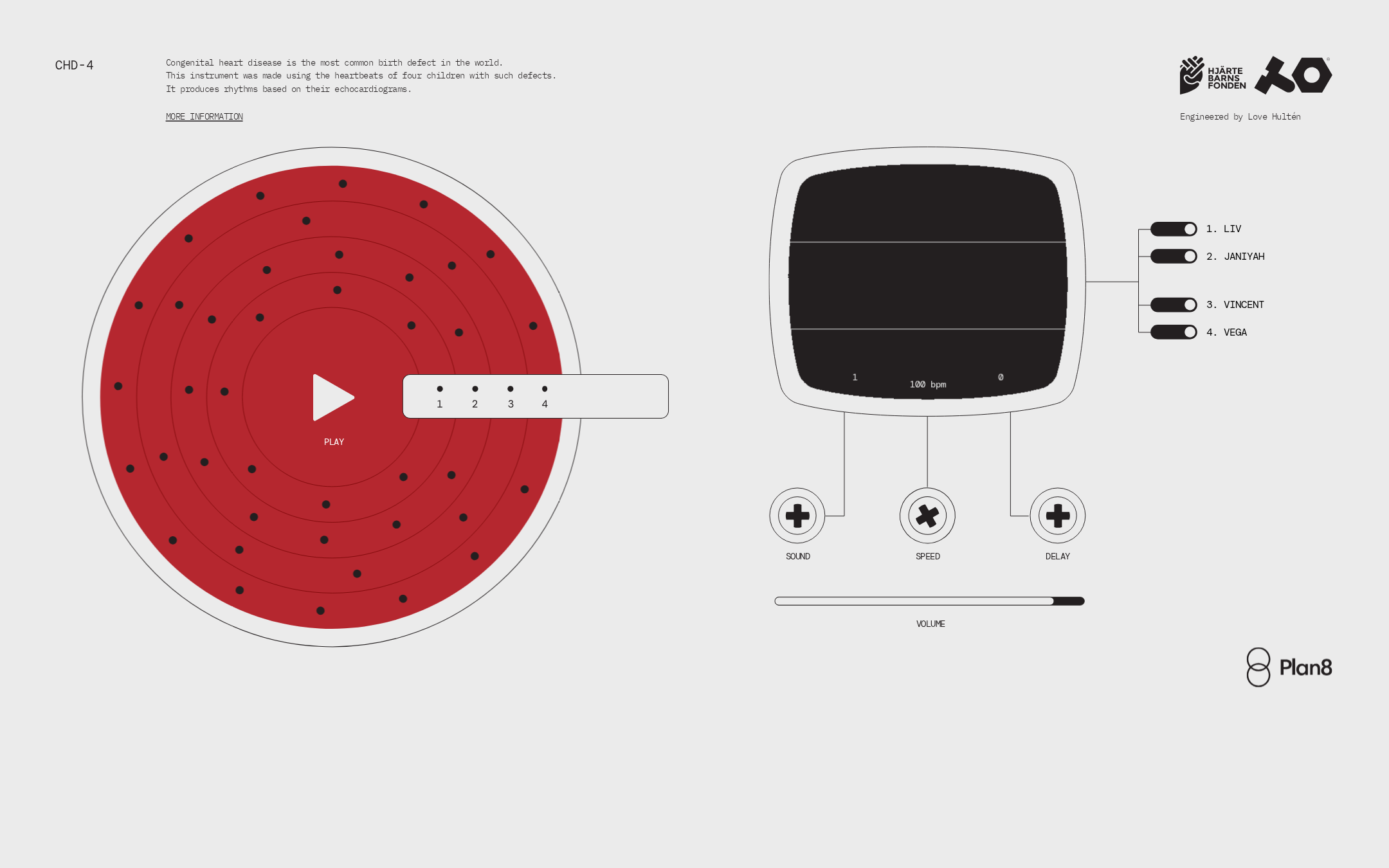
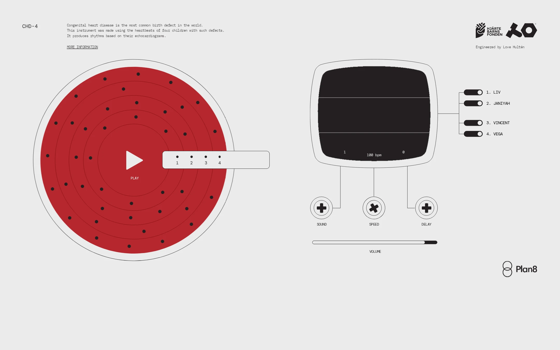
A highly resolved art direction with a rare and coherent connection between subject matter and interface form. The screen feels authored rather than assembled from generic product patterns.
What works
- The circular red sequencer creates an immediate focal point and a strong association with heartbeat data.
- The monitor, knobs, channel switches, and wiring-like connectors form a convincing instrument vocabulary.
- Generous negative space prevents the dense technical illustration from becoming visually noisy.
- Monospaced labeling and fine outlines consistently support the experimental hardware aesthetic.
Opportunities
- Increase the typographic scale or supporting hierarchy for the explanatory copy.
- Make the interactive affordances more visually distinct from decorative diagram elements.
- Ensure the red focal treatment remains perceivable for users with color-vision differences.
Uniqueness
The translation of congenital heart data into a playable drum-machine interface is unusually specific and gives the page a strong identity. The composition is distinctive without appearing dependent on a generic trend.
What works
- The experience joins social-impact storytelling, data sonification, and instrument design in one visual metaphor.
- The custom schematic presentation is more memorable than a standard awareness campaign layout.
- The four named rhythm sources add a human dimension to an otherwise technical interface.
Opportunities
- Explain the relationship between the source names, heart defects, and generated rhythms more explicitly.
- Use supporting storytelling to deepen the human context without weakening the deliberately spare art direction.
User experience
The primary action is easy to locate in the screenshot, but the interface relies on visual interpretation and offers limited visible instruction. Accessibility findings materially reduce the experience's inclusiveness.
What works
- The large play control establishes a clear first action.
- The numbered source selector and channel list suggest a manageable set of choices.
- Information and attribution are available without dominating the instrument.
Opportunities
- Add concise instructions for selecting sources, changing controls, and understanding the monitor output.
- Give every custom control a visible and programmatic name, state, and focus treatment.
- Increase the legibility of small labels and verify the layout at mobile widths.
- Provide non-visual or textual equivalents for the canvas and SVG-driven information where appropriate.
Conversion optimization
For an awareness and interactive-art homepage, conversion means initiating play, understanding the cause, and continuing to learn. The design strongly supports experimentation but could connect play to education more deliberately.
What works
- The interactive object is the dominant element, minimizing friction to experimentation.
- The information link is visible near the introductory explanation.
- Partner and creator attribution supports credibility and context.
Opportunities
- Pair the play invitation with a short outcome-oriented explanation of what the visitor will hear.
- Make the information path more prominent after or alongside the initial interaction.
- Offer a clear next step toward learning about congenital heart disease or supporting the associated organization.
- Clarify whether the four channels represent separate children, rhythm tracks, or selectable recordings.
What we'd improve
- 01high
Repair semantic and assistive-technology labeling
Add a descriptive page heading, meaningful names for all linked images and custom controls, a label for the range input, and text alternatives for important canvas or SVG information. Re-test keyboard focus order and state announcements.
- 02high
Improve instructional clarity
Add a compact instruction block explaining how to start playback, select a child or rhythm, adjust sound controls, and interpret the monitor. Keep it visually subordinate to the instrument.
- 03high
Resolve contrast and small-type risks
Correct the reported contrast failure and review the smallest labels against their backgrounds. Preserve the technical aesthetic while providing a more readable default and a clear focus state.
- 04medium
Strengthen the awareness pathway
Connect the interactive result to the congenital-heart-disease context with a clear, adjacent route to more information and the relevant organization, rather than leaving education behind a low-emphasis link.
- 05medium
Verify responsive and reduced-motion behavior
Test the layered instrument on narrow screens, confirm that controls remain usable without overlap, and provide a reduced-motion treatment for transitions or playback feedback.