Monika Michalczyk website analysis
A detailed critique of the homepage's craft, originality, usability, and ability to move visitors toward its intended goal.
Our observations
A visually distinctive and publishable portfolio homepage with excellent art direction and strong contrast, held back by limited visible project discovery and an unusually sparse first-screen information architecture.
Best practices
The page is structurally disciplined, has one detected H1, no detected duplicate IDs or heading skips, and uses a concise identity hierarchy. The absence of a detected main landmark is a semantic opportunity, although automated checks alone cannot establish full accessibility quality.
What works
- Clear single-purpose hero presentation with one detected H1.
- No detected contrast failures across the supplied samples.
- No detected duplicate IDs or heading-order skips.
- The contact path is visible within the primary focal element.
Opportunities
- Add a semantic main landmark around the principal content.
- Make the portfolio work or navigation destination more explicit from the first screen.
- Verify focus states, link labeling, image alternatives, and keyboard behavior outside the supplied automated observations.
Design
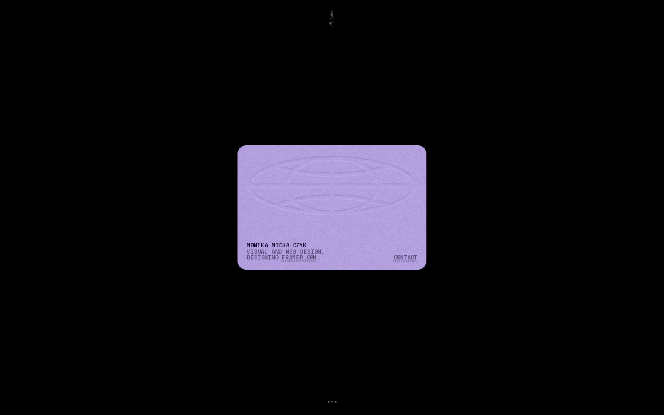
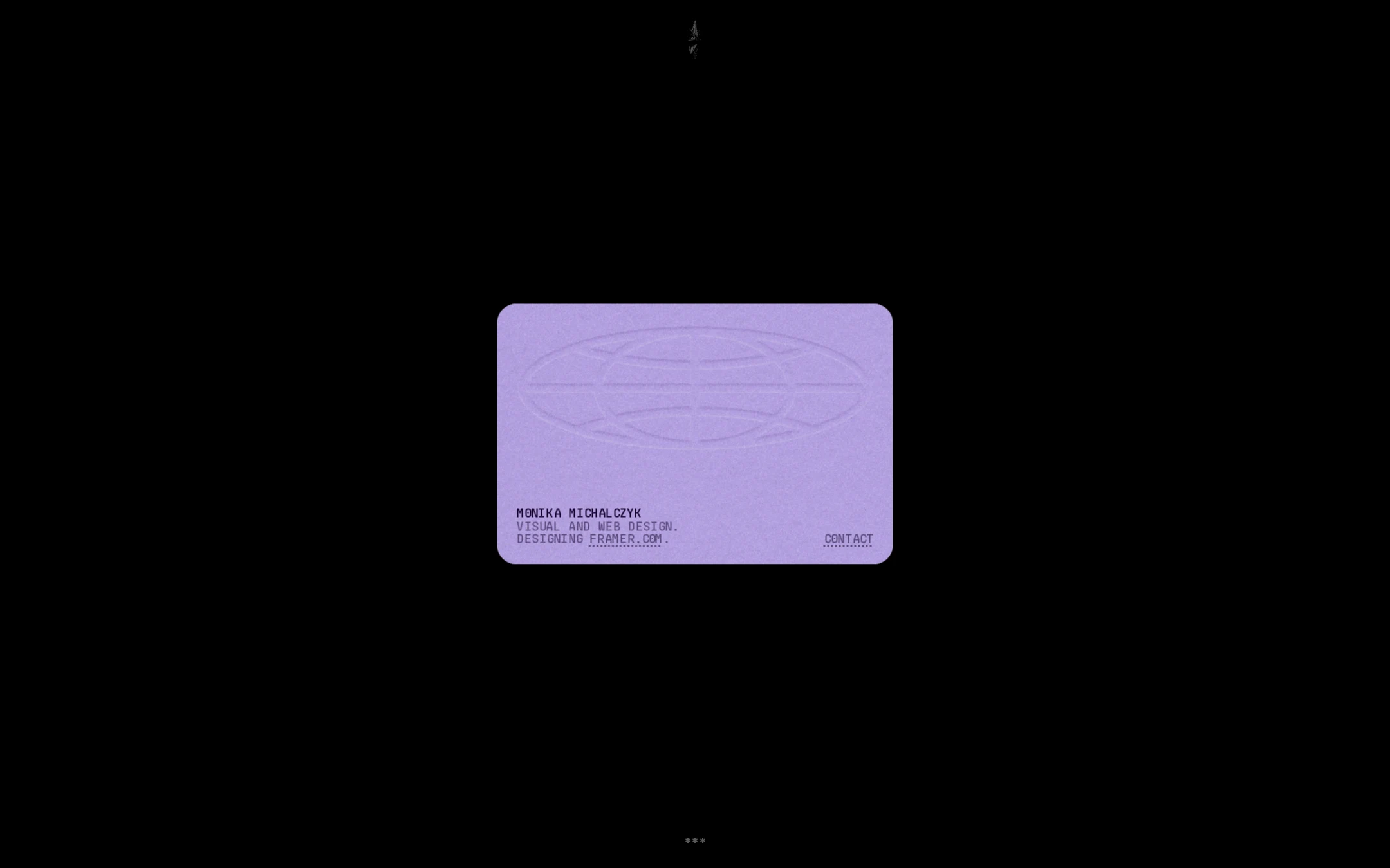
The composition is exceptionally cohesive and memorable, using scale, negative space, and a restrained accent color instead of conventional portfolio decoration. The card reads as a crafted identity object and gives the page a strong point of view.
What works
- Strong black-and-lavender contrast establishes an immediate visual signature.
- Large negative space gives the central card unusual prominence.
- Monospaced uppercase typography supports the technical, editorial tone.
- Rounded card geometry provides a controlled softness against the severe background.
Opportunities
- Increase the card’s informational richness slightly without losing its restraint.
- Provide a clearer visual relationship between the introductory card and the designer’s body of work.
- Ensure the faint peripheral marks remain meaningful and do not appear like unexplained interface artifacts.
Uniqueness
The page is highly differentiated from typical designer portfolios through its near-empty black field, miniature typographic card, and artifact-like presentation. Its restraint feels deliberate rather than generic.
What works
- The composition has a recognizable central conceit rather than relying on a standard grid or gallery hero.
- The limited palette and compact type treatment form a coherent authorial signature.
- The introduction behaves like a collectible visual object, which is unusual for a portfolio homepage.
Opportunities
- Extend the distinctive identity into project presentation so the uniqueness is sustained beyond the opening view.
- Use a consistent but accessible system for revealing work, capabilities, or process.
User experience
The initial message is legible and focused, but the visible experience is intentionally opaque. Visitors can identify the designer and find contact information, yet the screenshot does not show how to inspect work or understand the designer’s offering.
What works
- The primary message is uncluttered and easy to isolate visually.
- The contact link is positioned inside the main identity surface rather than hidden in a distant navigation bar.
- The limited number of elements reduces cognitive overload.
Opportunities
- Expose a clear route to selected work, case studies, or an archive.
- Clarify whether the card itself is interactive and what other areas of the page do.
- Test the experience at smaller viewports, where the very small type and large empty field may reduce orientation.
Conversion optimization
For a personal portfolio, the page succeeds as a memorable calling card and offers a direct contact route. It is less effective as an evaluation funnel because the visible first screen provides little evidence of work quality, services, or relevance to a prospective client or employer.
What works
- The designer’s name and role are immediately presented.
- Contact is available without requiring visitors to search through a conventional navigation structure.
- The strong visual identity can improve recall and perceived intentionality.
Opportunities
- Add a prominent, low-friction path to selected projects or an archive.
- Include a concise indication of availability, services, or engagement type if client acquisition is a goal.
- Pair the visual introduction with enough work context to support an informed contact decision.
What we'd improve
- 01high
Add a direct path into the work
Introduce an unmistakable way to reach selected projects or a work archive from the hero, while preserving the centered-card concept and sparse visual field.
- 02high
Strengthen first-screen context
Add one short supporting statement that clarifies the designer’s focus, services, or current availability so visitors can understand relevance without relying only on the title card.
- 03medium
Improve semantic structure
Use a semantic main landmark and verify that the contact link, image content, and any interactive card behavior have clear accessible names and keyboard-visible states.
- 04medium
Validate small-screen readability
Review the compact typography, card dimensions, and large negative-space treatment on narrow screens and at increased text sizes.
- 05low
Make peripheral details purposeful
Ensure the faint top and bottom marks communicate identity or interaction; otherwise reduce them so they do not compete with the primary message.