

Index_Georgia website analysis
A detailed critique of the homepage's craft, originality, usability, and ability to move visitors toward its intended goal.
Our observations
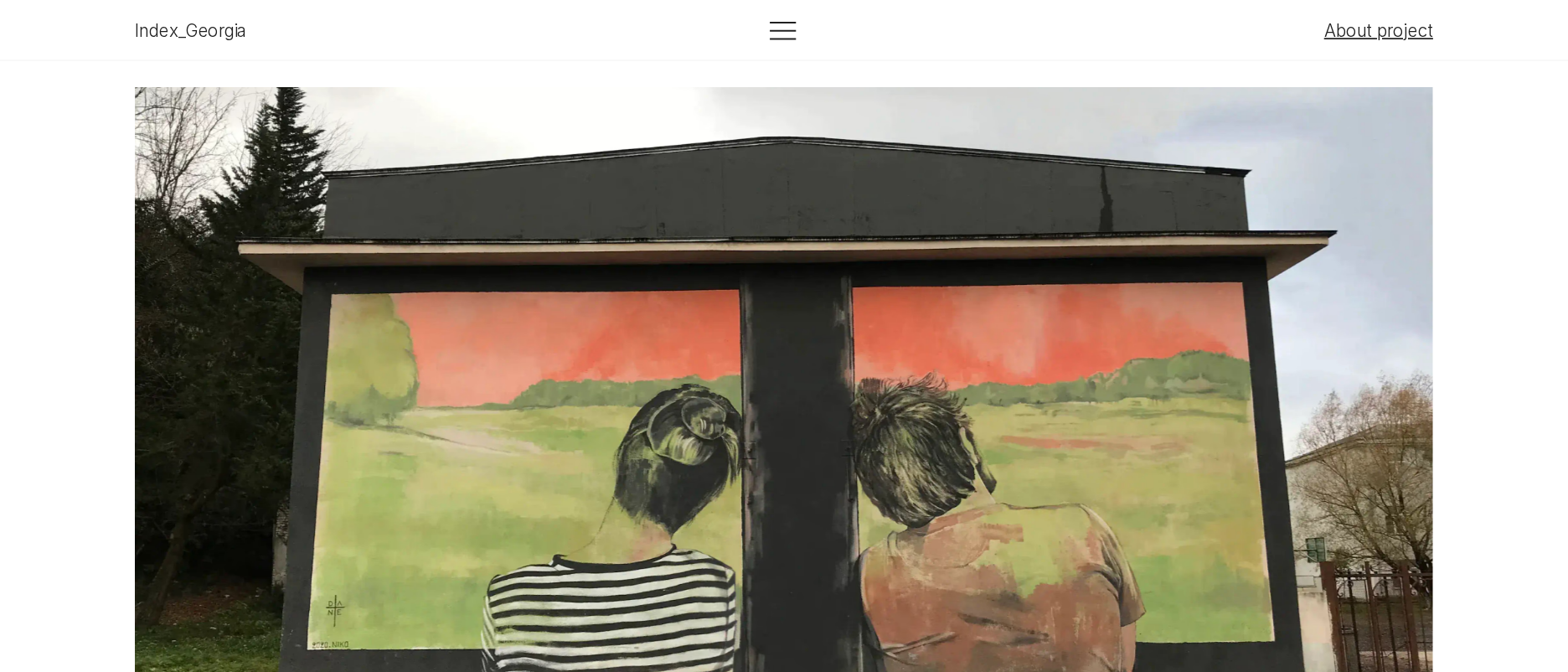
A strong, distinctive editorial archive whose restrained interface supports the artwork well, with legibility and wayfinding as the main areas for refinement.
Best practices
The page has a clear single h1, one main landmark, no duplicate IDs, and no detected heading skips. Its simple structure and descriptive image text support a solid baseline, although one serious contrast issue remains.
What works
- Semantic navigation and main content landmarks are present.
- The page has one clear introductory h1.
- No duplicate IDs or heading skips were detected.
- Image descriptions are supplied for the sampled artwork images.
Opportunities
- Resolve the reported serious text-contrast failure on the link identified by the accessibility audit.
- Verify keyboard focus visibility and interaction order for navigation and photo controls.
- Confirm that captions and image controls remain accessible when the archive is viewed at narrow widths.
Design
The restrained editorial system is coherent and lets the varied artwork carry the visual identity. The long page has a considered documentary character, though the dense small-scale text can reduce visual comfort.
What works
- Strong contrast between a neutral interface and colorful artwork photography.
- Consistent use of spacing, typography, and image-led editorial groupings.
- The varied image arrangements create rhythm without relying on decorative effects.
- The overall presentation feels purpose-built for cultural documentation.
Opportunities
- Increase typographic scale or spacing in the densest caption and metadata areas.
- Introduce clearer visual section markers so the long archive is easier to scan.
- Review image crops and alignment as a unified system while preserving the individuality of each entry.
Uniqueness
The site has a clear point of view: it treats Georgian street art as an organized visual record rather than a generic portfolio. Its uniqueness comes primarily from the subject matter and archival framing.
What works
- A specific geographic and cultural focus gives the collection a strong identity.
- The catalog-like treatment is more distinctive than a conventional masonry portfolio.
- The contrast between quiet interface design and expressive murals is effective.
Opportunities
- Make the archive's curatorial criteria and geographic scope more explicit near the beginning.
- Add stronger contextual signals such as dates, locations, artists, or categories where available.
- Consider a distinctive but restrained index or map view to deepen the archival character.
User experience
The page supports slow visual exploration, but the extensive vertical sequence and small text create friction for users who want to locate a particular work or understand the collection quickly.
What works
- The introductory statement immediately establishes the archive's purpose and date range.
- A predictable vertical reading flow suits documentary browsing.
- The artwork remains the dominant content throughout the experience.
- Navigation and photo controls appear visually uncomplicated.
Opportunities
- Add a persistent or highly visible contents/index mechanism for jumping between archive sections.
- Provide clearer labels for image groups and ensure photo-navigation controls communicate their full state.
- Improve scanability with consistent metadata placement and stronger section headings.
- Test the experience with keyboard, touch, zoom, and reduced-width layouts.
Conversion optimization
For a cultural archive, conversion is better understood as encouraging exploration, attribution, and return visits. The page establishes purpose well but offers limited visible orientation and few explicit next steps in the supplied evidence.
What works
- The focused premise gives visitors a reason to continue into the archive.
- Artist and project links create pathways to related context.
- The image-rich presentation encourages prolonged visual engagement.
Opportunities
- Add a clear archive index or filtering path to turn interest into deeper exploration.
- Surface project information, credits, and locations without forcing visitors to infer context from captions.
- Offer a concise closing invitation to continue browsing, share the archive, or learn about the project.
- Make external and internal link states visibly distinct and verify their contrast.
What we'd improve
- 01high
Fix the identified contrast failure
Adjust the affected link treatment so text and its background meet an appropriate contrast target, then re-test adjacent link states and image-caption combinations.
- 02high
Improve long-page orientation
Add a compact contents index, section labels, or a persistent archive navigation pattern so visitors can move directly to periods, locations, artists, or thematic groupings.
- 03high
Increase caption legibility
Review the smallest editorial text for size, line height, and spacing, especially in dense multi-column groups. Validate readability at browser zoom and on narrow screens.
- 04medium
Clarify archival metadata
Standardize the placement of artist, title, year, location, and source information so each work can be understood and credited without relying on surrounding prose.
- 05medium
Strengthen image interaction cues
Make enlargement or previous/next behavior explicit through visible labels, consistent controls, and keyboard-accessible focus states.
- 06low
Add a meaningful closing pathway
End the archive with a concise project note, credits, and related links that support continued research without competing with the artwork.