BAO London website analysis
A detailed critique of the homepage's craft, originality, usability, and ability to move visitors toward its intended goal.
Our observations
A distinctive and commercially credible restaurant homepage with strong editorial art direction, held back from an exceptional rating by accessibility defects, very small supporting text, and a less prominent booking path than the supplied metadata suggests.
Best practices
The page has a clear semantic main structure, one detected H1, recognizable navigation, and a dedicated footer, but automated checks identify several material accessibility issues.
What works
- A single H1 is present for the primary restaurant proposition.
- The page has recognizable hero, content, footer, navigation, and form regions.
- Primary links and buttons use consistent, visually identifiable pill treatments.
- The site presents multiple routes into the brand: restaurants, food, karaoke, story, careers, and newsletter.
Opportunities
- Repair the unnamed header link and provide accessible naming for the two form controls.
- Resolve the three documented text-contrast failures, especially white text over imagery and low-contrast footer copy.
- Replace duplicate SVG IDs and correct the heading-level skip in the navigation content.
- Increase the legibility and touch comfort of the very small header and footer text at narrow widths.
Design
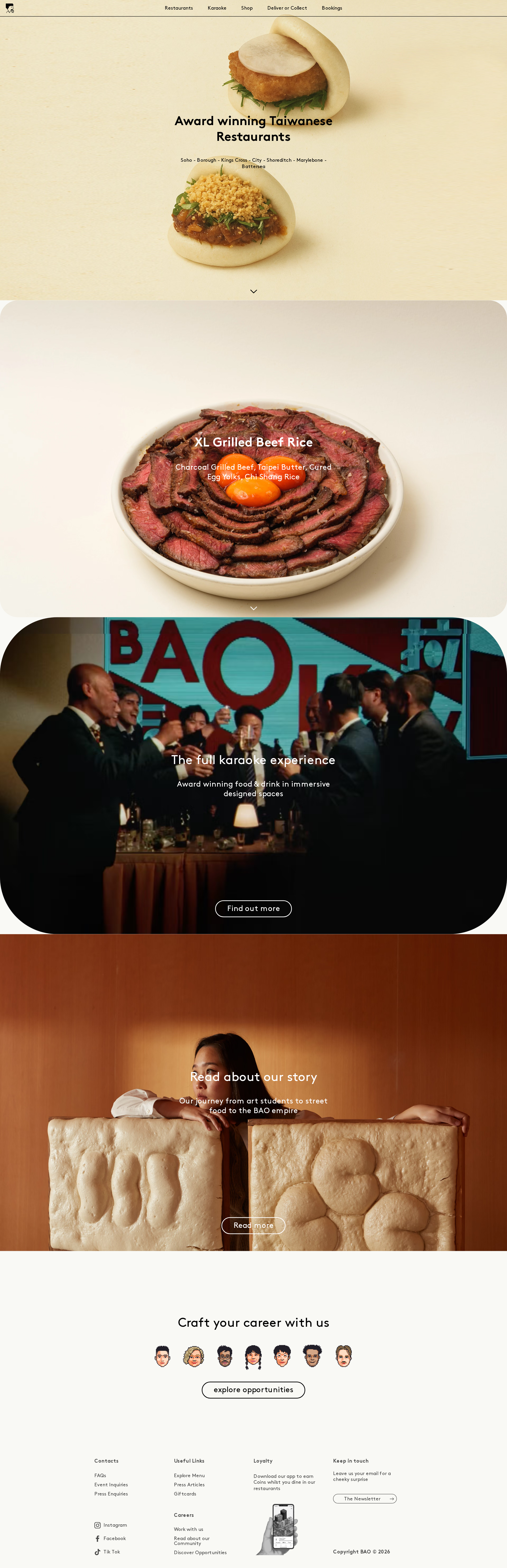
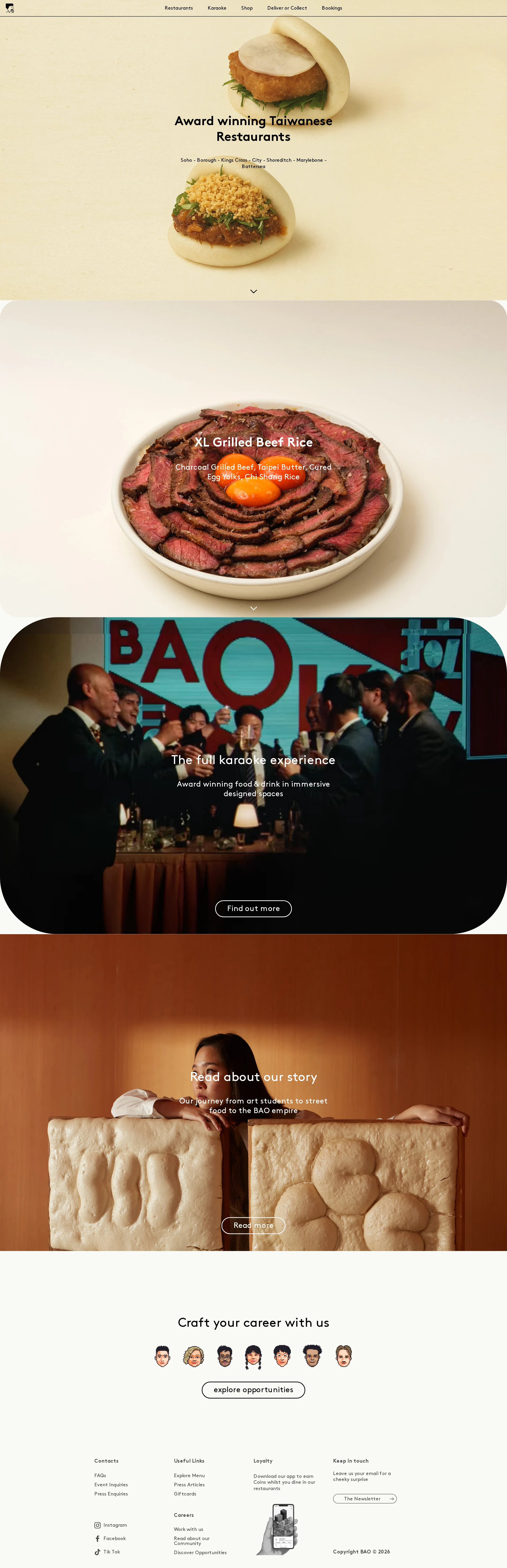
The visual design is highly coherent and memorable, using food photography, restrained typography, and a warm editorial rhythm to express the restaurant brand.
What works
- The hero immediately communicates Taiwanese food through large, centered product imagery.
- The sequence from signature dish to karaoke to brand story creates a clear brand narrative.
- The limited palette and repeated centered alignment produce strong visual consistency.
- Rounded image panels soften the otherwise minimalist layout and provide a recognizable structural motif.
Opportunities
- Give the booking and ordering actions more visual prominence in the hero, rather than relying primarily on navigation.
- Improve overlay readability with stronger image treatment or a more deliberate text-safe area.
- Consider slightly stronger typographic differentiation between section headings and supporting copy to improve scanability.
Uniqueness
The combination of sculptural food photography, playful hospitality culture, and restrained editorial layout gives the homepage a recognizable point of view.
What works
- Food is treated as the primary visual subject rather than as generic restaurant decoration.
- The karaoke section expands the brand beyond dining into a social entertainment experience.
- The unusual careers presentation with illustrated staff portraits adds personality to an otherwise pared-back system.
Opportunities
- Make the relationship between the restaurant locations and the homepage story more distinctive and immediately discoverable.
- Use a more ownable treatment for booking and ordering interactions so the conversion layer feels as authored as the imagery.
User experience
The content journey is easy to understand and visually engaging, but small supporting text, contrast issues, and a relatively hidden primary task create friction.
What works
- The vertical sequence is straightforward and requires little cognitive overhead.
- Each major content chapter has a concise title and supporting action.
- The page balances food, atmosphere, story, and recruitment content without feeling overcrowded.
Opportunities
- Expose booking, delivery, and location selection earlier in the page hierarchy.
- Ensure overlay copy remains readable across the varied photographic backgrounds.
- Audit keyboard focus, submenu behavior, form labeling, and mobile menu semantics in addition to the detected markup issues.
- Improve heading hierarchy so navigation headings do not skip levels.
Conversion optimization
The page is persuasive for brand discovery and restaurant consideration, but its most valuable transactional actions are not sufficiently dominant in the visible hero.
What works
- The signature dish section creates appetite and gives the brand an immediate product anchor.
- Karaoke and story sections provide differentiated reasons to visit beyond a standard restaurant pitch.
- Calls to action are concise and visually consistent.
- The newsletter form and careers block support longer-term audience and recruitment goals.
Opportunities
- Add a persistent or prominent hero-level choice between booking a restaurant and ordering delivery.
- Pair restaurant discovery with location-specific booking actions rather than leaving the user to navigate through broad menu categories.
- Clarify whether the karaoke CTA leads to room booking, package information, or general discovery.
- Use concise reassurance near the primary CTA, such as location coverage or booking availability, only where factually supported.
What we'd improve
- 01high
Make booking and ordering primary hero actions
Add clearly labeled, high-visibility actions for booking a table and ordering delivery within or immediately below the hero. Keep restaurant discovery available, but do not make users infer the next step from the navigation.
- 02high
Complete the accessibility remediation pass
Add accessible names to the unnamed link and both form controls, fix the documented contrast failures, remove duplicate SVG IDs, and correct the heading hierarchy. Re-test keyboard navigation and focus visibility afterward.
- 03medium
Improve text readability over photography
Introduce consistent text-safe areas, image overlays, or alternate text colors for the photographic sections where the automated audit found contrast failures. Verify the treatment across every responsive crop.
- 04medium
Strengthen location discovery
Surface the restaurant locations and their relevant booking paths closer to the top of the homepage so visitors can move from brand interest to a specific venue with fewer navigation steps.
- 05low
Increase supporting-text scale at small viewports
Review header, footer, newsletter, and secondary copy sizing on narrow screens. Preserve the minimal aesthetic while improving legibility and tap-target clarity.