Atomo Management website analysis
A detailed critique of the homepage's craft, originality, usability, and ability to move visitors toward its intended goal.
Our observations
A visually strong and distinctive agency landing page with an excellent editorial point of view. Its primary opportunities are semantic accessibility, clearer purpose-setting for new visitors, and a more explicit conversion route.
Best practices
The page has strong visual hierarchy and a clear category-based navigation system, but structural accessibility evidence is incomplete.
What works
- Navigation categories are immediately visible and aligned with the agency’s apparent services.
- The high-contrast black interface on a light field remains legible in the supplied screenshot.
- The composition is focused and avoids unnecessary interface clutter.
Opportunities
- Add a meaningful h1 and a main landmark so the page has a clear document structure.
- Declare the document language and provide an accessible name for the unnamed navigation link.
- Confirm that the canvas imagery has an appropriate alternative or equivalent text-based experience.
Design
The homepage has a polished, art-directed identity that feels appropriate to a contemporary creative representation agency.
What works
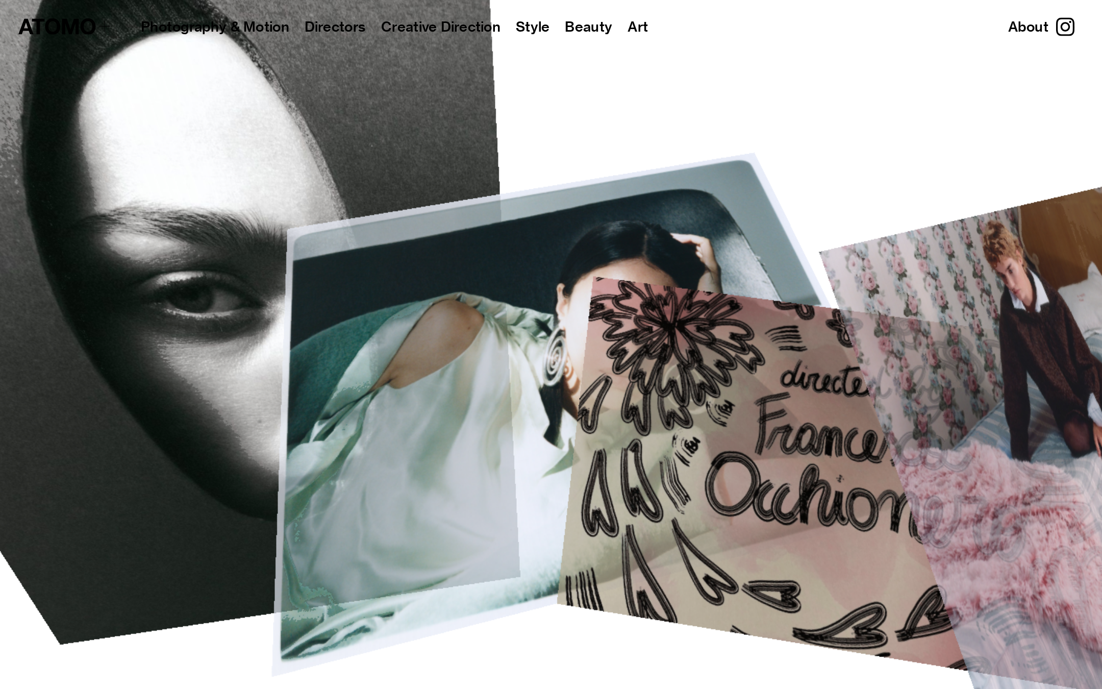
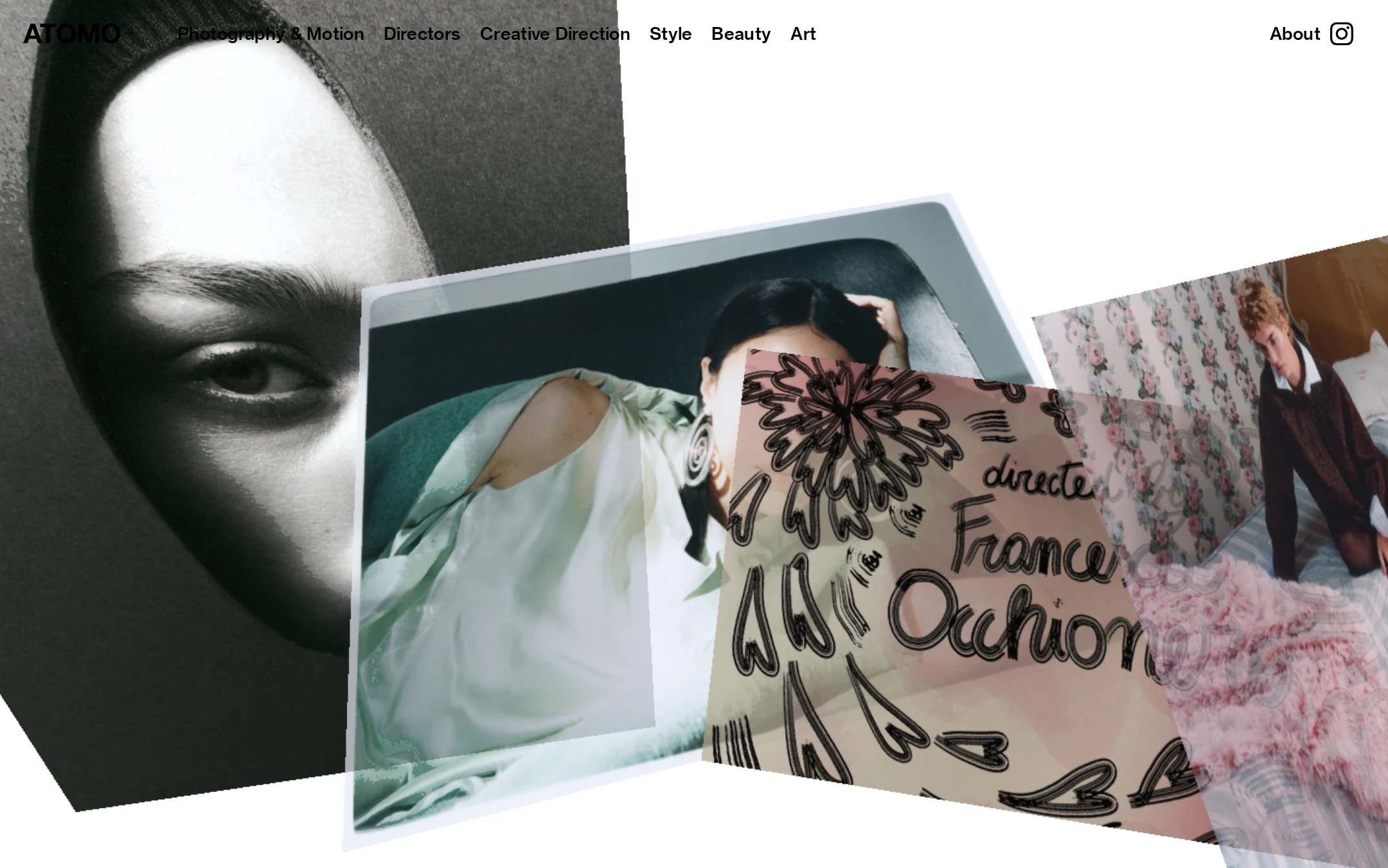
- The collage establishes atmosphere and category breadth immediately.
- Asymmetrical image layering creates depth and a memorable opening frame.
- The restrained interface allows the portfolio imagery to remain the dominant brand asset.
Opportunities
- Reduce competing focal points or introduce a subtle reading order for users who need clearer visual prioritization.
- Ensure the wordmark and navigation remain legible over every responsive crop and image state.
Uniqueness
The layered photographic treatment gives the page a recognizable editorial character rather than presenting a generic agency grid.
What works
- The combination of portraiture, tilted image planes, and handwritten visual texture creates a distinctive opening statement.
- The page expresses the agency’s creative domain through art direction instead of generic promotional copy.
Opportunities
- Extend the same point of view into project detail and roster pages so the landing-page identity feels like part of a complete system.
- Use original supporting interactions or editorial transitions carefully if introduced, rather than relying only on familiar portfolio patterns.
User experience
The visible navigation is easy to locate and appears to provide direct routes into key disciplines, but the screenshot offers limited orientation and the technical evidence identifies meaningful accessibility gaps.
What works
- The top navigation exposes major content areas without requiring discovery.
- Labels such as Photography & Motion, Directors, and Creative Direction are specific and understandable.
- The visual presentation is focused on the agency’s likely audience of commissioning and creative professionals.
Opportunities
- Add a short, accessible introduction explaining Atomo’s role and geographic or service scope.
- Give the social icon an explicit accessible label and verify keyboard focus visibility.
- Test the fixed canvas and overlaid navigation on narrow screens, zoomed layouts, and reduced-motion settings.
Conversion optimization
The page is effective as a reputation-building visual statement, but its next step for prospective clients is not apparent in the supplied homepage view.
What works
- The category navigation can quickly route visitors toward relevant talent disciplines.
- The immediate display of high-quality work supports credibility for an image-led agency.
- The About route provides at least one path to additional context.
Opportunities
- Add a clearly discoverable contact, bookings, or commissioning action for prospective clients.
- Pair the visual opening with concise positioning copy and a proof point such as locations, roster scope, or selected client work.
- Make the intended journey from category browsing to enquiry explicit without compromising the editorial composition.
What we'd improve
- 01high
Repair document semantics and link labeling
Add a meaningful h1 and main landmark, set the html lang attribute, and provide an accessible name for the unnamed navigation or social link. Recheck the result with keyboard and screen-reader navigation.
- 02high
Create a visible commissioning pathway
Introduce a clearly labeled Contact, Bookings, or Enquiries action near the primary navigation or within the About destination so prospective clients have an obvious next step.
- 03medium
Add concise orientation copy
Use a short accessible introduction to explain Atomo Management’s representation and creative-content offering, while keeping the collage as the visual lead.
- 04medium
Validate responsive composition
Review the canvas crop, navigation wrapping, image overlap, touch target sizing, and contrast at mobile widths, zoom levels, and high-text-size settings.
- 05low
Define an accessible image experience
Document meaningful alternative text or adjacent text equivalents for the visual centerpiece, particularly if the canvas contains portfolio work that conveys agency information.