Leichtfried website analysis
A detailed critique of the homepage's craft, originality, usability, and ability to move visitors toward its intended goal.
Our observations
A visually accomplished, premium textile homepage with strong editorial composition, but it requires substantial accessibility remediation before it can be considered gallery-ready without qualification.
Best practices
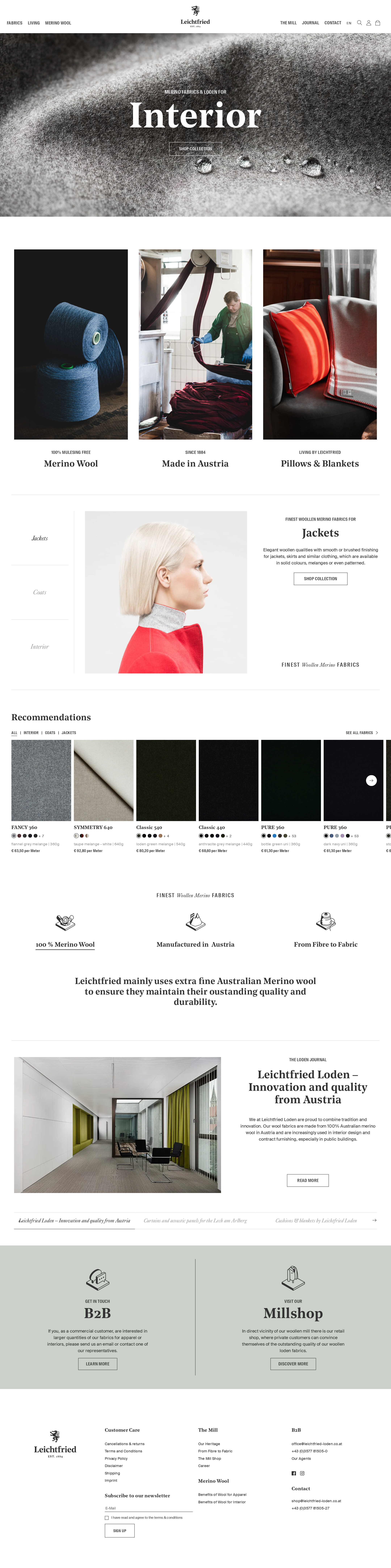
The page has a coherent content structure, one main landmark, a semantic footer, clear commercial pathways, and repeated calls to action. However, the automated accessibility score is 48, with serious naming, labeling, contrast, and heading issues.
What works
- The homepage has one main landmark and one semantic footer.
- Primary paths for fabrics, apparel, interior, B2B, and the mill are visibly represented.
- Buttons and links use a consistent outlined treatment that supports brand consistency.
- There are no duplicate IDs or heading skips in the supplied evidence.
Opportunities
- Add a descriptive h1 that communicates the page's primary proposition.
- Provide accessible names for the logo, search, account, cart, and product-image links.
- Associate visible or programmatic labels with the search and newsletter controls.
- Audit the 74 reported contrast failures, especially light-gray submenu text and translucent navigation states.
Design
The design is restrained, distinctive, and well matched to a premium textile manufacturer. It balances tactile photography, old-world serif typography, and precise editorial spacing without relying on decorative excess.
What works
- The material-focused imagery gives the homepage a strong sensory identity.
- The contrast between oversized serif display type and condensed utility typography feels appropriate for fashion and manufacturing.
- The progression from product discovery to process, heritage, and service content is visually coherent.
- The sage B2B and mill-shop panel introduces warmth without breaking the restrained palette.
Opportunities
- Increase the visual prominence of supporting copy where the screenshot makes it difficult to scan at normal viewing distance.
- Make the active state in tabs and carousels more visually explicit than a subtle rule or color change.
- Consider a more distinctive treatment for the primary conversion path so commerce actions do not compete equally with editorial links.
Uniqueness
The combination of Austrian mill heritage, textile close-ups, documentary production imagery, and luxury editorial typography gives the page a clear point of view. Its restrained fashion-art-direction language is strong, though some interaction patterns remain familiar.
What works
- The homepage connects raw fiber, production, apparel, interiors, and retail in one narrative.
- The manufacturing imagery adds credibility beyond a conventional lifestyle-fashion presentation.
- The typography and textile photography create a recognizable premium craft position.
Opportunities
- Use more signature visual cues tied to the mill's process or regional identity in navigation and section transitions.
- Differentiate the recommendation and journal modules further; their carousel conventions are common across commerce sites.
User experience
The information architecture appears broad and purposeful, but small type, low contrast, extensive navigation, and carousel-heavy presentation may make key paths harder to use. The absence of a detected h1 and numerous unnamed controls are significant usability concerns.
What works
- Users can enter through multiple relevant intents, including apparel, interior, mill history, B2B, and shop content.
- The three-card discovery section offers a quick orientation after the hero.
- Product recommendations expose imagery, names, prices, and color variation cues.
Opportunities
- Add a clear page-level heading and a concise introductory proposition near the top of the document.
- Ensure every carousel has an accessible label, keyboard controls, current-slide state, and a non-motion alternative.
- Increase minimum text sizes and contrast for navigation, metadata, and supporting descriptions.
- Test mobile layouts for menu discoverability, product-card density, and horizontal carousel usability.
Conversion optimization
For a combined brand and commerce homepage, the page offers credible conversion routes without sacrificing editorial tone. Calls to action such as shopping collections, discovering more, and entering the B2B or mill shop areas are present, but the initial hero and supporting content distribute attention across many goals.
What works
- Commerce is introduced early through apparel, interior, and product recommendation pathways.
- The product carousel includes useful purchase-oriented details such as price and color variations.
- B2B and Mill Shop panels address distinct high-intent audiences near the lower part of the page.
- The process and heritage content can build trust for a considered textile purchase.
Opportunities
- Define one primary above-the-fold action for the most commercially important audience, then use secondary actions for brand exploration.
- Add concise proof points near product and B2B calls to action, such as lead times, sampling, certifications, or order guidance if applicable.
- Make product cards and collection links fully named and accessible so visual browsing does not become the only route to conversion.
- Provide persistent or repeated access to the shop and inquiry/contact paths after the editorial sections.
What we'd improve
- 01high
Repair the document and control accessibility foundation
Add one meaningful h1, label search and newsletter fields, give the logo/search/account/cart and product-image links accessible names, and re-run a contrast audit across navigation, menus, overlays, and muted metadata.
- 02high
Make carousel content operable without visual interpretation
Give each hero, product, content, and journal carousel an accessible label, keyboard-operable previous/next controls, visible focus states, slide status, and a static or reduced-motion fallback.
- 03high
Strengthen the primary conversion route
Choose the dominant homepage goal—shop fabrics, request a sample, or contact the mill—and give it a clearly prioritized hero action while retaining apparel, interior, and heritage as secondary pathways.
- 04medium
Improve scanability of supporting content
Increase the legibility of small navigation, product metadata, and editorial descriptions, and use short descriptive summaries beside major image modules so meaning is not dependent on photography.
- 05medium
Validate responsive behavior and touch interaction
Review mobile header access, hero cropping, card stacking, tab behavior, carousel gestures, focus order, and text scaling at narrow widths; these behaviors were not established by the supplied desktop evidence.
- 06low
Add stronger trust signals at decision points
Place relevant manufacturing, material, provenance, sampling, and service information beside B2B, Mill Shop, and fabric recommendation actions rather than relying on users to infer credibility from the editorial narrative.