John C. Flood website analysis
A detailed critique of the homepage's craft, originality, usability, and ability to move visitors toward its intended goal.
Our observations
Strong service-business foundation with good lead-generation structure, but significant accessibility and semantic issues keep it in review rather than publication.
Best practices
The page includes a single H1, a main landmark, clear service navigation, regional information, trust content, and multiple contact paths. However, the automated audit identifies serious contrast and naming problems alongside structural inconsistencies.
What works
- Clear service and geographic positioning in the hero
- Prominent phone and online-booking actions
- Dedicated trust, testimonial, service-area, and certification content
- Single H1 and one main landmark detected
Opportunities
- Resolve all 23 reported contrast failures, prioritizing navigation, buttons, and text over imagery
- Give every linked image and icon control an accessible name
- Correct the duplicated navigation ID and review heading hierarchy around the H2-to-H4 transition
- Verify keyboard access and focus visibility for navigation, accordion, carousel, and search controls
Design
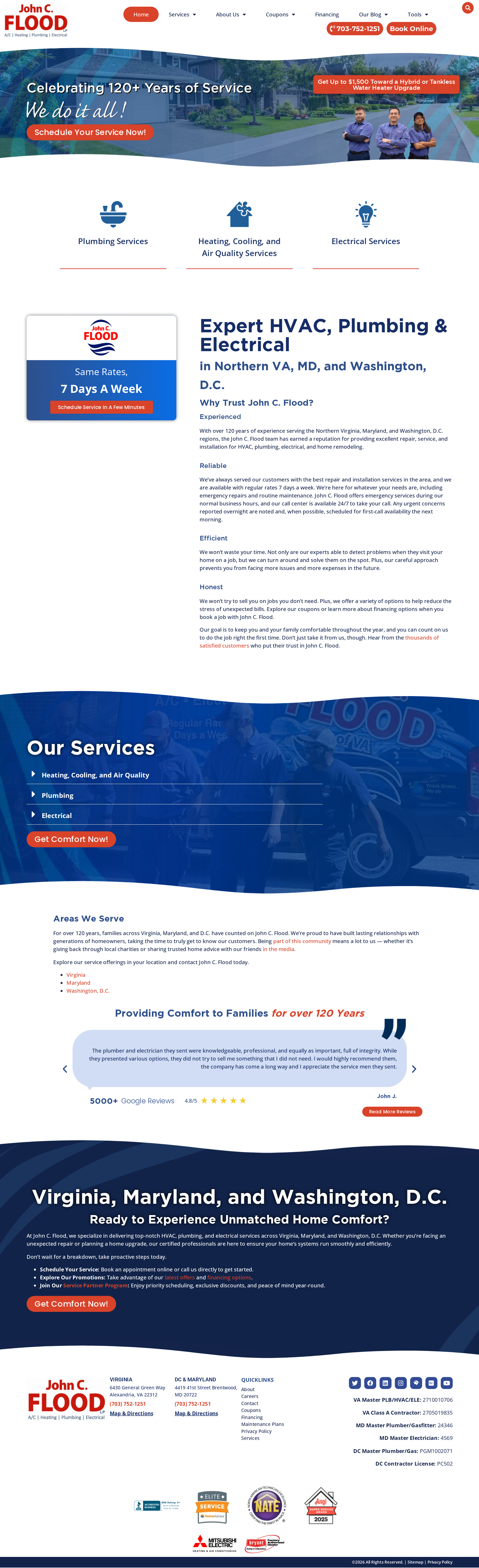
The page has a coherent contractor-oriented visual identity and a clear above-the-fold composition. Its long-form layout, wave transitions, and image-backed sections create variety, although dense copy and mixed typography make later sections feel less refined.
What works
- Consistent blue, red, and white brand expression
- Hero clearly combines service category, geography, offer, and action
- Wave-shaped transitions create continuity across long sections
- Trust elements and certifications are visually integrated into the page
Opportunities
- Reduce the number of competing typefaces and standardize heading treatments
- Increase body-text size or line length control in dense explanatory sections
- Simplify promotional treatments so the main booking action remains dominant
- Use more consistent spacing and card structure between trust, service, and location content
Uniqueness
The page has some recognizable personality through irregular blue section transitions, regional storytelling, and a long-established service brand. Its underlying pattern remains familiar to the home-services category, with conventional service cards, offers, testimonials, and repeated contact prompts.
What works
- Curved section boundaries add a distinctive visual rhythm
- The regional service proposition is visible and specific
- Team imagery, review proof, and certifications support an established local identity
Opportunities
- Develop a more ownable visual motif beyond wave separators and stock-style service imagery
- Make the company history and regional expertise more visually distinctive
- Replace generic promotional patterns with clearer proof of local outcomes and service standards
User experience
The page supplies most information a prospective homeowner needs, including service categories, locations, trust signals, and contact options. The experience is weakened by the length of the page, dense text, competing calls to action, and reported accessibility defects.
What works
- Service categories are immediately discoverable
- Geographic coverage is explicit
- Phone, booking, consultation, and service CTAs appear throughout the page
- Testimonials and credentials reduce uncertainty
Opportunities
- Create a clearer priority path for emergency service, routine booking, and quote-seeking visitors
- Shorten or progressively reveal dense trust and location copy
- Ensure image-only links, accordions, carousel controls, and search controls have meaningful accessible labels
- Test the multi-column content and footer at mobile widths before release
Conversion optimization
For a regional contractor homepage, the conversion structure is strong: the hero offers immediate scheduling, the header exposes phone contact and online booking, and the page repeatedly reinforces trust and service coverage. Conversion clarity is reduced by several competing offers and by limited visible qualification detail near the primary actions.
What works
- Phone number and online booking are visible in the header
- Hero includes a direct scheduling CTA and promotional offer
- Trust claims, reviews, service areas, and certifications support decision-making
- Repeated calls to action provide multiple opportunities to convert
Opportunities
- Separate emergency, scheduled maintenance, and replacement journeys more clearly
- Add concise expectations near primary CTAs, such as service timing, coverage, or next steps
- Use one dominant primary CTA label across major sections
- Improve contrast and accessible naming so conversion controls remain usable for all visitors
What we'd improve
- 01high
Remediate accessibility defects before publication
Fix the 23 reported contrast failures, add alternative text to the missing image, provide accessible names for all eight unnamed links, repair duplicate navigation IDs, and correct the heading-level skip. Re-run keyboard, screen-reader, and contrast checks after changes.
- 02high
Clarify the primary conversion path
Define distinct paths for urgent repair, routine service, and replacement or upgrade inquiries. Keep phone contact and booking prominent, but reduce competing offer treatments and use consistent action labels.
- 03medium
Improve content density and hierarchy
Break the long trust narrative into shorter summaries with expandable detail or supporting proof points. Standardize heading levels and reduce the number of type families used across controls and content.
- 04medium
Validate responsive behavior
Audit navigation, hero offer panels, service controls, testimonial content, and the certification-heavy footer at narrow widths. Confirm that text does not become too small, controls remain comfortably tappable, and no horizontal overflow occurs.
- 05low
Strengthen distinctive regional storytelling
Use more original local photography, service-team details, and outcome-focused evidence to make the brand feel less like a conventional contractor template while preserving its established trust cues.