

Einride - Intelligent movement website analysis
A detailed critique of the homepage's craft, originality, usability, and ability to move visitors toward its intended goal.
Our observations
A distinctive, visually mature industrial technology homepage with strong editorial hierarchy and clear platform storytelling. It is suitable for gallery consideration, but semantic structure, contrast, link naming, and conversion emphasis should be improved.
Best practices
The page has a coherent hierarchy, clear major sections, and a functional-looking contact/newsletter structure, but the supplied audit reveals important accessibility and semantic gaps.
What works
- The page separates hero, platform capabilities, operational proof, and contact content into understandable sections.
- The platform cards use concise labels and supporting descriptions, making the product scope scannable.
- The footer exposes key product areas and company links rather than hiding all navigation behind a minimal menu.
Opportunities
- The audit reports no detected H1, which weakens page semantics and document navigation.
- Four contrast failures and two unnamed links are marked as serious-impact issues in the supplied accessibility evidence.
- Very small utility and metadata text may reduce readability, particularly in the dark hero and footer.
Design
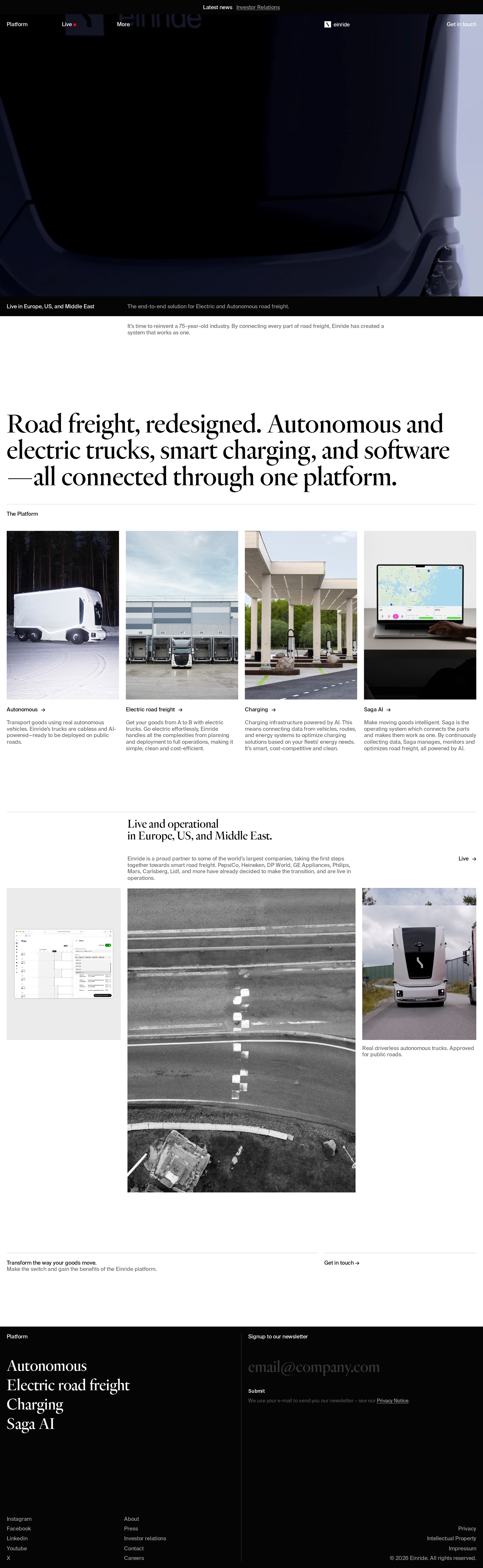
The visual system is highly controlled and well matched to an advanced mobility brand, using contrast, typography, and photography instead of ornamental UI.
What works
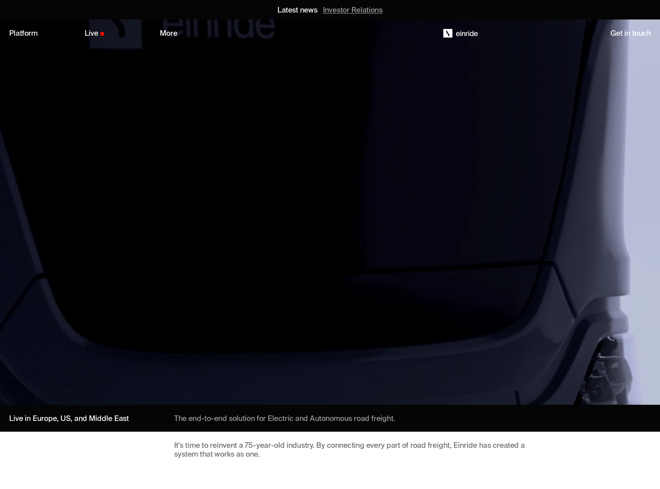
- The cinematic truck image gives the homepage an immediate, memorable point of view.
- The serif display typography creates an editorial voice that differentiates the page from typical logistics and SaaS marketing sites.
- The four-card platform section balances consistency with varied imagery and gives the page a strong visual rhythm.
- The asymmetric operational section adds tension and avoids making the entire page feel like a uniform card grid.
Opportunities
- The hero image is visually powerful but does not appear to communicate the core platform proposition as directly as the large statement that follows.
- Some small captions and metadata recede so far into the composition that the page’s hierarchy can become overly quiet.
- The operational collage could use a stronger visual or typographic cue to clarify the intended sequence.
Uniqueness
The combination of freight technology, cinematic vehicle cropping, and restrained editorial typography gives the homepage a recognizable identity, even though the underlying section patterns are familiar.
What works
- The page treats industrial mobility with an art-directed, magazine-like sensibility rather than a conventional enterprise dashboard aesthetic.
- The juxtaposition of autonomous-truck imagery, road documentation, infrastructure, and software interfaces supports a broad but coherent brand world.
- The stark black, white, and photographic palette is consistent across the experience.
Opportunities
- The platform card pattern and newsletter footer are common marketing conventions and could be made more ownable through richer proof points or interaction.
- The page could express Einride’s operational differentiation more concretely through visible outcomes, customer evidence, or quantified milestones.
User experience
The content path is understandable on desktop, but the sparse utility scale, missing H1, unnamed links, and low-contrast findings create avoidable friction and accessibility risk.
What works
- Visitors can quickly identify the four major platform areas.
- The operational section provides geographic context and moves the narrative beyond product descriptions.
- The footer gives users several routes to continue exploring the company.
Opportunities
- Repair the two unnamed links with accessible names that describe their destination or action.
- Establish one clear H1 for the page and review heading semantics so the document structure matches the visual hierarchy.
- Increase contrast and, where necessary, text size for the four failing text treatments and small footer or metadata copy.
- Validate keyboard focus visibility, image alternative text, mobile reading order, and touch targets in a full accessibility pass; these behaviors are not established by the supplied evidence.
Conversion optimization
The page communicates a compelling category and provides contact and newsletter routes, but the business action is visually subordinate to the brand presentation.
What works
- The positioning statement clearly describes a connected road-freight platform.
- A visible “Get in touch” route appears in the page navigation and lower content area.
- The newsletter form is placed in the footer alongside product navigation, giving engaged visitors a low-commitment next step.
Opportunities
- Make the primary business action more explicit near the opening proposition, such as a contextual contact or solution-exploration CTA.
- Connect each platform category to a clearly labeled next step so visitors can move from awareness to relevant product detail.
- Add concise evidence—such as deployment scale, customer outcomes, or operational milestones—to reduce uncertainty for enterprise visitors.
- Clarify the distinction between contacting Einride, exploring products, and subscribing to updates so the footer does not carry too much conversion responsibility.
What we'd improve
- 01high
Repair semantic and accessible navigation issues
Add a meaningful H1, confirm a logical heading outline, provide accessible names for both unnamed links, and resolve all four reported contrast failures. Re-test with keyboard navigation and a screen reader.
- 02high
Strengthen the opening conversion path
Place one clearly labeled business CTA alongside or immediately after the core platform proposition, then maintain consistent action labels through the platform and operational sections.
- 03medium
Improve proof and decision support
Add compact, verifiable deployment or performance evidence near the operational section so enterprise visitors can assess credibility without relying only on imagery and broad positioning.
- 04medium
Review small-screen and small-type behavior
Inspect the responsive variants for text scaling, image crop, card stacking, focus states, and footer form usability. Pay particular attention to the 12px utility text and low-contrast dark-surface copy.
- 05low
Make the operational story easier to follow
Introduce a clearer section label, numbering, or short connective captions around the asymmetric image composition to establish a more intentional reading sequence.