

The Adrian Brinkerhoff Poetry Foundation website analysis
A detailed critique of the homepage's craft, originality, usability, and ability to move visitors toward its intended goal.
Our observations
A distinctive, publication-quality nonprofit homepage with strong art direction and a credible editorial voice. It is suitable for a curated design gallery, with modest opportunities to improve wayfinding, action prominence, and small-text legibility.
Best practices
The page demonstrates strong information architecture and disciplined visual consistency, supported by clean structural metadata.
What works
- The supplied automated snapshot reports one primary heading, a single main landmark, no heading skips, no duplicate IDs, and no sampled contrast failures.
- Content is organized into recognizable thematic sections with clear headings and repeated linking patterns.
- The page supports multiple audience intents, including film discovery, poetry browsing, events, resources, organizational information, and newsletter signup.
Opportunities
- Validate keyboard focus visibility, carousel controls, semantic labeling, and screen-reader announcements in an interactive audit.
- Review the smallest navigation, metadata, and utility text at common mobile widths and browser zoom levels.
- Make the foundation's highest-value action more explicit instead of relying primarily on understated text links.
Design
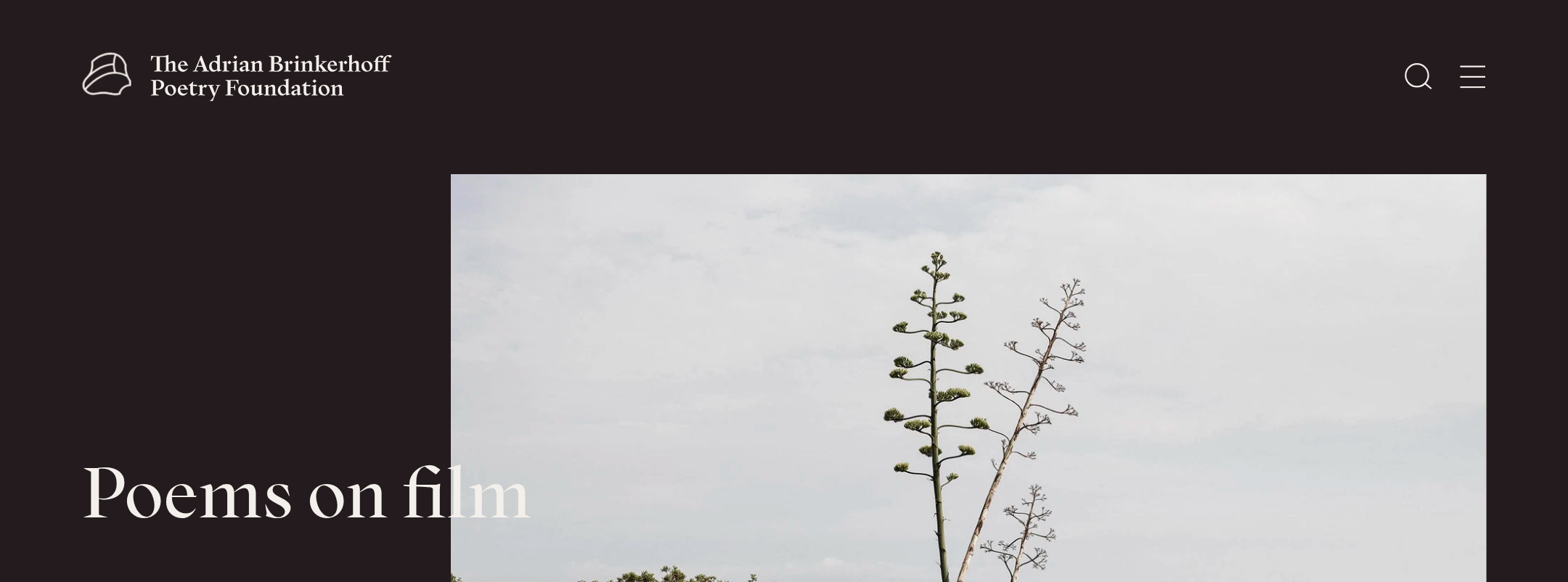
Exceptional editorial art direction, with a restrained palette and strong integration of typography, image, and pacing.
What works
- The split hero creates an immediate cinematic point of view without excessive decoration.
- Alternating dark panels, light editorial fields, large imagery, and compact rails produce a deliberate rhythm across a long homepage.
- The display serif and supporting text system feel appropriate to poetry and establish a recognizable institutional character.
- Image selection and cropping give the page a sense of place and cultural seriousness.
Opportunities
- Some sections depend heavily on small labels and subtle rules; slightly stronger hierarchy could improve scanning without changing the overall aesthetic.
- Ensure image crops preserve meaningful subjects and text overlays at narrow widths.
Uniqueness
The homepage has a clear and memorable point of view, distinguishing the foundation from generic nonprofit or literary websites.
What works
- It frames poetry through film and visual culture, expressed consistently in both content and composition.
- The combination of cinematic photography, literary typography, and quiet institutional restraint feels authored rather than template-driven.
- Large mission-oriented moments are balanced with archive-like browsing modules.
Opportunities
- Further emphasize the foundation's geographic reach or distinctive programming model in the first screen or opening transition.
- A more recognizable signature interaction could strengthen memorability, provided it remains accessible and does not compete with the content.
User experience
The experience encourages exploration and communicates breadth, but the long scroll and understated controls place a burden on visitors who arrive with a specific task.
What works
- The content progression moves naturally from featured work to broader discovery and institutional context.
- Card and feature patterns make a large body of cultural content feel curated rather than overwhelming.
- The page appears structurally well organized in the supplied evidence.
Opportunities
- Add clearer signposting for visitors seeking films, events, educational material, or organizational information.
- Improve the visual prominence and labeling of carousel controls and make the active/available state obvious.
- Consider persistent or repeated pathways to key sections on a page of this length.
Conversion optimization
Conversion is appropriately soft and cultural rather than sales-led, but important nonprofit actions are visually quieter than the editorial content.
What works
- The page offers several meaningful engagement routes, including film viewing, poem discovery, event exploration, newsletter signup, and deeper organizational pages.
- The newsletter form is placed in the footer alongside contact and institutional information, where it fits the relationship-building goal.
- The mission and programming are communicated through content rather than aggressive promotional language.
Opportunities
- Elevate one primary engagement action near the hero, such as watching a featured film, discovering events, or supporting the foundation.
- Clarify the value and frequency of newsletter signup near the form rather than presenting it as a nearly label-free utility.
- If donations or support are a priority, provide a visible, consistently named support pathway in the main navigation or an early feature section.
What we'd improve
- 01high
Establish a clearer primary action
Choose the foundation's most important homepage outcome—film viewing, event discovery, newsletter signup, or support—and give it a stronger, consistently named entry point near the hero and in the main navigation.
- 02high
Audit small interface text across responsive states
Review navigation, metadata, captions, and utility links at mobile widths and increased browser zoom. Preserve the quiet editorial style while improving readable scale, spacing, and focus visibility.
- 03medium
Improve discovery orientation
Add concise contextual labels or filters for major content types so visitors can distinguish films, poems, events, resources, and institutional content without scanning the full page.
- 04medium
Strengthen carousel accessibility
Verify that each horizontal rail has an accessible name, clearly labeled previous and next controls, sensible keyboard behavior, visible focus states, and an understandable mobile interaction.
- 05low
Make newsletter value more explicit
Add a short explanation of what subscribers receive and how often, positioned close to the email field, while retaining the restrained footer treatment.