BillionToOne website analysis
A detailed critique of the homepage's craft, originality, usability, and ability to move visitors toward its intended goal.
Our observations
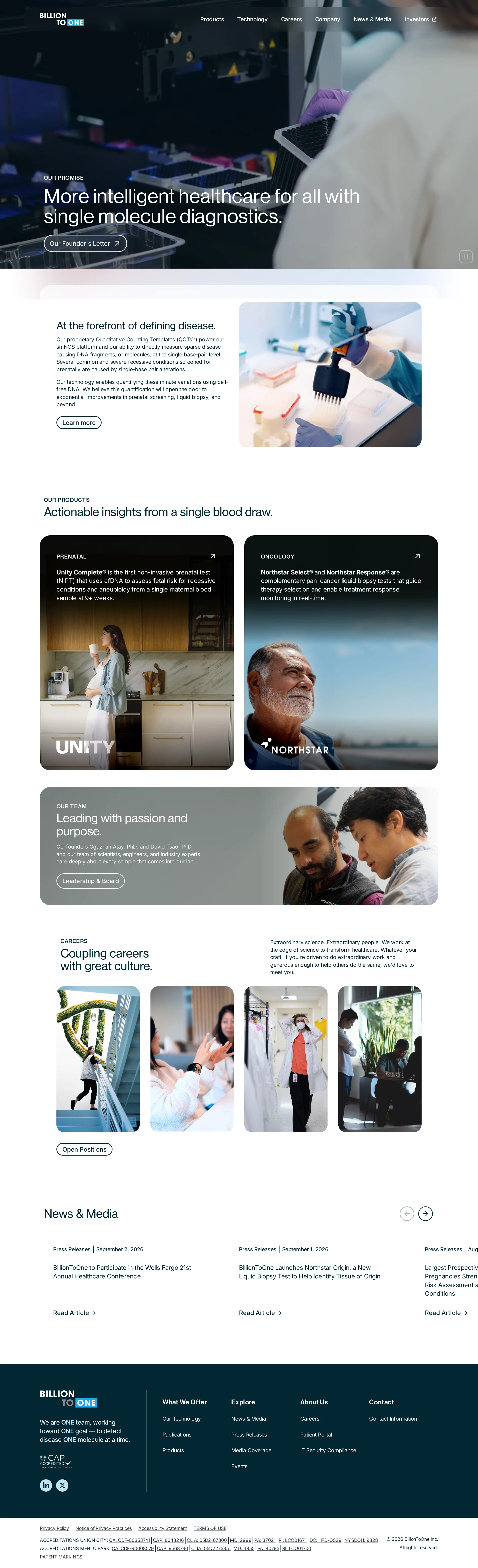
A visually polished and credible healthcare marketing homepage with strong narrative structure and photography, held back from exceptional status by documented accessibility and small-type issues.
Best practices
The page has one H1, a logical heading sequence, a main landmark, semantic navigation, and a footer. Automated accessibility evidence nevertheless identifies 17 contrast failures and two serious naming or labeling issues.
What works
- Clear page landmarks and heading structure.
- Consistent navigation, section organization, and button patterns.
- Strong use of descriptive product, leadership, career, and news pathways.
Opportunities
- Resolve the 17 reported contrast failures, particularly in hero and navigation text.
- Give the footer logo link an accessible name.
- Add an accessible label to the hero video play/pause control.
- Validate keyboard focus, carousel controls, and reduced-motion behavior in a manual audit.
Design
The design is cohesive, contemporary, and appropriate for a biotechnology company. It balances scientific imagery with human-centered storytelling and maintains a consistent visual rhythm across a long homepage.
What works
- Distinctive laboratory hero with a clear mission statement.
- Strong photography and rounded-card language across products and culture content.
- Good contrast between dark brand sections and spacious light editorial sections.
- Clear visual hierarchy from hero to product, culture, careers, and news content.
Opportunities
- Increase the prominence and readability of supporting copy in dense sections.
- Give the news area stronger visual grouping and clearer separation between article items.
- Reduce the dependence on photographic overlays for essential text legibility.
Uniqueness
The combination of single-molecule diagnostics, product storytelling, and culture photography gives the site a credible identity, although its overall structure remains familiar within premium healthcare and biotech marketing.
What works
- Product storytelling is specific to prenatal screening and oncology diagnostics.
- The careers and leadership sections add a human layer beyond a standard product showcase.
- The visual system feels intentional rather than template-driven.
Opportunities
- Develop a more ownable visual device for explaining single-molecule diagnostics.
- Make the scientific differentiator more visually demonstrable instead of relying primarily on photography and copy.
User experience
The information architecture is understandable and the page offers clear routes into products, careers, leadership, and news. Readability and accessibility concerns reduce confidence for users navigating the page under different visual or interaction conditions.
What works
- Navigation categories map well to the company's major audiences and content areas.
- The product cards provide prominent, direct entry points for prenatal and oncology audiences.
- The long-form sequence supports both brand discovery and deeper exploration.
Opportunities
- Improve text contrast and minimum readable size throughout the hero, navigation, cards, and news area.
- Ensure every icon-only or media-control interaction has an accessible name.
- Make carousel position, available items, and keyboard operation more apparent.
- Test the page at zoom and on small screens; those behaviors cannot be confirmed from the supplied screenshot.
Conversion optimization
For a corporate healthcare homepage, the page effectively builds trust and directs visitors toward product, leadership, career, and news content. Conversion intent is distributed across several audiences rather than concentrated around one primary action.
What works
- The hero communicates the company's category and mission immediately.
- Product cards are visually prominent and support fast audience self-selection.
- Founder, leadership, careers, and news pathways reinforce trust and credibility.
Opportunities
- Introduce a more explicit primary pathway for clinical, provider, or diagnostic-partner inquiries.
- Clarify the next step associated with each product card beyond exploratory browsing.
- Use stronger article metadata and grouping to support visitors seeking evidence, publications, or company updates.
- Consider audience-specific calls to action for patients, providers, laboratories, investors, and prospective employees.
What we'd improve
- 01high
Repair critical accessibility barriers
Correct the 17 reported text-contrast failures, add an accessible name to the footer logo link, and label the hero video play/pause control. Recheck focus visibility and keyboard operation afterward.
- 02high
Strengthen hero readability
Increase the separation between the hero copy and its photographic background with a more reliable overlay, alternate text treatment, or a controlled static fallback, then validate contrast across representative video frames.
- 03medium
Make audience pathways more explicit
Add clearer entry points for clinical, provider, laboratory, partner, and career audiences so visitors can identify the appropriate next action without relying on broad navigation categories.
- 04medium
Improve news discoverability
Increase article grouping, metadata legibility, and carousel orientation cues so users can understand the available stories and move through them efficiently.
- 05low
Visualize the scientific differentiator
Add an original, accessible explanatory graphic or visual sequence showing how single-molecule diagnostics create actionable insight, complementing the existing photography.