Base Off Mute website analysis
A detailed critique of the homepage's craft, originality, usability, and ability to move visitors toward its intended goal.
Our observations
A distinctive and publishable editorial concept with excellent art direction, held back from top-tier status by documented contrast issues, missing heading semantics, and limited evidence of interaction and responsive behavior.
Best practices
The page is focused and structurally coherent, but automated evidence identifies meaningful accessibility and semantic gaps.
What works
- One main landmark is present.
- Episode content is organized as a consistent list of linked entries.
- The page has a clear visual hierarchy and restrained interface language.
- Duplicate IDs and heading skips were not detected.
Opportunities
- Improve the five documented synopsis contrast failures, especially in secondary or sliding-panel content.
- Add a meaningful H1 that reflects the page purpose and verify the heading hierarchy.
- Ensure episode links, disabled states, and any motion controls have clear keyboard focus and accessible names.
- Test the full interface at narrow widths and with reduced-motion preferences.
Design
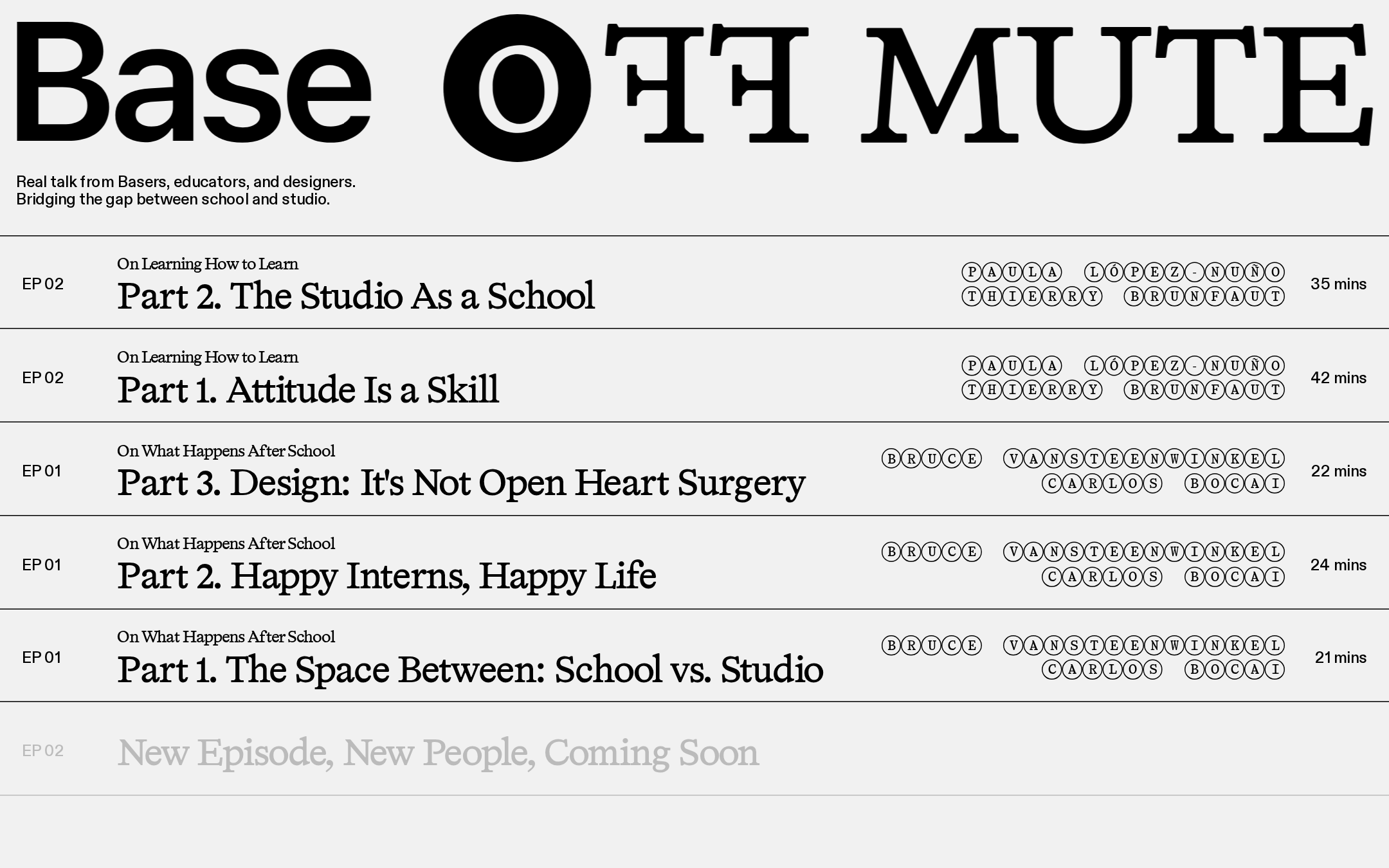
The visual system is exceptionally disciplined and gives the content a strong publication-like identity.
What works
- The oversized masthead creates immediate recognition and strong first-impression hierarchy.
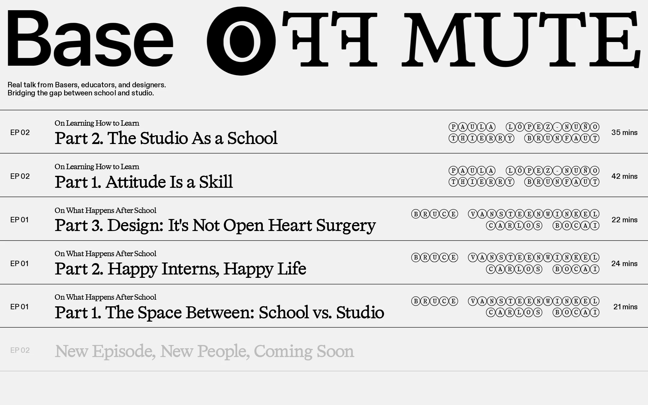
- Repeated ruled episode bands make the archive feel intentional and easy to scan.
- Circular participant lettering is a memorable graphic signature.
- The near-monochrome palette and typography carry the concept without decorative excess.
Opportunities
- Introduce a slightly stronger distinction between active, unavailable, and already-consumed episodes if those states exist.
- Validate that the largest display treatment remains legible and balanced across mobile widths.
- Consider a small amount of supporting imagery or contextual content only if it improves discovery without weakening the typographic focus.
Uniqueness
The composition feels authored rather than template-driven, particularly in its treatment of the masthead and guest names.
What works
- The page avoids the familiar thumbnail-and-card podcast layout.
- The letter-in-circle participant treatment creates a recognizable visual motif.
- The relationship between school, studio, and conversation is expressed through an index-like editorial structure.
Opportunities
- Make the series context and editorial point of view more discoverable beyond the opening description.
- Use episode-level visual or thematic cues selectively to differentiate entries with similar metadata patterns.
User experience
The episode archive is straightforward to scan, although accessibility and interaction details require further validation.
What works
- Titles, episode numbers, guests, and runtimes occupy predictable positions.
- The repeated row structure supports quick comparison between episodes.
- The page presents a clear content-first path rather than competing calls to action.
Opportunities
- Increase the legibility of secondary synopsis content and low-emphasis states.
- Expose clear play, listen, or destination affordances where the row interaction is not self-evident.
- Confirm that the fixed header does not obscure content or reduce usable space on smaller screens.
- Provide an accessible current, unavailable, or upcoming state for the muted future entry.
Conversion optimization
For an editorial audio project, the page successfully drives attention toward the episode list, but the next action and wider discovery funnel are not fully evident in the screenshot.
What works
- The masthead quickly communicates the project identity and subject area.
- The episode list places the primary content directly below the introduction.
- Durations and guest names help visitors choose an entry efficiently.
Opportunities
- Add a prominent, accessible listening action or platform destination for the featured episode.
- Make the preferred starting point explicit for first-time visitors.
- Include lightweight paths to subscribe, follow, or explore the project context if those are core goals.
- Use descriptive link labels or supporting action text so the entire row is not the only apparent interaction target.
What we'd improve
- 01high
Resolve synopsis contrast failures
Adjust the affected secondary copy and muted states so text remains clearly legible against its background in every episode state; recheck the five flagged synopsis instances across hover, active, and disabled presentations.
- 02high
Restore semantic heading structure
Add one meaningful H1 for the page and verify that episode and section headings follow a logical hierarchy without relying solely on visual type scale.
- 03high
Clarify the primary listening action
Make the featured episode’s listen or destination action explicit with an accessible name, visible focus treatment, and a clear distinction between linked, unavailable, and upcoming rows.
- 04medium
Test narrow-screen reflow
Validate the masthead, participant lettering, title column, and runtime column at mobile widths; allow columns to stack or wrap without truncation or horizontal scrolling.
- 05medium
Define reduced-motion behavior
Because the audit reports animation and many transition-bearing elements, provide a reduced-motion presentation that preserves state changes without relying on sliding or decorative movement.
- 06low
Strengthen content discovery
Add a concise entry point for new visitors, such as a recommended first episode or a compact series-about link, while preserving the intentionally sparse editorial composition.