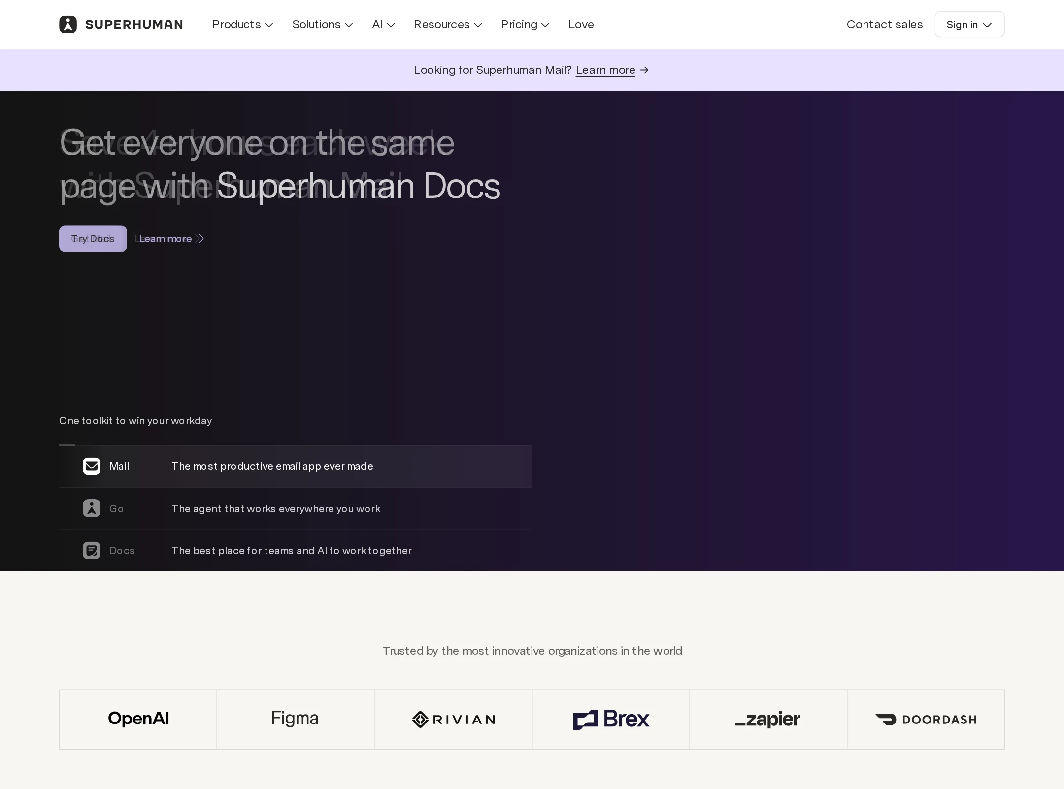


Superhuman website analysis
A detailed critique of the homepage's craft, originality, usability, and ability to move visitors toward its intended goal.
Our observations
Excellent visual direction and product storytelling, with accessibility and semantic issues that prevent an exceptional rating.
Best practices
The page has a clear marketing structure, consistent navigation patterns, prominent calls to action, and a substantial footer. Automated checks identify important implementation weaknesses.
What works
- The page uses a clear main region and semantic navigation landmarks.
- CTA patterns are repeated consistently across product sections.
- The content is organized into recognizable product, proof, enterprise, and footer areas.
- Responsive layout variants are present in the component evidence.
Opportunities
- Add a meaningful H1 to establish the page’s primary subject for assistive technology and document structure.
- Resolve the unnamed link and duplicate IDs, particularly where icons and interactive controls are involved.
- Audit the three reported contrast failures, including carousel controls and a secondary CTA.
- Verify video alternatives, keyboard interaction, focus visibility, and reduced-motion behavior.
Design
A highly polished visual system with excellent control of contrast, imagery, section rhythm, and product presentation.
What works
- Dark product-demo panels create strong visual anchors within a long page.
- Warm neutrals and lavender callouts provide a distinctive editorial counterpoint to the UI imagery.
- Cards, buttons, labels, and spacing feel consistently art-directed.
- The page uses interface imagery to make AI capabilities concrete and visually credible.
Opportunities
- Reduce the number of competing product narratives in the middle of the page to sharpen the central story.
- Give the most important conversion path slightly more visual emphasis than secondary exploration links.
- Review dense footer content and small supporting labels for legibility at smaller viewports.
Uniqueness
The combination of premium productivity software demos, warm editorial surfaces, and vivid atmospheric product imagery feels considered and recognizable, though it remains within established premium SaaS conventions.
What works
- The alternation between immersive dark panels and quiet cream sections produces a memorable cadence.
- The color progression across teal, plum, lavender, and burgundy gives individual product stories distinct character.
- The product suite is presented as a connected ecosystem rather than a collection of unrelated feature pages.
Opportunities
- Develop one more unmistakable brand signature beyond gradients, rounded cards, and interface mockups.
- Use a more singular hero statement or visual metaphor to differentiate the opening from other AI productivity pages.
User experience
The page is visually easy to scan and offers multiple routes into the suite, but its length, carousel dependence, and reported accessibility defects introduce friction.
What works
- Centered section headings and repeated CTA placement make the page’s structure predictable.
- Product demonstrations and concise feature cards support quick visual comprehension.
- Customer logos, testimonial content, and enterprise messaging provide useful reassurance for different audiences.
- The sticky navigation keeps core pathways available as the visitor scrolls.
Opportunities
- Provide a stronger opening H1 and clearer first-step proposition.
- Ensure carousel controls expose clear names, states, keyboard behavior, and sufficient contrast.
- Consider a persistent or repeated suite-level CTA so visitors are not forced to infer which product is the recommended starting point.
- Test the full experience with screen readers, keyboard-only navigation, zoom, and reduced-motion settings.
Conversion optimization
The homepage supports conversion well through repeated product CTAs, customer proof, feature demonstrations, and enterprise positioning, although the breadth of the suite can dilute the primary action.
What works
- Product-specific CTAs appear close to relevant demonstrations.
- Customer logos and customer-story access add credibility before later conversion moments.
- Enterprise messaging and contact-sales pathways address higher-consideration buyers.
- The page balances direct trial actions with lower-commitment learning links.
Opportunities
- Define one primary conversion objective for the hero and make its value proposition immediately explicit.
- Clarify the relationship between trying individual products and adopting the broader Superhuman suite.
- Add concise qualification details near major CTAs, such as audience fit, trial expectations, or plan context, if available.
- Measure whether the carousel advances understanding or hides important product information from visitors who do not interact with it.
What we'd improve
- 01high
Repair semantic and accessibility foundations
Add one descriptive H1, provide an accessible name for the reported unnamed link, replace duplicate IDs with unique identifiers, and remediate the three reported contrast failures. Re-run automated and manual accessibility checks afterward.
- 02high
Make the hero proposition and primary action explicit
State the suite’s central value in a single top-level heading and establish one dominant next step, while keeping product-specific exploration as a secondary path.
- 03high
Harden carousel and media interactions
Expose meaningful control labels and selected states, support keyboard operation and focus visibility, provide equivalent content for videos, and verify behavior under reduced-motion preferences.
- 04medium
Reduce narrative dilution across the suite
Group products around a concise audience-oriented story, and consider a short suite overview or comparison mechanism before the visitor encounters several independent feature sections.
- 05medium
Validate responsive readability
Test long headings, compact labels, carousel controls, feature cards, and footer columns at narrow widths and zoom levels, with particular attention to contrast and tap-target clarity.
- 06low
Strengthen the distinctive brand signature
Explore a recurring visual or editorial device that is unique to Superhuman’s product philosophy, rather than relying primarily on gradients, UI mockups, and rounded cards.