PlanGrid | Autodesk Forma website analysis
A detailed critique of the homepage's craft, originality, usability, and ability to move visitors toward its intended goal.
Our observations
A strong, credible enterprise support page with effective task prioritization and a coherent visual system. It merits gallery inclusion after accessibility and markup-quality issues are addressed.
Best practices
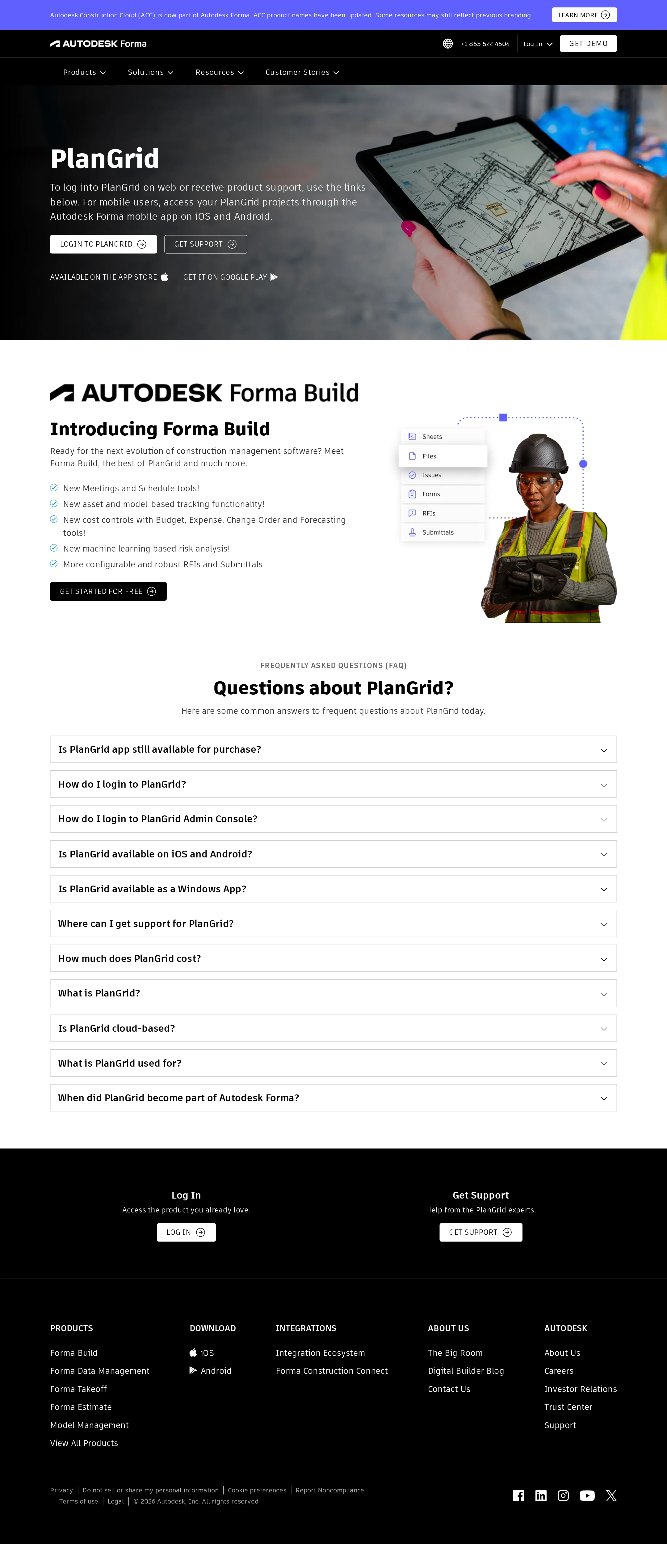
The page has a single clear H1, no reported heading skips, one main landmark, strong sampled contrast results, and obvious task-oriented calls to action. Accessibility quality is held back by missing alternative text, an unnamed logo link, and repeated IDs.
What works
- A single page-level H1 gives the support page a clear subject.
- The hero provides direct login and support actions without requiring users to search.
- The audit reports zero sampled contrast failures and no heading skips.
- The FAQ covers practical access, platform, pricing, and product-transition concerns.
Opportunities
- Add meaningful alternative text to the Forma Build image or mark it decorative when appropriate.
- Give the logo link an accessible name that identifies the Autodesk Forma home destination.
- Remove duplicate IDs and ensure every interactive control has a unique relationship with its menu or panel.
- Verify keyboard focus states, accordion semantics, and mobile navigation behavior in a live accessibility review.
Design
The page combines strong photography, disciplined black-and-white branding, and a clear information hierarchy. Its main weakness is that the FAQ section becomes visually repetitive and the transition from PlanGrid support to Forma Build is somewhat abrupt.
What works
- The hero image immediately communicates construction-site context and product use.
- The black header, black footer, and white content sections create a confident enterprise rhythm.
- The Forma Build module adds visual variety through a worker image and interface-oriented illustration.
- The page maintains consistent control styling and restrained use of accent color.
Opportunities
- Make the PlanGrid-to-Forma Build relationship more visually and verbally explicit.
- Introduce more hierarchy or grouping within the long FAQ list to reduce repetition.
- Give the support action band a stronger visual connection to the hero actions instead of presenting it as a late-page duplicate.
Uniqueness
The page is well executed but intentionally conventional for enterprise software. Its strongest distinctive quality is the combination of product-transition messaging and practical PlanGrid support in one focused destination.
What works
- The transition-page purpose is more specific than a generic software landing page.
- The construction photograph and worker cutout give the content a credible industry context.
- The FAQ topics are tailored to an existing product audience rather than a broad acquisition funnel.
Opportunities
- Use a more distinctive transition visual or timeline to explain the product relationship.
- Surface a concise migration or continuity promise if that is central to the user concern.
- Reduce reliance on familiar enterprise patterns such as generic bordered accordions and multi-column footer navigation.
User experience
The page supports the likely primary tasks well: logging in, finding help, checking platform availability, and understanding the successor product. The information architecture is direct, though the collapsed FAQ design makes answer discovery dependent on repeated interaction.
What works
- Primary actions are visible in the hero and repeated later for users who scroll.
- The page sequence follows a sensible path from immediate assistance to product context and self-service answers.
- FAQ labels are written as concrete user questions and are easy to scan.
- App-store links are surfaced directly in the hero for mobile users.
Opportunities
- Consider opening or highlighting the most common FAQ answer, especially login or support guidance.
- Add stronger visual grouping between account access, mobile availability, and product-transition questions.
- Confirm that the sticky two-level header does not consume excessive viewport height on smaller screens.
Conversion optimization
For a support and transition page, the conversion model is appropriate: it prioritizes login and support rather than forcing a sales funnel. The Forma Build trial action is visible, but its relationship to the PlanGrid audience and next steps could be clearer.
What works
- The hero offers two differentiated actions for existing users: login and support.
- A free-start action introduces a commercial path without displacing the support purpose.
- The product section explains several concrete Forma Build capabilities before presenting its action.
- Repeated login and support actions in the lower band accommodate long-page visitors.
Opportunities
- Clarify whether existing PlanGrid users should log in, contact support, or start a Forma Build trial.
- Add concise reassurance around account continuity, data, or migration if supported by the product facts.
- Use a more descriptive trial CTA or supporting line to distinguish new evaluation from existing-user access.
- Measure whether the repeated lower-page actions assist users or simply duplicate the hero controls.
What we'd improve
- 01high
Fix the identified accessibility and ID issues
Add an accessible name to the logo link, provide appropriate alternative text for the Forma Build image, and replace duplicated SVG and menu IDs with unique identifiers. Re-test keyboard navigation and accordion relationships after the change.
- 02high
Clarify the user path from PlanGrid to Forma Build
Add a short transition statement near the Forma Build module explaining which users should continue to use PlanGrid, which users should explore Forma Build, and where support fits into that decision.
- 03medium
Improve FAQ scanability
Group the eleven questions into small categories such as access, devices, support, pricing, and product history, or elevate the highest-frequency questions above the longer background questions.
- 04medium
Strengthen the trial CTA context
Pair the free-start action with a concise qualifier describing who the trial is for and how it relates to current PlanGrid users, without weakening the page's support-first intent.
- 05low
Validate responsive and interaction behavior
Test the sticky header, hero crop, app-store links, accordion focus states, and footer stacking at narrow widths and with reduced-motion preferences. These behaviors cannot be confirmed from the supplied desktop evidence.